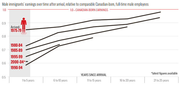
The Globe and Mail has been working on a story about immigration to Canada because apparently not all immigrants come to America. The story has its section headers running down the side column of the page, like many other segmented stories you’ll see posted online these days, but also uses graphics to make and supplement its arguments.
This one chart from the piece is an example of how the simple format of a line chart can clearly express and visualise an interesting trend. Immigrants from the past two decades earn less than immigrants to Canada in the 1970s. Those from the early 90s, however, do appear to have a faster rate of income growth that approaches parity with Canadian-born income-earners.

Leave a Reply
You must be logged in to post a comment.