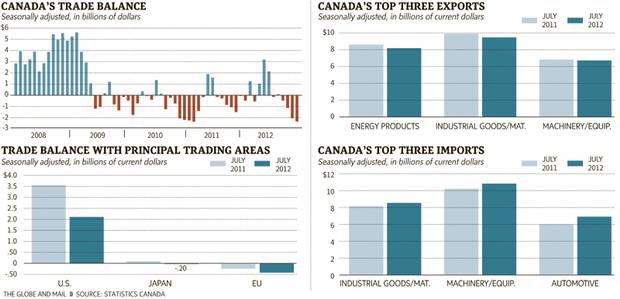
The Globe and Mail of Canada published an infographic that where I work would probably be called a datagraphic. It presents data in a graphic fashion without a lot of context or conclusions that turn data into information. The piece in question looks at Canada’s balance of trade, i.e. how much it imports from other countries vs how much it exports to other countries.

While I appreciate the goal of the overall piece and fully understand that it may have in fact first lived in the print edition, the version shown on their website feels too large for the few data points contained within the graphic. The bars on the right and beneath the timeline are far too wide. The sections could likely have been condensed into a smaller, more compact space that would have given more visual weight to the timeline that clearly tells the story of a more volatile trading period for Canada since the global recession of 2008.
I also would probably change the chart type or simply look at a different data set for the trade balance with principal partners because the data for Japan barely registers. And while the other data can be seen, the minor differences are difficult to read. I would probably shift the emphasis from the actual dollar value of exports and imports to the percentage growth (or decline) of each over the last year.
Leave a Reply
You must be logged in to post a comment.