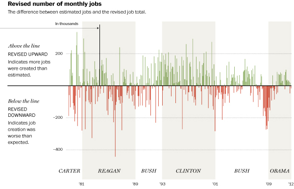
Last Friday was the jobs report for the month of August. And it was not as high as economists had expected. The problem is that the initial report is often inaccurate despite the fact we make such a big deal about the report. So the Washington Post looked at the revisions that take place in the months afterwards. Yeah, the initial reports are not so accurate.

The first two sets of charts (not shown above) look at the initial versus the revised numbers. The third (the cropping above) looks at the difference between those figures. The result is that the first few years of President Obama’s presidency created more jobs than expected but that the last two months have seen worse-than-expected job creation. I would be curious to see how this correlates to the end of the stimulus plan, but I imagine it would be difficult to link that to the jobs reports.
Credit for the piece goes to Todd Lindeman.
Leave a Reply
You must be logged in to post a comment.