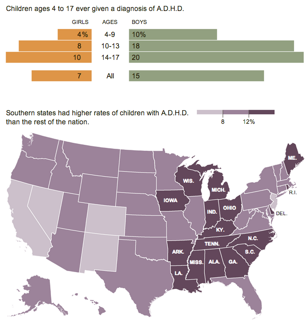
Keeping with maps, they can be useful, but all too often people fall back upon them because it is a quick and easy way of displaying data for geographic entities. This graphic from the New York Times on ADHD is not terribly complex, but it uses a map effectively.
The article discusses how ADHD rates among states vary, but are still higher in the South. The map supports that argument. Consider how it would be different if every other state were darkened to a different shade of purple. There would be neither rhyme nor reason as to why the map was being used.

A subtle point worth noting is that only the states falling into the highest bin are labelled. Those are the states that best support the story. The remainder of the states are left unlabelled so as not to distract from the overall piece.
Credit for the piece goes to the New York Times.
Leave a Reply
You must be logged in to post a comment.