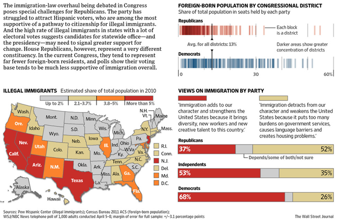
Following on last week’s posts on immigration comes today’s post on how that might impact Republican politics. Well I say might but pretty much mean definitely. The graphic comes from the Wall Street Journal and it takes a look at the demographic makeup of states, House congressional districts and then survey data on immigration broken into Republicans vs. Democrats.

I think the piece is a good start, but at the end of the introductory paragraph is the most salient point about the piece. And unfortunately the graphic does not wholly embody that part. Of course within limited time and with limited resources, achieving that sort of completeness is not always possible. That said I think overall the piece is successful, it just lacks that finishing graphical point.
Credit for the piece goes to Dante Chinni and Randy Yeip.
Leave a Reply
You must be logged in to post a comment.