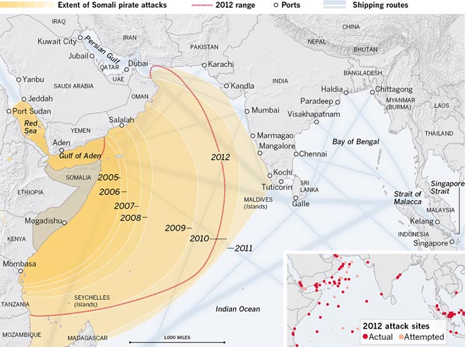
Today’s post looks at an interactive graphic from the Los Angeles Times. The subject matter is piracy and the piece has three distinct views, the second of which is displayed here.

Generally speaking, the package is put together fairly well. My biggest concern is with the first graphic. It uses circles to represent the number of attacks by locale over time. I would have either included a small table for each geographic area noted, or instead used a bar chart or line chart to show the progress over time.
Credit for the piece goes to Robert Burns, Lorena Iñiguez Elebee, and Anthony Pesce.
Leave a Reply
You must be logged in to post a comment.