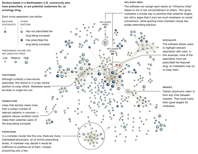
This network diagram from the New York Times looks at a community of doctors with respect to a prescription oncology drug. Colour is used to denote types of doctors while size denotes the volume of prescriptions for any oncology drug. Admittedly, I am not keen of the bubble effect placed on the circles. Those effects and the heavy black outlines for the circles distract a bit, but not excessively so.

What really makes this graphic, as is making so many of the Times’ graphics, is the annotation and explanation of the presented data. The user can readily see how some doctors are connected, but understanding the shapes and patterns of those connections is not as clear. But then the Times furthers that by explaining how the marketers of this oncology drug would use this data.
Credit for this piece goes to the New York Times graphics team.
Leave a Reply
You must be logged in to post a comment.