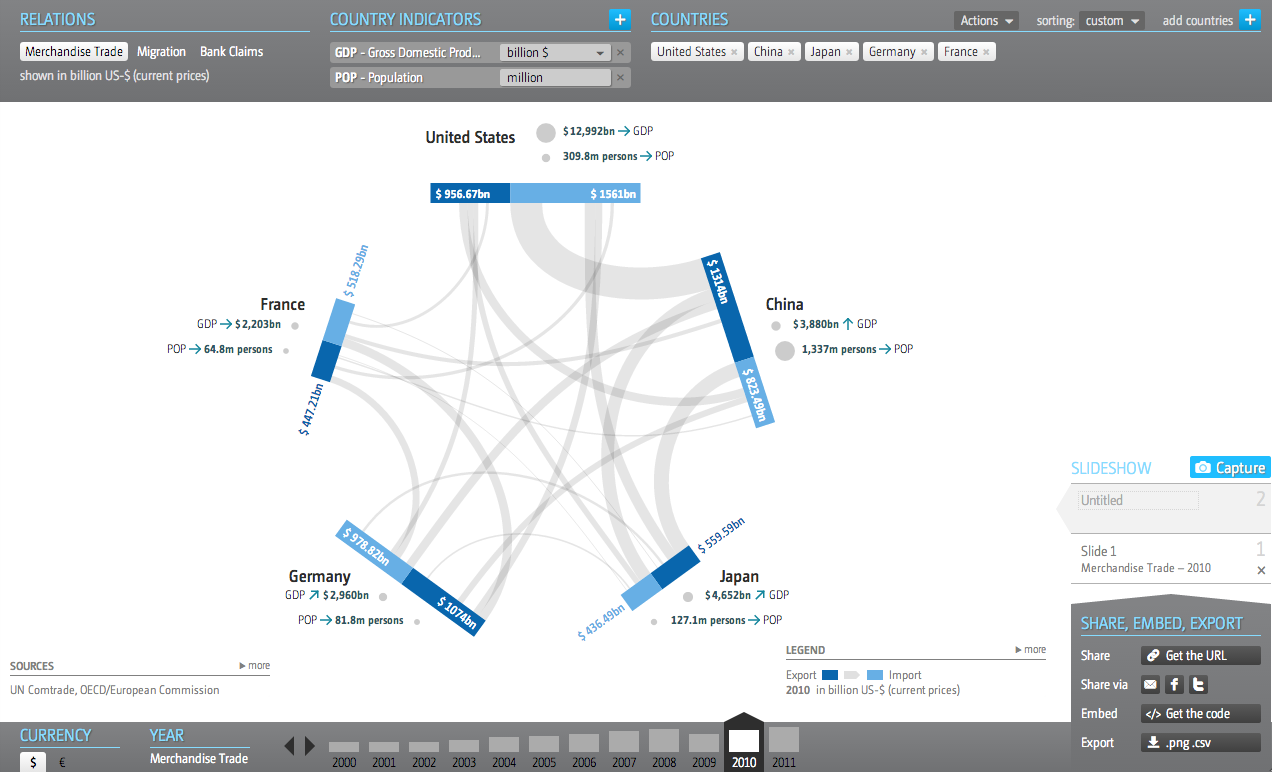
In the interests of transparency and full disclosure, for my employer I design interactive web-based applications that display significant amounts of data on various countries and industries—along with other design things. So I am always curious to see how others handle similar types and quantities of data. This interactive application—I hesitate to call something like this an interactive infographic because of its scale and scope—comes from the Global Economic Dynamics project.

I commend the designers for opting not to use a map despite the nature of a dataset that focuses on countries. Especially in this application, where the full pattern of trade or migration would only be visible through multiple clicks to load maps of export/import markets of a particular country.
The user can add multiple countries, switch to a different dataset, change the year of the displayed data, currency, metrics, &c. There is quite a bit going on in this application and the controls are carefully placed in the margins of the piece.
And while I could probably write a lot more about this piece, I will end up the ability to share any insights made while using this application. Because what is the value of a kernel of knowledge if you cannot share it? Consequently, this piece offers a multitude of options. The usual social media options are present. You can also download a .png for use in a presentation, e.g. PowerPoint, or you can download the data. But fascinatingly, the application allows you to embed the piece into your own site.
Unfortunately, I cannot find any specific designers attached to the project. So credit goes to the Global Economic Dynamics project.
Leave a Reply
You must be logged in to post a comment.