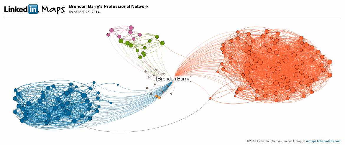
Today’s post comes via a co-worker. LinkedIn’s R&D lab published a tool to map your LinkedIn connections. You login to your account and then receive a social network of map. Mine, seen below, clearly shows three different and generally not inter-connected networks. The orange represents my current employer; the blue is my university network; the green and pink are high school and my employer while in university (they were in the same town).
To be fair, I’m not a frequent user of LinkedIn. So for those of who you use it more regularly to make connections, contacts, and acquaintances will find yourselves with more complex networks.
Credit for the piece goes to LinkedIn.
Leave a Reply
You must be logged in to post a comment.