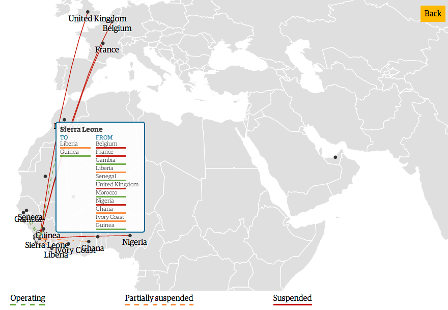
Definitely not really, but far more interesting than snakes. Today’s piece comes from the Guardian. Admittedly, the piece and thus the data is a month old, but it still is an interesting way of looking at the impact of the Ebola outbreak in Africa.

The graphic begins with a map highlighting the spread of the outbreak and some of the immediate measures taken by different governments. By clicking on a button, however, the user can get more details on the specific impact of quarantines and border closures. In this case, I have clicked on Sierra Leone and can see that a good number of flights are either suspended or partially suspended.
Credit for the piece goes to Achilleas Galatsidas and Mark Anderson.
Leave a Reply
You must be logged in to post a comment.