Today we look at a really nice piece from the Washington Post on urban homicide. It combines big, full-width images that use interactivity to promote exploration of data. But as you can see in the screenshot below, the designers took care to highlight a few key stories. Just in case the reader does not want to take the time to explore the data set.
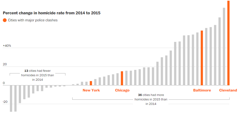
But the piece uses scale to provide contrast throughout the article. Because in addition to the three or four big graphics, a similarly well-thought-out and well-designed approach was taken towards smaller, inline supplemental graphics. Here is an example about the homicide rate for New York.
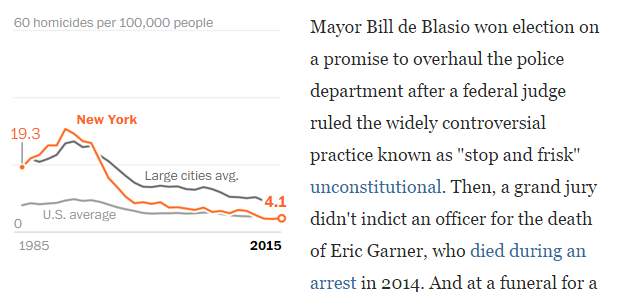
What I really enjoy about these small graphics is the attention paid to highlighting New York against the background averages provided for context. Note how the orange line for the city breaks the grey lines. It is a very nice detail.
Overall, this is a really strong piece marrying written content and data visualisation.
Credit for the piece goes to Denise Lu.
Leave a Reply
You must be logged in to post a comment.