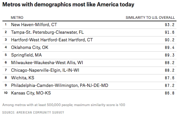
Not every graphic information graphic is a sexy chart or map. Sometimes tables communicate the story just as well. Maybe even better. Today’s post comes from FiveThirtyEight, which examined a claim about what places represent “Normal America”. Turns out that when one looks at the data, here age, race, ethnicity, and education, Normal America is found in the eastern half of the country. And it includes some big cities, notably both Philadelphia and Chicago. The whole article is worth a read, as it goes on exploring states representing Normal America and then places that represent 1950s America.

So where is Normal America? New Haven, Connecticut.
Credit for the piece goes to Jed Kolko.
Leave a Reply
You must be logged in to post a comment.