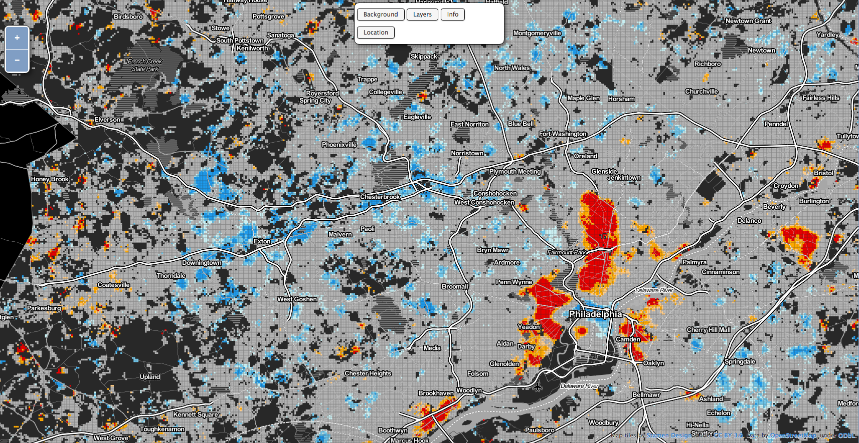
Last week Philadelphia became the first large US city to introduce a soda tax. (Berkeley introduced one a few years ago, but is 1/10 the size of Philly.) The Guardian has a really nice write-up on how the tax was sold not on health benefits, but of civic benefits to the education system. But the article made me wonder if somebody had published a map looking at obesity in Philadelphia. Turns out Philadelphia Magazine published an article with just such a map from another source, RTI International. (You can find the full interactive map here.)
The map has three views, one of which allows you to see areas of statistically significant clustering. North and West Philly had some bright red clusters, whereas the western suburbs, in particular along the Main Line have some very cold blues.

Credit for the piece goes to RTI International.
Leave a Reply
You must be logged in to post a comment.