Well the Democratic DC primaries were last Tuesday and Hillary Clinton won. So now we start looking ahead towards the July conventions and then the November elections. Consequently, if a day is an eternity in politics we have many lifespans to witness before November. But that does not mean we cannot start playing around with electoral college scenarios.
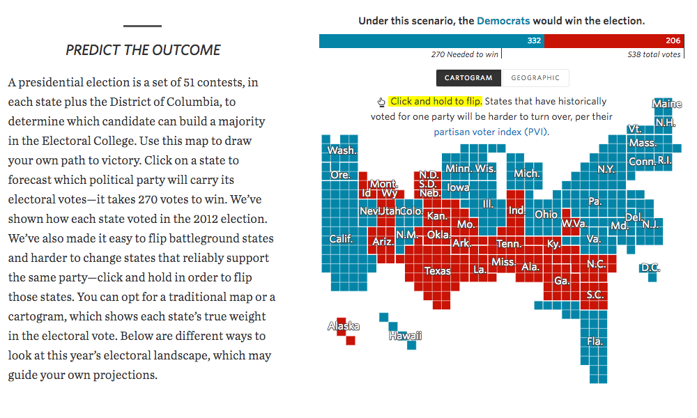
The Wall Street Journal has a nice scenario prediction page that leads with the 2012 results map, in both traditional map and cartogram form. You can play god and flip the various states to either red or blue. But from the interaction side the designers did something really interesting. Flipping a state requires you to click and hold the state. But the speed with which it then flips is not equal for all states. Instead, the length of hold time depends upon the state’s likelihood to be a flippable state, based on the state’s partisan voter index. For example, if you try and flip Kansas, you will have to wait awhile to see the state turn blue. But try and flip North Carolina and the flip is near instantaneous.
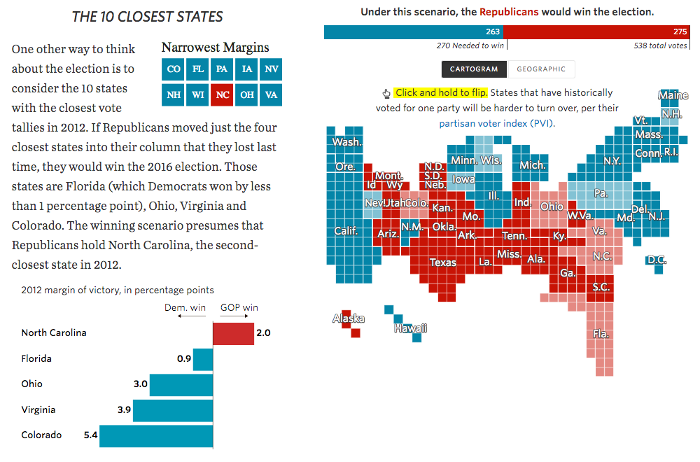
While the geographic component remains on the right, the left-hand column features either text, or as in this other screenshot, smaller charts that illustrate the points more specifically.
Taken all together, the piece does a really nice job of presenting users with a tool to make predictions of their own. The different sections with concepts and analysis guide the user to see what scenarios fall within the realm of reason. But, what takes the cake is that flipping interaction. Using a delay to represent the likelihood of a flip is brilliant.
Credit for the piece goes to Aaron Zitner, Randy Yeip, Julia Wolfe, Chris Canipe, Jessia Ma, and Renée Rigdon.
Leave a Reply
You must be logged in to post a comment.