At least politically.
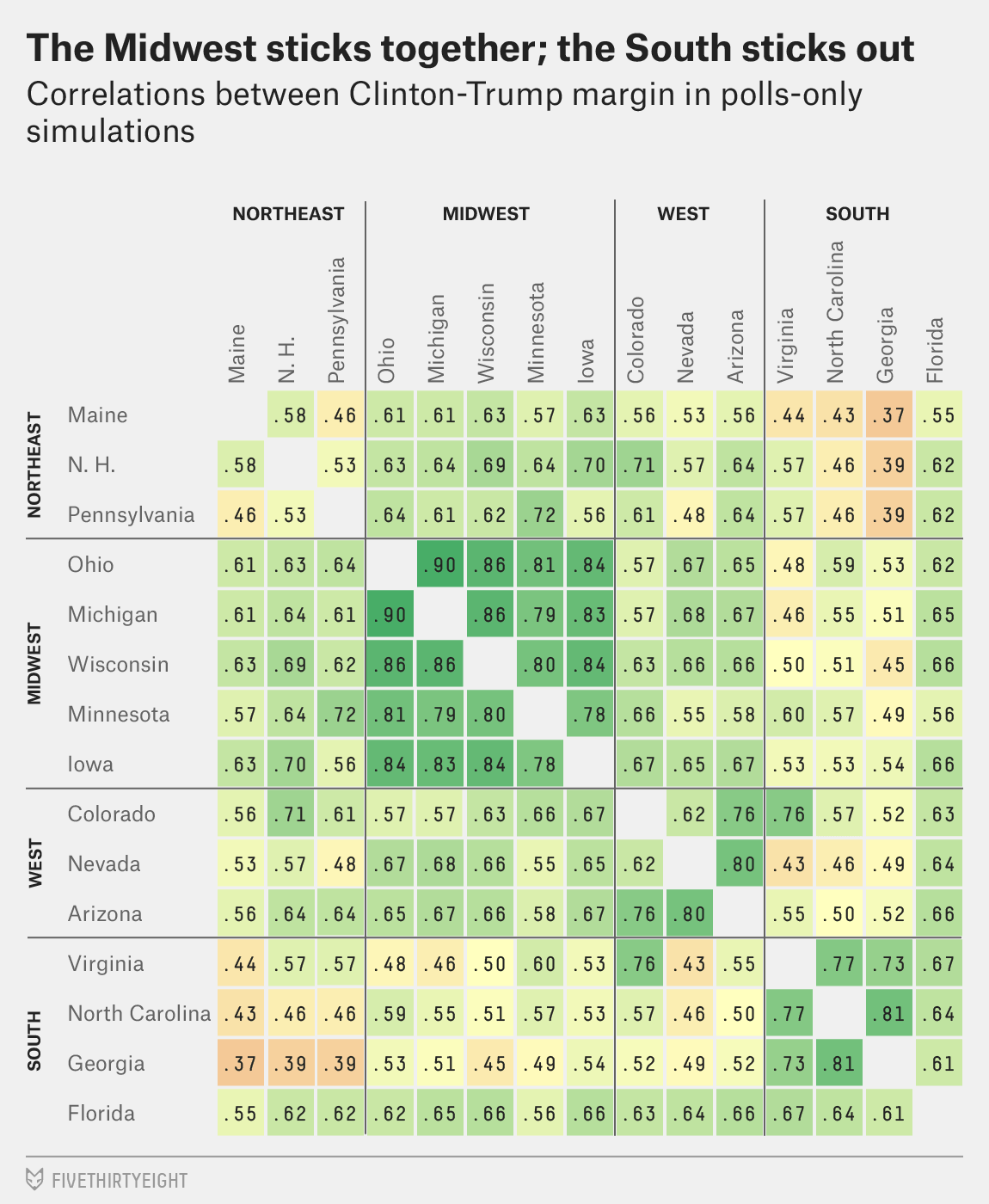
According to this piece from FiveThirtyEight, maybe not as much as they used to be. From a data visualisation standpoint, what stuck out at me was this plot of correlations of how similar various states are. Basically, the closer to the number 1, the more similar, the closer to 0, the less.

I might question the value of placing the numbers within the squares—see what I did there?—because the colours could be used with a legend to indicate the range of similarity. But if this were an interactive piece, it certainly could be done to reveal the number on tap or mouseover.
Anyway, it was interesting to see that among swing states, Pennsylvania is least like Georgia but most like Minnesota. The former, certainly. The latter, who would have guessed, don’t ya know.
Credit for the piece goes to the FiveThirtyEight graphics department.
Leave a Reply
You must be logged in to post a comment.