Well have we got an interesting week this week. Friday begins Trump Time. So hold onto your Twitter accounts, folks. But before we get there, I wanted to do a short week of some data-driven graphics that take a look at the state of things.
Instead of what I had intended for today, let us take a look at a new post from the Wall Street Journal that examines GDP, inflation, industrial production, and the unemployment rate in advanced economies. At its most basic level, the graphics show how many of the 39 advanced economies have a value within a one-percentage point range. The size of the dots indicates how many countries fall within the bin.
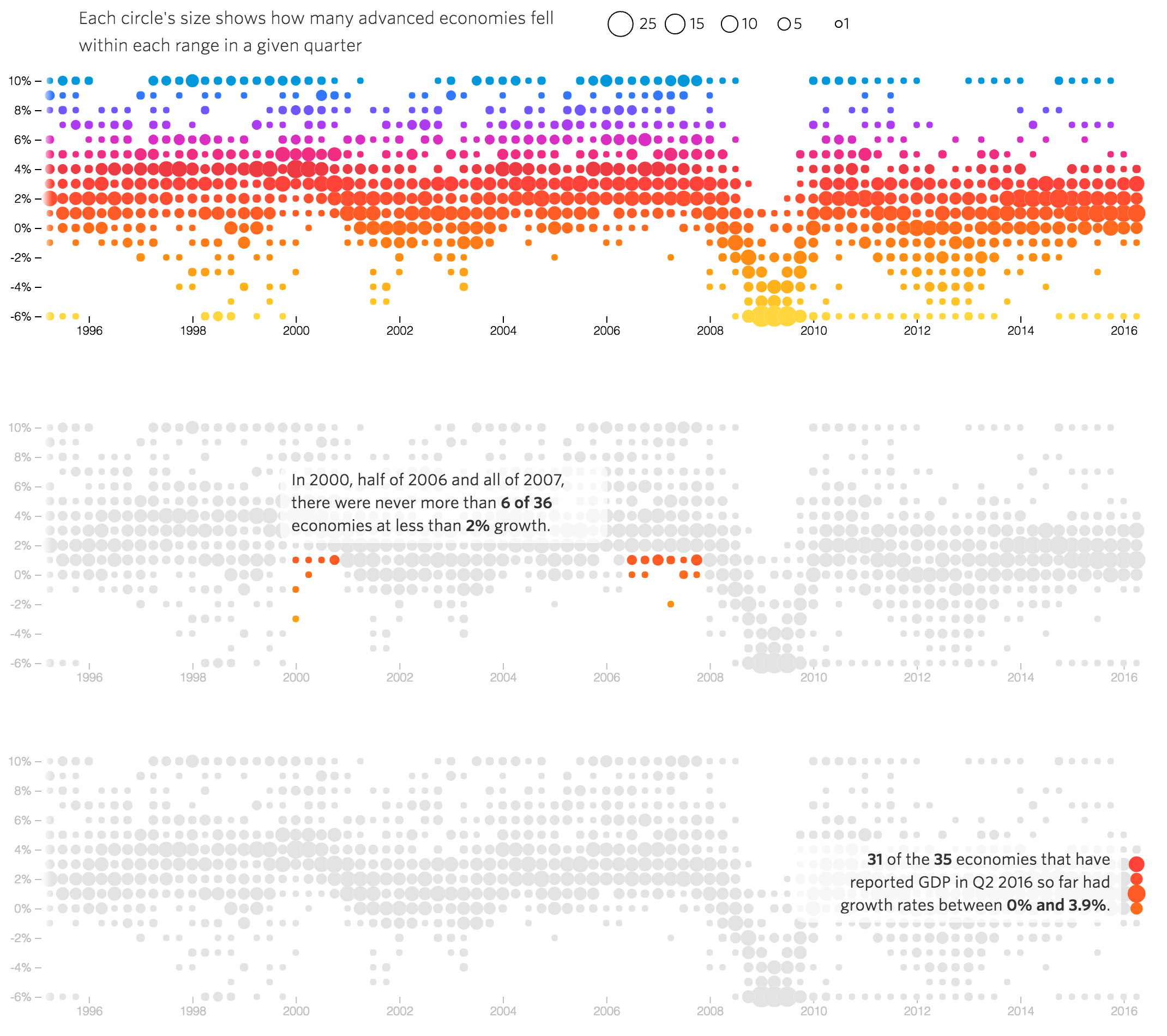
What keeps getting me, however, is the colour. Nowhere does the piece explain what the colour represents. Does it represent anything? I think it might only be used to show the ranges in the values, not the number of countries sharing said values. And if that is the case, it is a poor design decision.
My eye goes to the colour first before it goes to the dot density let alone the size of the dots. Like a Magic Eye, when I stare at the piece long enough, I begin to see the overall trend for each metric. But blink and the colours reassert their visual dominance.
I wonder what would happen if the graphic settled on a single colour? My instinct says that the patterns would become far clearer, because colour change would no longer be a visual pattern needing interpretation—even though it needs no interpretation from a data standpoint. By limiting the number of visual patterns, the piece would make the data stand out more clearly and make for clearer communication.
If an editor screams something like “It needz more colourz!!1!”, I would reserve four separate colours and then use one and only one for each of the four metrics.
That all said, what the piece does really well is explain segments of the data. In the above screenshot, you can clearly see and get the overall GDP story. But then from there you read down and get explanations or callouts of the overall to provide more context and information. The designer greys out the remainder of the dots and allows the colour to emphasise those countries in focus. A lightly transparent overlay allows for the background dots to remain faintly visible while the text can clearly be read.
All in all, I am not sure where I fall on this particular piece. It does some things well, others not so much. But either way, the piece does paint an interesting portrait of populism’s potential causes.
Credit for the piece goes to Andrew Van Dam.
Leave a Reply
You must be logged in to post a comment.