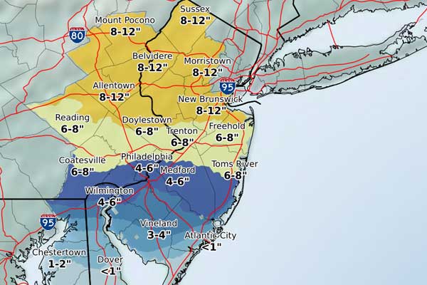
Today, 9 February, it finally snowed significantly here in Philadelphia. In Chicago it probably snowed shortly after I moved out in September. Today’s graphic is a forecast map from philly.com using National Weather Service (NWS) data.

I fail to understand the divergent palette—to be fair this is not the only instance of it throughout the meteorological world. There is a split at the six-inch mark—but why? If anything, my eye would think that the 4–6 range is the heaviest, not the yellow. Snowfall is usually more of a continuous range, and so both within the blues and yellows you get that through a softer edge as the colours become more intense. And then you hit the six-inch mark and a violent shift.
I am also curious as to why the choice to use a coloured map background. Especially if the colour, a lightish green-blue is so close to the lightish blue used by the map to forecast snowfall.
In short, I think this Philadelphia map could use some attention from some designers to make the message a bit clearer.
Credit for the piece goes to the philly.com graphics department.
Leave a Reply
You must be logged in to post a comment.