I still remember where I was on 23 June 2016 as the Brexit referendum results were coming in—drunk at a karaoke bar (for celebrating the end of a softball season) talking with a guy from Manchester about how the hell Britain could be voting to leave the European Union.
Fast forward a year (and a week) and where is the United Kingdom today? Well, still in the European Union. Though Article 50, the formal mechanism by which a country leaves the EU, was invoked in March, the UK remains part of the EU for at least two more years. But the vote has had some effects.
The Economist put together a nice piece explaining these effects by pairing chart and explanatory text.
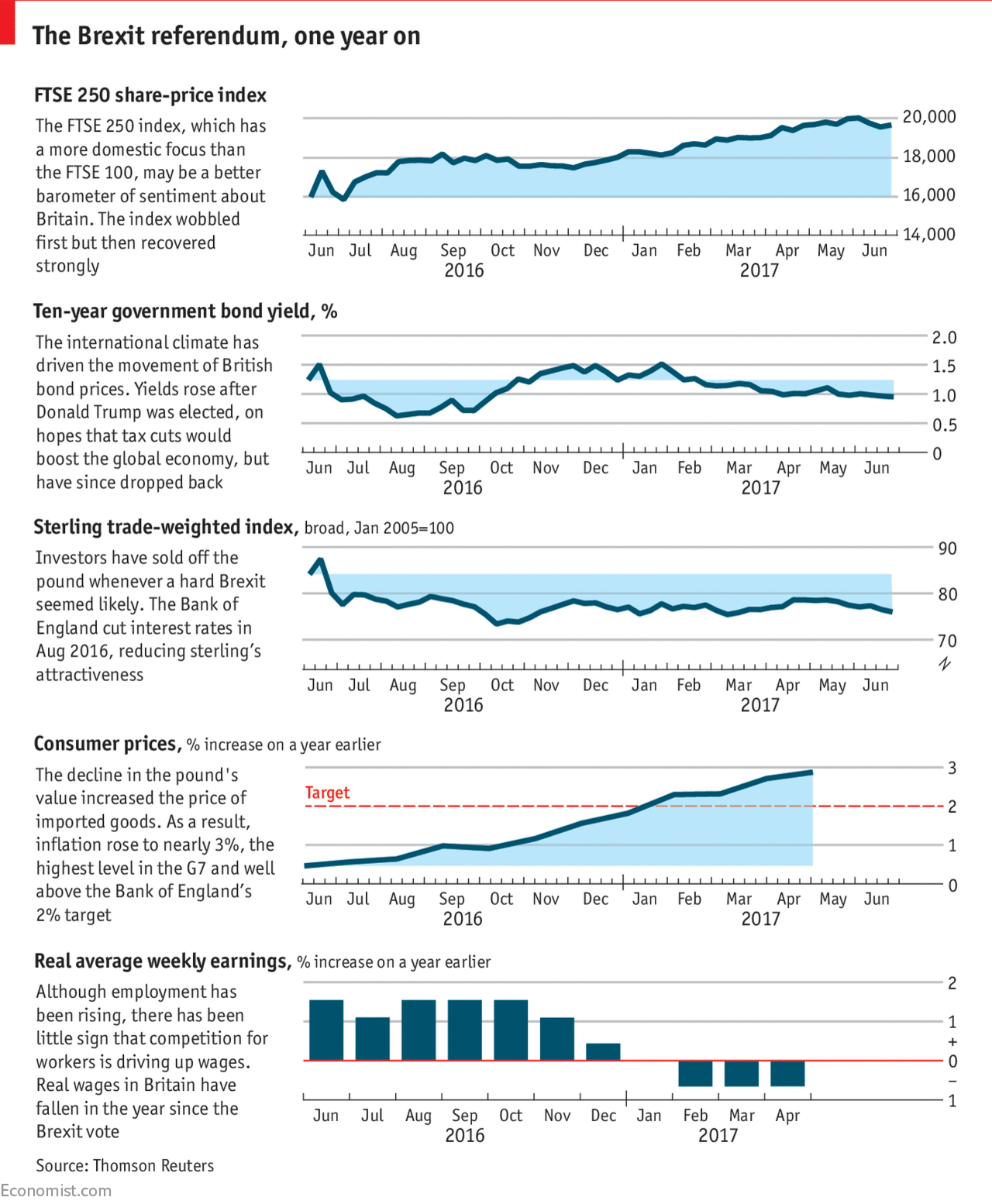
I really like the concept and the layout. However, the charts themselves probably could use some additional vertical space—difficult to tell for certain—to allow the smaller variations to show. But that would almost certainly mean changing the layout to accommodate for greater white space around the text boxes. Tricky, but I think it would be an improvement.
Credit for the piece goes to the Economist graphics department.
Leave a Reply
You must be logged in to post a comment.