I don’t use Reddit. But things begin to made sense for me in this article from the Economist as it explained the origins behind Trump’s weird tweet of himself beating up a CNN-headed wrestler.
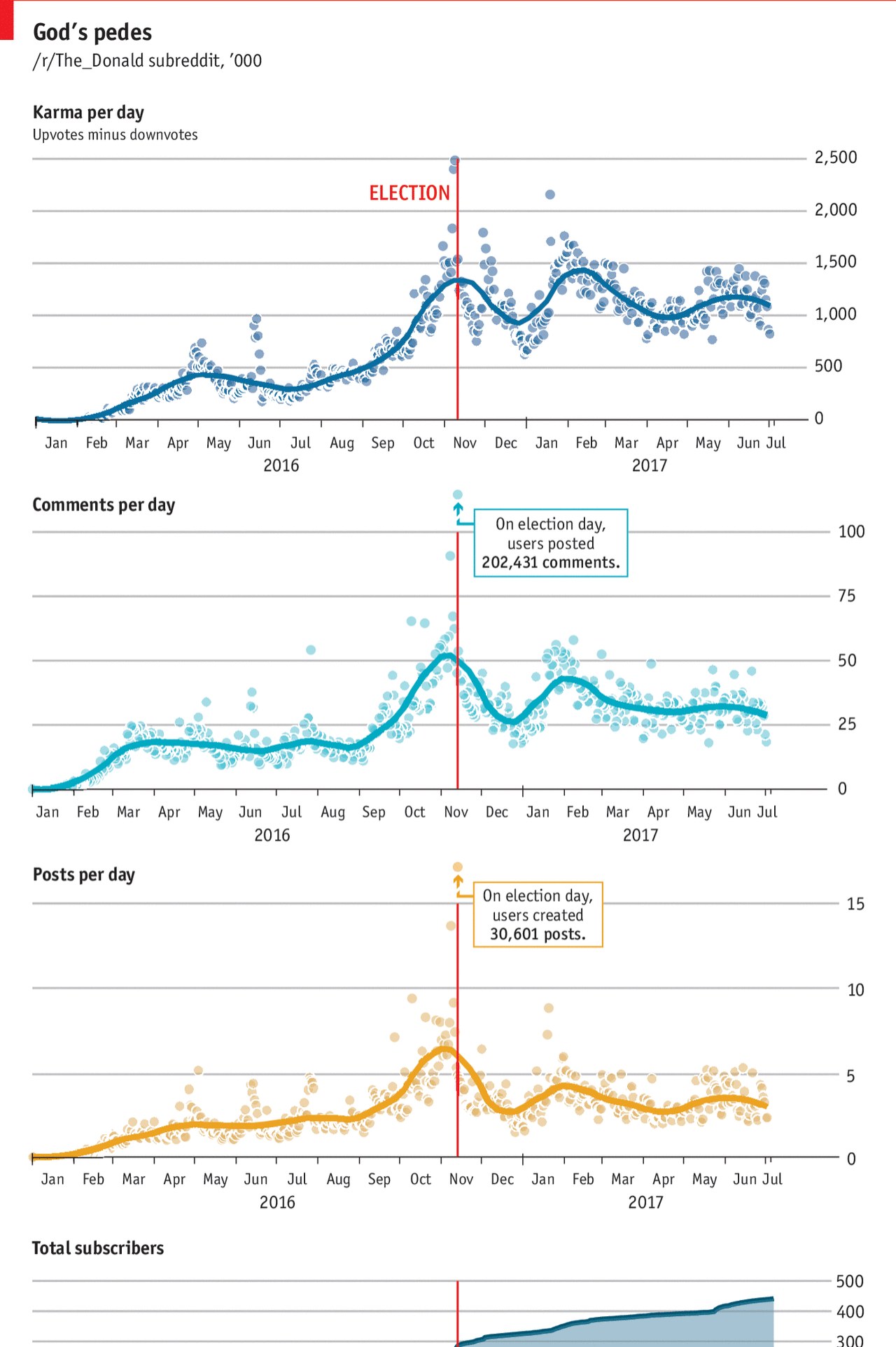
I think the thing perhaps lacking from the graphic is a line that tracks Trump’s approval or popularity. The article mentions that explicitly and it would be interesting to see that track over time. Although I certainly understand how stacking so many line charts above each other could become difficult to compare.
And my final critique are the Election Day outliers. They are above the y-axis maximum. But I wonder if there couldn’t have been a way of handling the outlier-ness of the datapoints while remaining true to the chart scales.
Credit for the piece goes to the Economist graphics department.
Leave a Reply
You must be logged in to post a comment.