In the United Kingdom, the month of January has been less than stellar for the National Health Service, the NHS, as surgeries have been cancelled or delayed, patients left waiting in corridors, and a shortage of staff to cope with higher-than-usual demand.
But another problem is the shortage of hospital beds, which compounds problems elsewhere in hospitals and health services. The Guardian did a nice job last week of capturing the state of bed capacity in some hospitals. Overall, the piece uses line charts and scatter plots to tell the story, but this screenshot in particular is a lovely small multiples set that shows how even with surge capacity, the beds in orange, many hospitals are running at near 100% capacity.
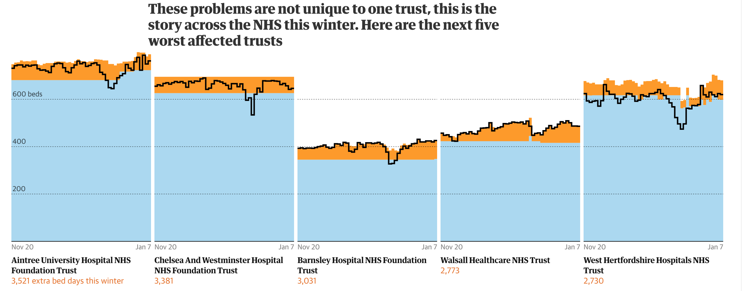
Credit for the piece goes to the Josh Holder.
Leave a Reply
You must be logged in to post a comment.