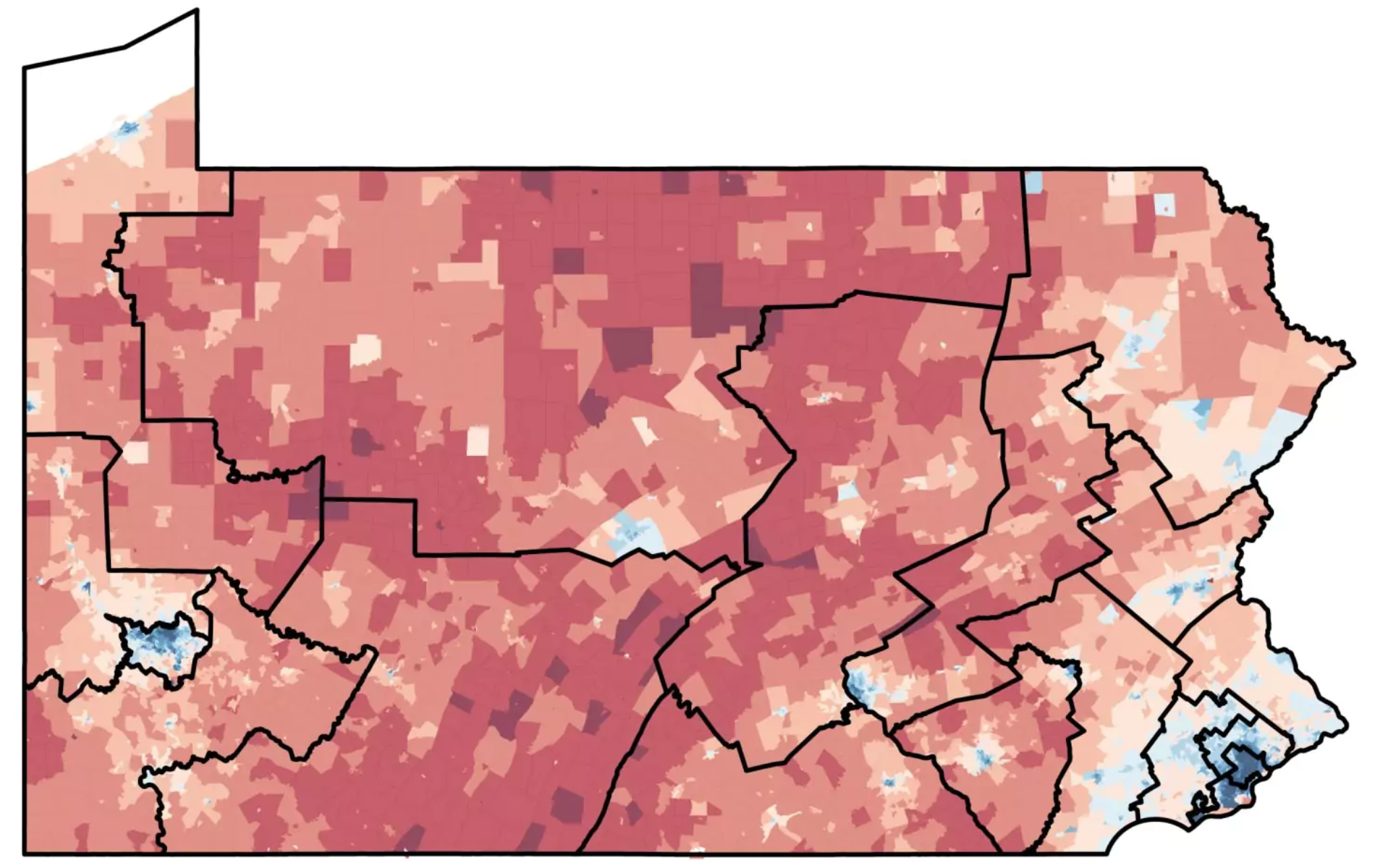
Almost a month ago I wrote about how the Pennsylvania Supreme Court was considering a case involving the state’s heavily gerrymandered US congressional districts, which some have called among the worst in the nation. About a week later the Pennsylvania Supreme Court decided that the map is in fact so gerrymandered it violates the Pennsylvania Constitution. It ordered the Republican-controlled legislature to create a new, non-gerrymandered map that would have to be approved by the Democratic governor. I did not write up that then Pennsylvanian Republicans appealed to the US Supreme Court—no graphics for that story. That appeal was rejected by Justice Alito, but with only days to spare the state legislature then created this new map and sent in this new one on Friday.

The problem, according to the governor and outside analysts, is that the map is just as gerrymandered as the previous one. Consequently, yesterday the governor rejected the new map and so now the Pennsylvania Supreme Court, working with outside experts in political redistricting, will create a new congressional map for Pennsylvania. Hopefully before May when the state has its first primaries.
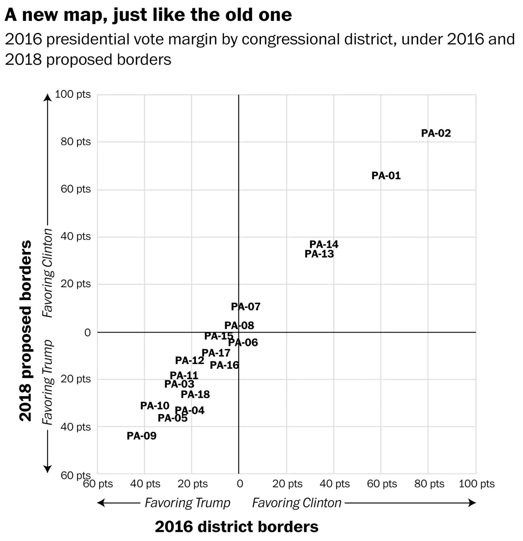
But just how do we know that the new map, despite looking different, was just as gerrymandered. Well, the Washington Post plotted the election margins for districts in 2016 using precinct data versus their proposed 2018 map overlaid atop those same precincts. What did they get? Almost identical results. The districts are no longer Goofy Kicking Donald Duck-esque, but they exhibit the same Republican bias of the previous map.

For the purposes of design, I probably would have dropped the “PA-” labels, as they are redundant since the whole plot examines Pennsylvania congressional districts. I think that, perhaps with a marker, and maybe a line of no-change would go a bit further in more clearly showing how the ultimately rejected map was nearly identical to its previous incarnation.
Credit for the map borders goes to the Pennsylvania state legislature, the version here to the Washington Post Wonkblog. All Wonkblog for the scatterplot.
Leave a Reply
You must be logged in to post a comment.