One week ago today, President Trump touted soaring stock prices as an indicator of a roaring economy. In truth, stock market prices are not that. They are driven by fundamentals, such as GDP growth, wage increases, and inflation. Furthermore stock prices can be fickle and volatile. Whereas a recession does not begin overnight, the factors build over a period of time, a stock market correction can happen in a single day.
So one week hence, the stock market has seen fully one-third of its gains over the past year wiped out. That is over $1 trillion gone from market funds, 401ks, college saving funds, &c. But again, not to freak people out, these things can and do happen. But because they can and do happen, presidents do not often go touting the stock market as it can come back and bite them.
This morning’s paper therefore had a pleasant graphic to accompany a story about the recent declines. And it was on the front page.
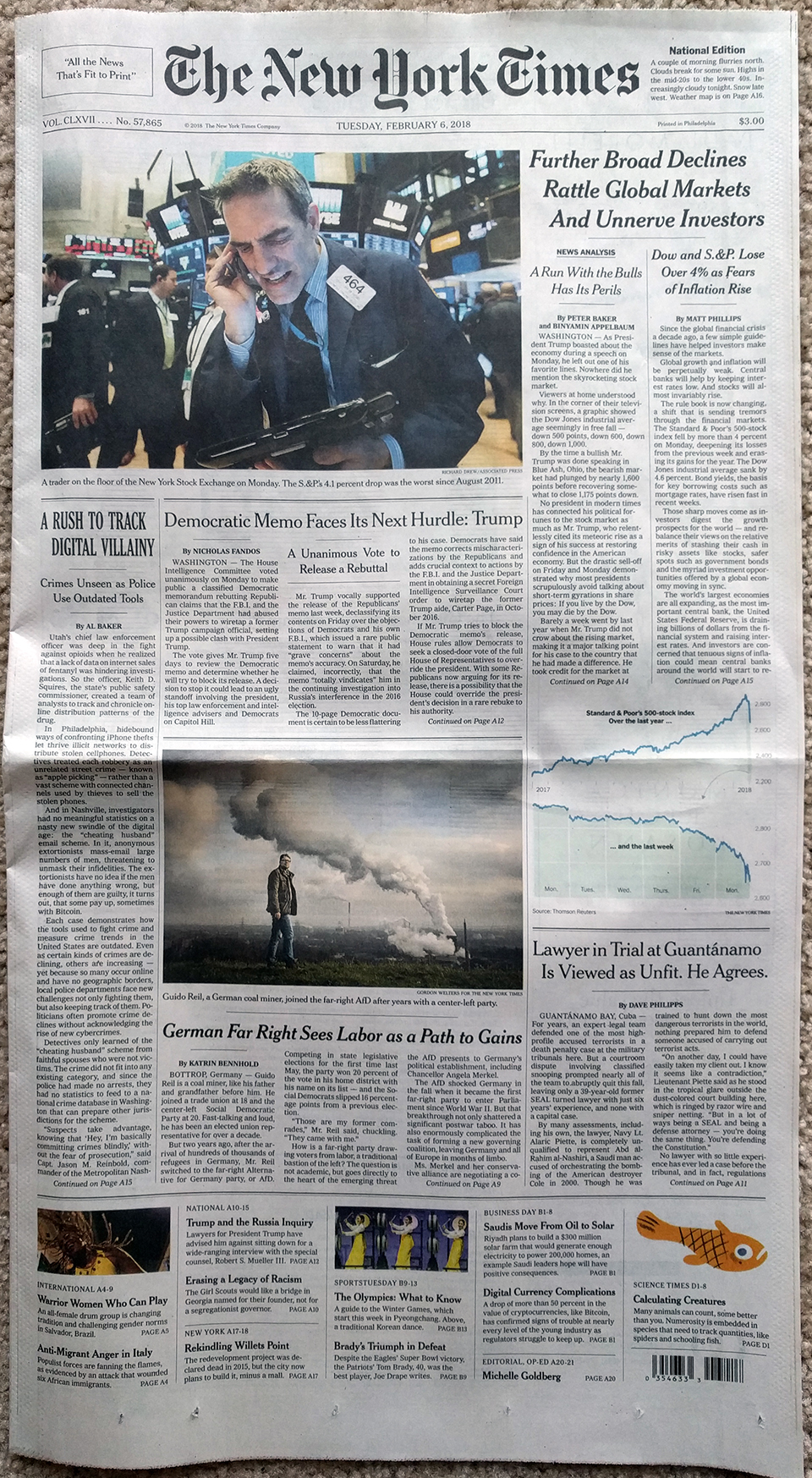
Like with the choropleth story I covered a little over a week ago, the graphic in today’s paper was not revolutionary nor earth shattering. It was two line charts as one graphic. What was neat, however, was how it supported two different articles.
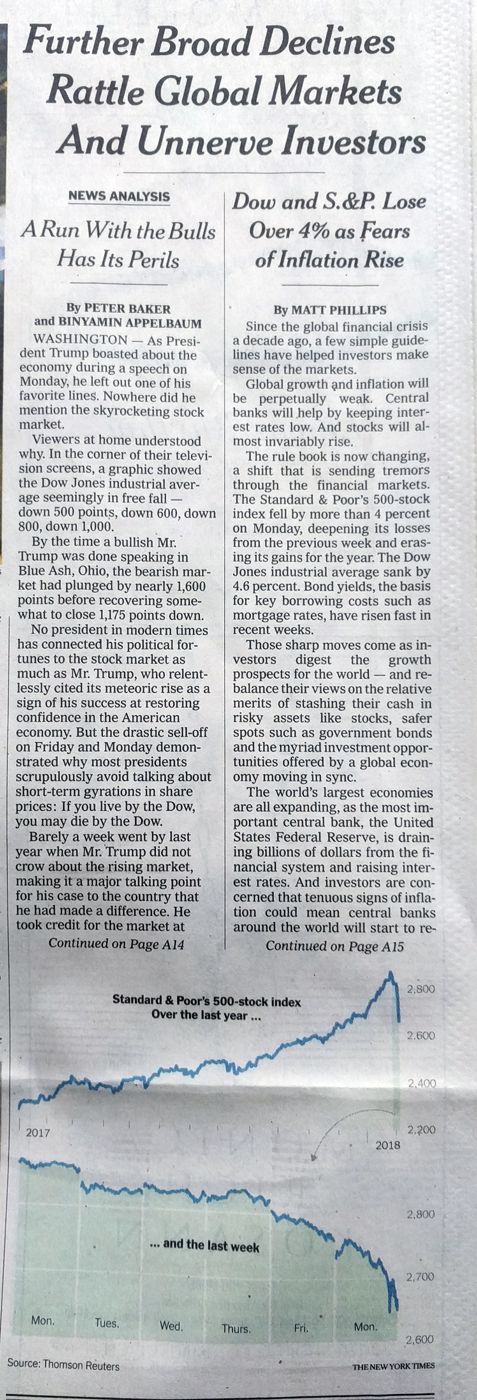
But when I looked closer I found what was really neat: context.
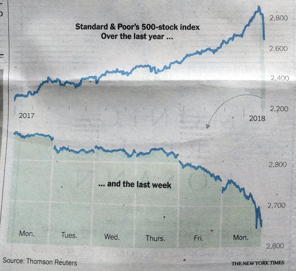
The chart does a great job of showing that context of adding nearly $8 trillion in value over the course of the administration. But then that sharp decline at the right-side of the chart is blown out into its own detail to show how all was steady until Friday’s economic news was released. I think perhaps the only drawback is how tiny and fragile that arrow feels. I wonder if something a little bolder would better draw the eye or connect the dots between the two charts. Maybe even moving the “… and the last week” line above the chart line would work.
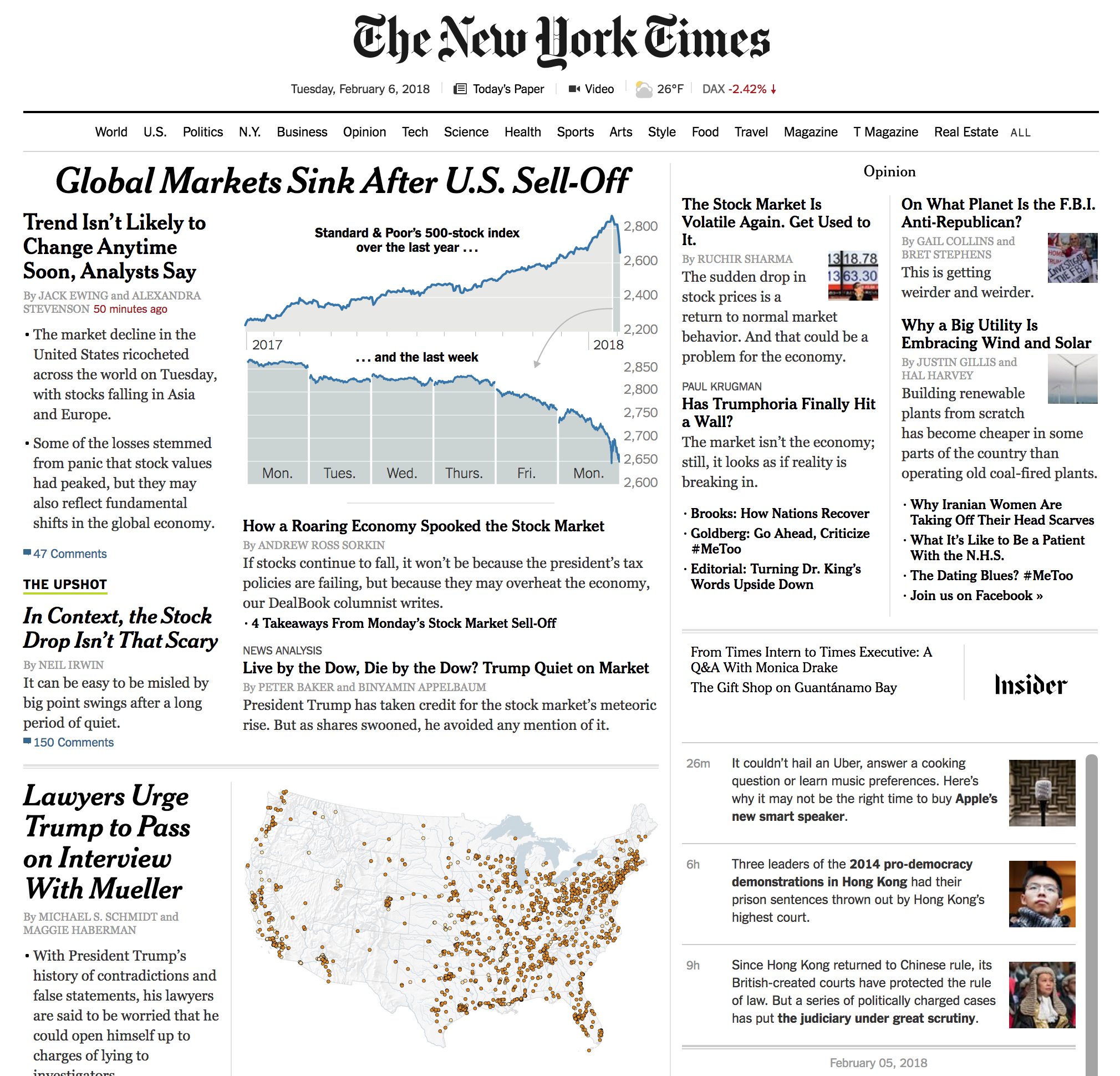
Anyway, I was just curious to see how the charts were depicted on the web. And then lo and behold I was treated to two graphics on the home page. The other is for an article about flood risks to chemical plants, not part of this post. But the focus of our post on the stock market was the same as in print. But here is the homepage with two different graphics, always a treat for a designer like myself.
Credit for the piece goes to the New York Times graphics department.
Leave a Reply
You must be logged in to post a comment.