Here in Philadelphia, I think yesterday was the first day it had not rained in over a week. Not that everyday was a drenching storm, but at least showers passed through along with some downpours and definitely grey skies. But what about my old home, Chicago?
Well, FiveThirtyEight turned to a longer-term look and examined how over the century the amount of rainfall in the upper Midwest has been increasing. We are actually looking at the same places the Post looked at a few days ago. But instead of political maps, we have rainfall maps.
This one in particular is weird.
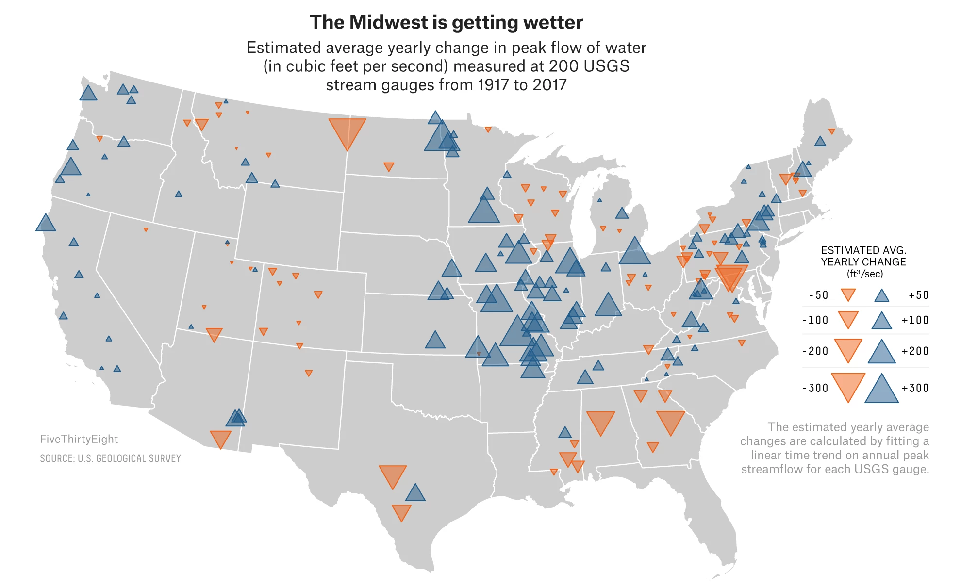
I get why they have the map, to show the geographic distribution of the rain gauges that collect the data. And those are site specific, not statewide. But did the designer have to choose area?
We know that area is a less than ideal way of allowing users to compare data points. And as I just noted, a choropleth, even at say the county level, is out of the question. But what about little squares? Or circles? Could colour have been used to encode the same data instead of size? And then we would likely have fewer overlapping triangles.
I suppose the argument is that the big triangles make a bigger visual impact. But they do so at the cost of comparable data points across the Midwest. Maybe the designer chose the area of triangles because there were too few gauges across the country. I am not sure, but for me the triangles are not quite on point.
That said, the graphics throughout the rest of the article are quite good, especially the opening scatterplots. They are not the sexiest of charts, but they clearly show a trends towards a wetter climate.
Credit for the piece goes to Ella Koeze.
Leave a Reply
You must be logged in to post a comment.