Surprise, surprise. This morning we just take a quick little peak at some of the data visualisation from the Pennsylvania primary races yesterday. Nothing is terribly revolutionary, just well done from the Washington Post, Politico, and the New York Times.
But let’s start with my district, which was super exciting.

Moving on.
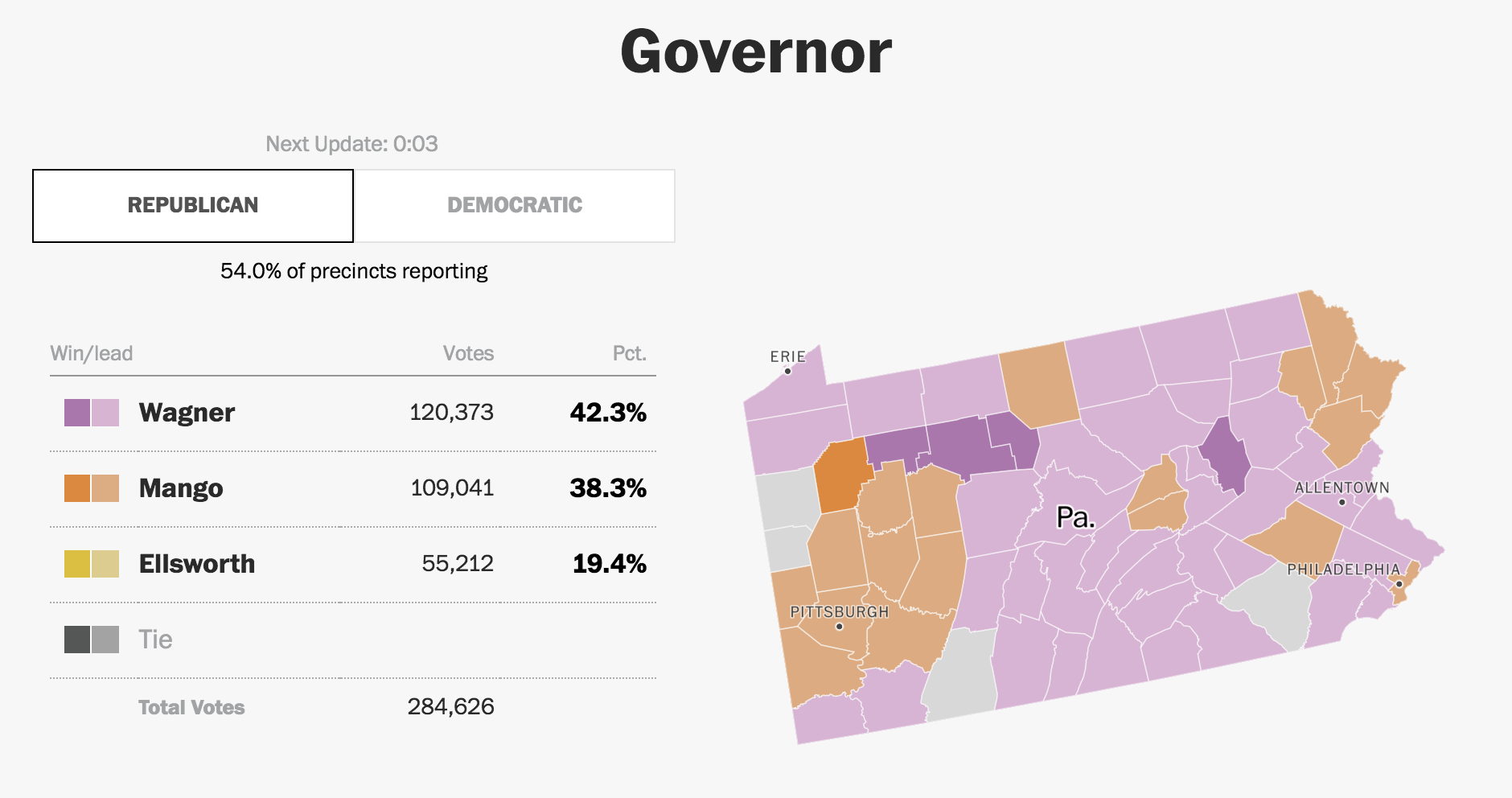
Each of the three I chose to highlight did a good job. The Post was very straightforward and presented each office with a toggle to separate the two parties. Usually, however, this was not terribly interesting because races like the Pennsylvania governor had one incumbent running unopposed.

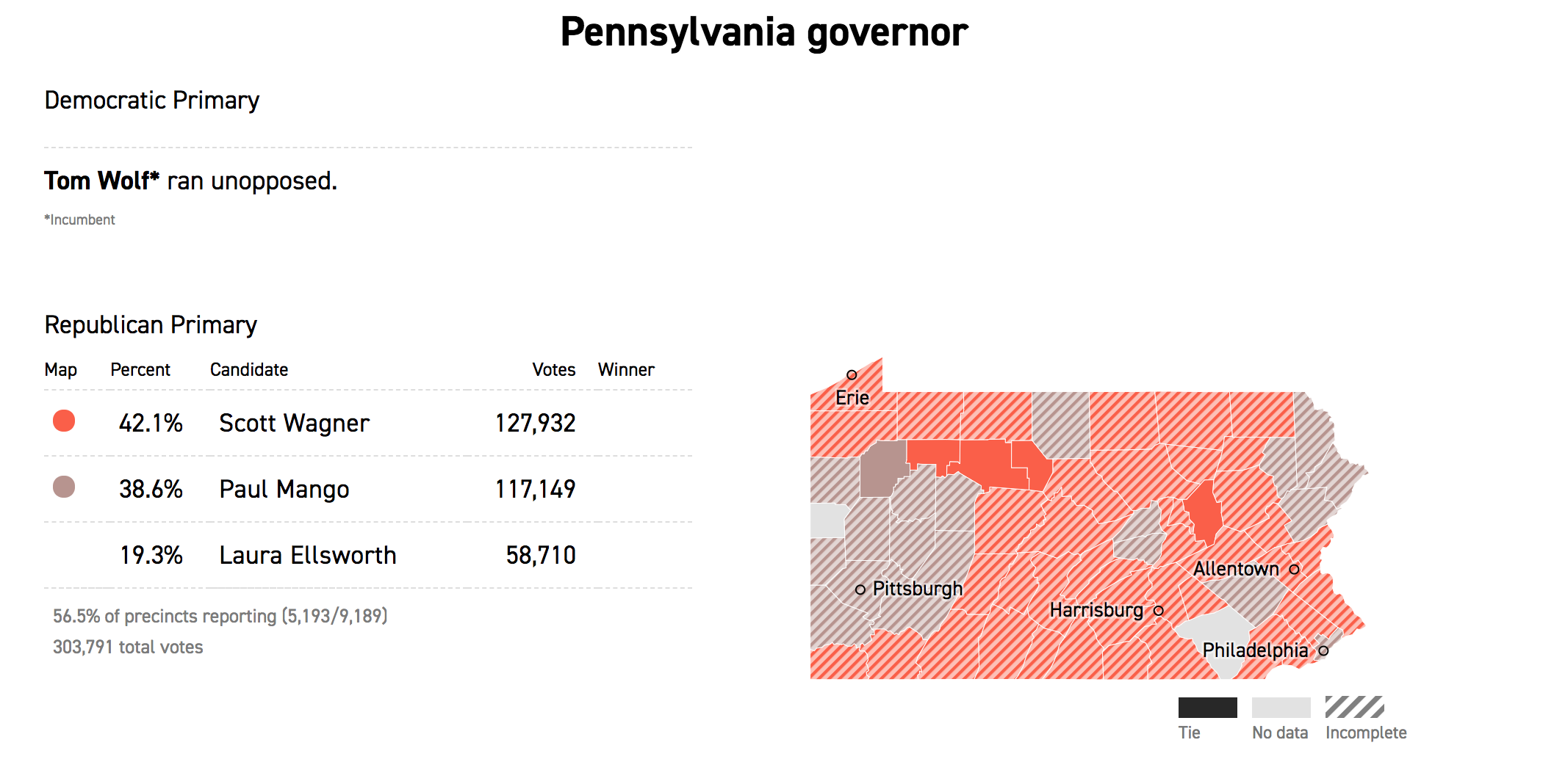
But Politico was able to hand it differently and simply presented the Democratic race above the Republican and simply noted that the sitting governor ran unopposed. This differs from the Post, where it was not immediately clear that Tom Wolf, the governor, was running unopposed and had already won.

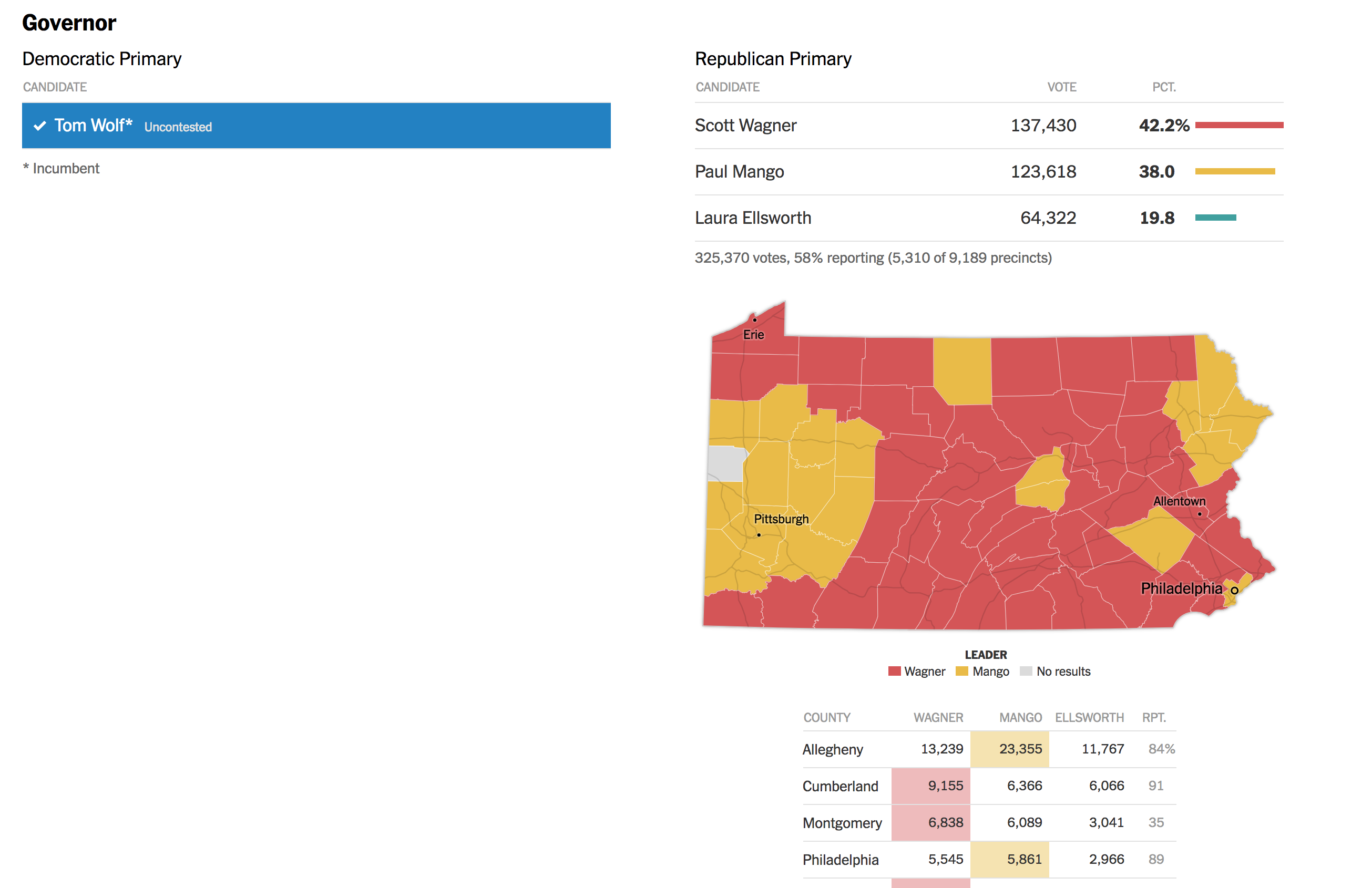
The Times handled it similarly and simultaneously displayed both parties, but kept Wolf’s race simple. The neat feature, however, was the display of select counties beneath the choropleth. This could be super helpful in the midterms in several months when key races will hinge upon particular counties.

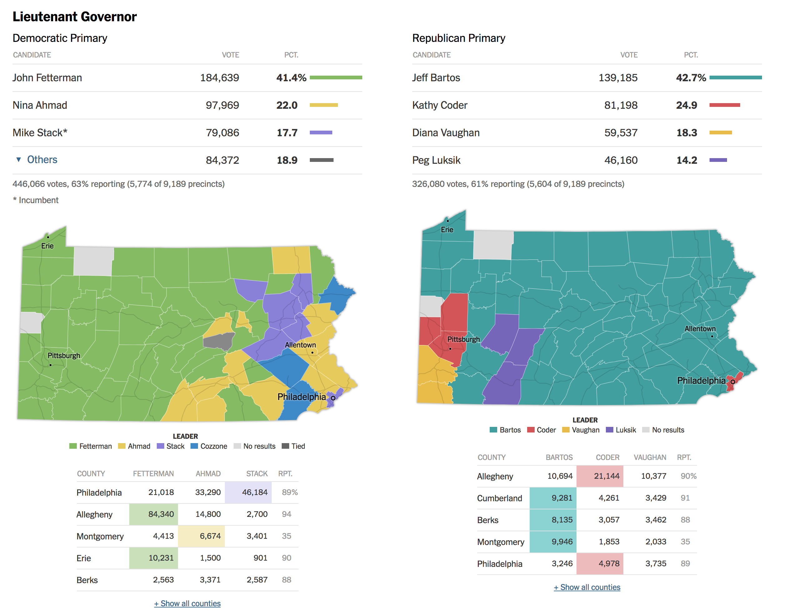
But where the Times really shines is the race for Pennsylvania’s lieutenant governor. Fun fact, in Pennsylvania the governor and lieutenant governor do not run as a ticket and are voted for separately. This year’s Democratic incumbent, Mike Stack, does not get on with the governor and had a few little scandals to his name, prompting several Democrats to run against him. And the Times’ piece shows the two parties result, side-by-side.

Credit for the Post’s piece goes to the Washington Post graphics department.
Credit for Politico’s piece goes to Politico’s graphics department.
Credit for the Times’ piece goes to Sarah Almukhtar, Wilson Andrews, Matthew Bloch, Jeremy Bowers, Tom Giratikanon, Jasmine C. Lee and Paul Murray, and Maggie Astor.
Leave a Reply
You must be logged in to post a comment.