We are now less than 100 days away—95 to be exact—from the 2018 midterm elections here in the United States. As we get closer and closer we not only get more information from polls, but also campaign finance reports. Those can sometimes serve as a proxy for support as lots of grassroots support can dump lots of cash in a candidate’s war chest. Wheras a candidate who drums up little support might find him or herself with scant funds to fight the campaign.
So what does that funding tell us right now? Well last week Politico posted an article looking at that data. They broke the dataset into chunks by the likelihood of the results. This screenshot is of Pennsylvania’s 1st Congressional District.
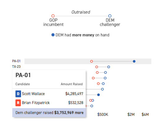
Each district is represented by a dot plot, with the total money raised by each candidate plotted, the distance in grey being the amount by which the Democrat outraised the Republican.
This is a nice piece as the hover state provides a nice grey bar behind the district to focus the user’s attention. Then for the secondary level of information in terms of cash on hand for the Democrats, i.e. who has cash now, we get the dot filled in versus the open state for simply money raised. Then of course the hover state reveals the actual numbers for the two candidates along with the difference between the two.
The funny thing with this particular district, the Pennsylvania 1st, is that Wallace is not necessarily raising a lot of money. He is a self-funding millionaire. He also is not the most electable Democrat in a competitive seat. It will be fascinating to watch how this particular district performs over the next few months, but most importantly in November.
Credit for the piece goes to Sarah Frostenson.
Leave a Reply
You must be logged in to post a comment.