Stepping away from both the Brexit drama and the aircraft drama of the week, let’s look at US political drama. Specifically, the Democratic field and some of the early support for candidates and assumed-to-be candidates.
This piece comes from an article about the bases of various candidates. From a data visualisation perspective it uses a scatter plot to compare the net favourability of the candidate to the share of people who have an opinion about said candidate.
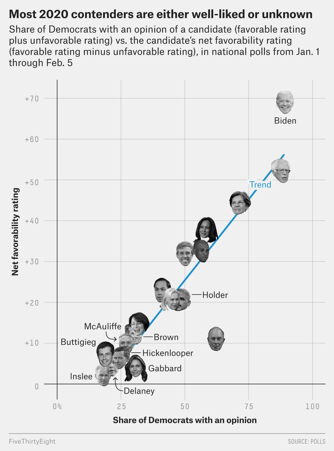
But what if you don’t know who the candidate is? As in, you don’t know what they look like. Well, then it might be difficult to find Bernie or Elizabeth Warren. This kind of graphic relies on facial recognition. I’m not certain that’s the best, especially when one is talking about a field in which people may not know or have an opinion on the candidates in question.
Another drawback is that the sizes of the faces are large. And, especially in the lower left corner, this makes it easier to obscure candidates. Where exactly is Sherrod Brown? Between a unidentified face and that of Terry McAuliffe.
I think a more simplistic dot/circle approach would have worked far better in this instance.
Credit for the piece goes to the FiveThirtyEight graphics department.
Leave a Reply
You must be logged in to post a comment.