Moving away from climate change now, we turn to the lovely land of Afghanistan. While the Trump administration continues to negotiate with the Taliban in hopes of ending the war, the war continues to go worse for Afghanistan, its government, and its allies, including the United States.
It is true that US and NATO ally deaths are down since the withdraw of combat troops in 2014. But, violence and sheer deaths are significantly up. And as this article from the Economist points out, the deaths in Afghanistan are now worse than they are in Syria.
The beginning of the article uses a timeline to chart the history of Afghan conflicts as well as the GDP and number of deaths. And it is a fascinating chart in its own right. But I wanted to share this, a small multiples featuring graphic looking at the geographic spread of deaths throughout the country.
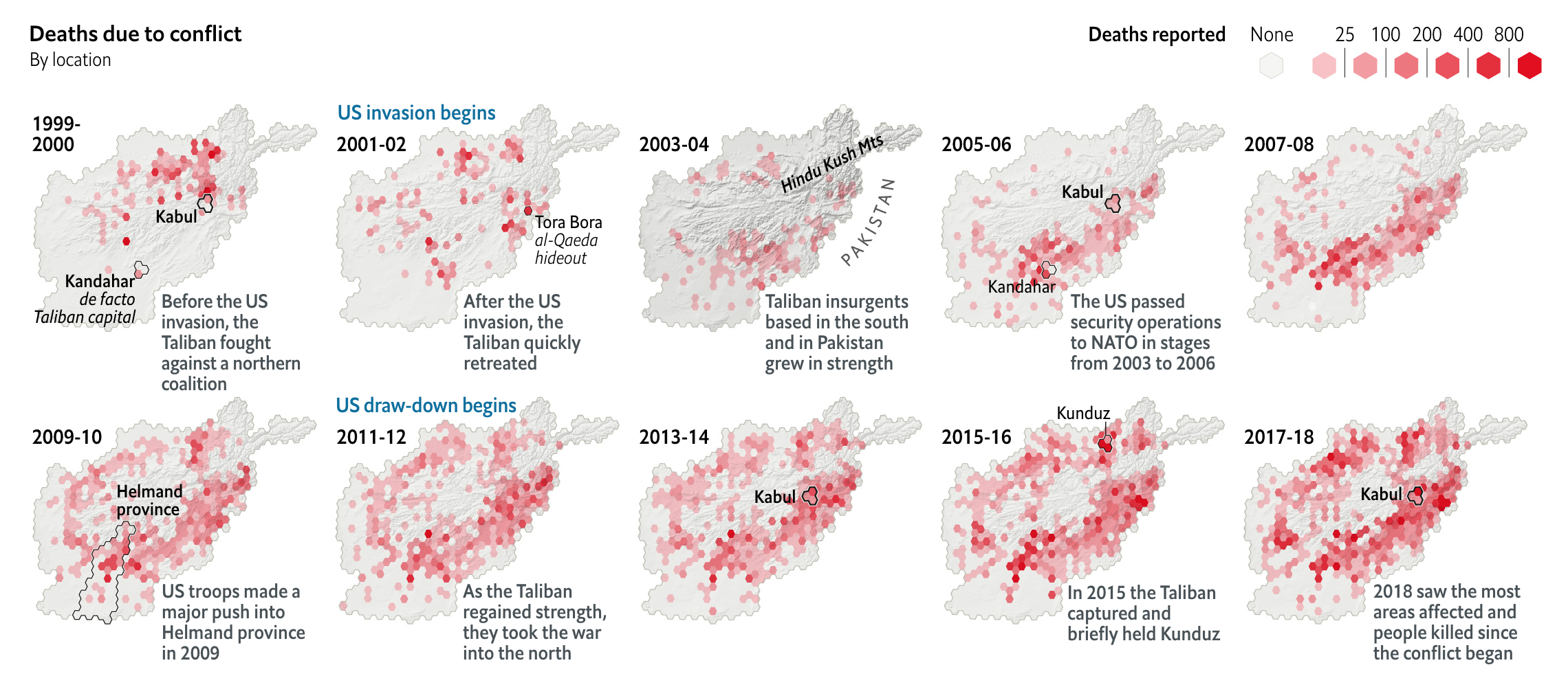
It does a nice job by chunking Afghanistan into discrete areas shaped as hexagons and bins deaths into those areas. All the while, the shape remains roughly that of Afghanistan with the Hindu Kush mountain range in particular overlaid. (Though, I am not sure why it is made darker in the 2003–04 map.)
To highlight particular cities or areas, hexagons are outlined to draw attention to the population centres of interest. But overall, the rise in violence and deaths is clear and unmistakable. And it has spread from what was once pockets in the south to the whole of the country that isn’t mountains or deserts.
Tamerlane would be proud.
Credit for the piece goes to the Economist graphics department.
Leave a Reply
You must be logged in to post a comment.