Last week we looked at a few posts that showed the future impact of climate change at both a global and US-level scale. In the midst of last week and those articles, the Washington Post looked backwards at the past century or so to identify how quickly the US has changed. Spoiler: some places are already significantly warmer than they have been. Spoiler two: the Northeast is one such place.
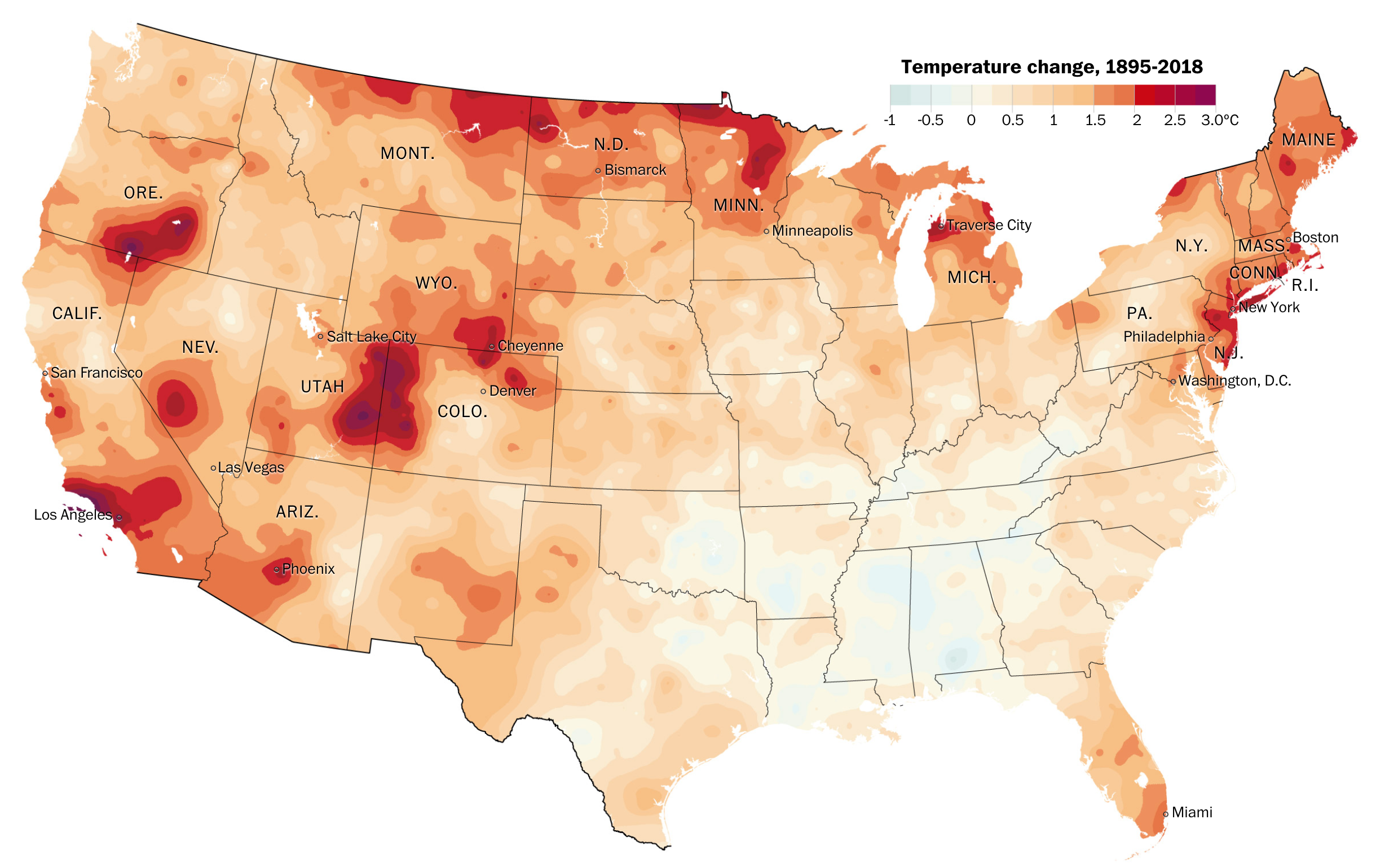
The piece is a larger and more narrative article using examples and anecdotes to make its point. But it does contain several key graphics. The first is a big map that shows how temperature has changed since 1895.

The map does what it has to and is nothing particularly fancy or groundbreaking—see what I did there?—in design. But it is clear and communicates effectively the dramatic shifts in particular regions.
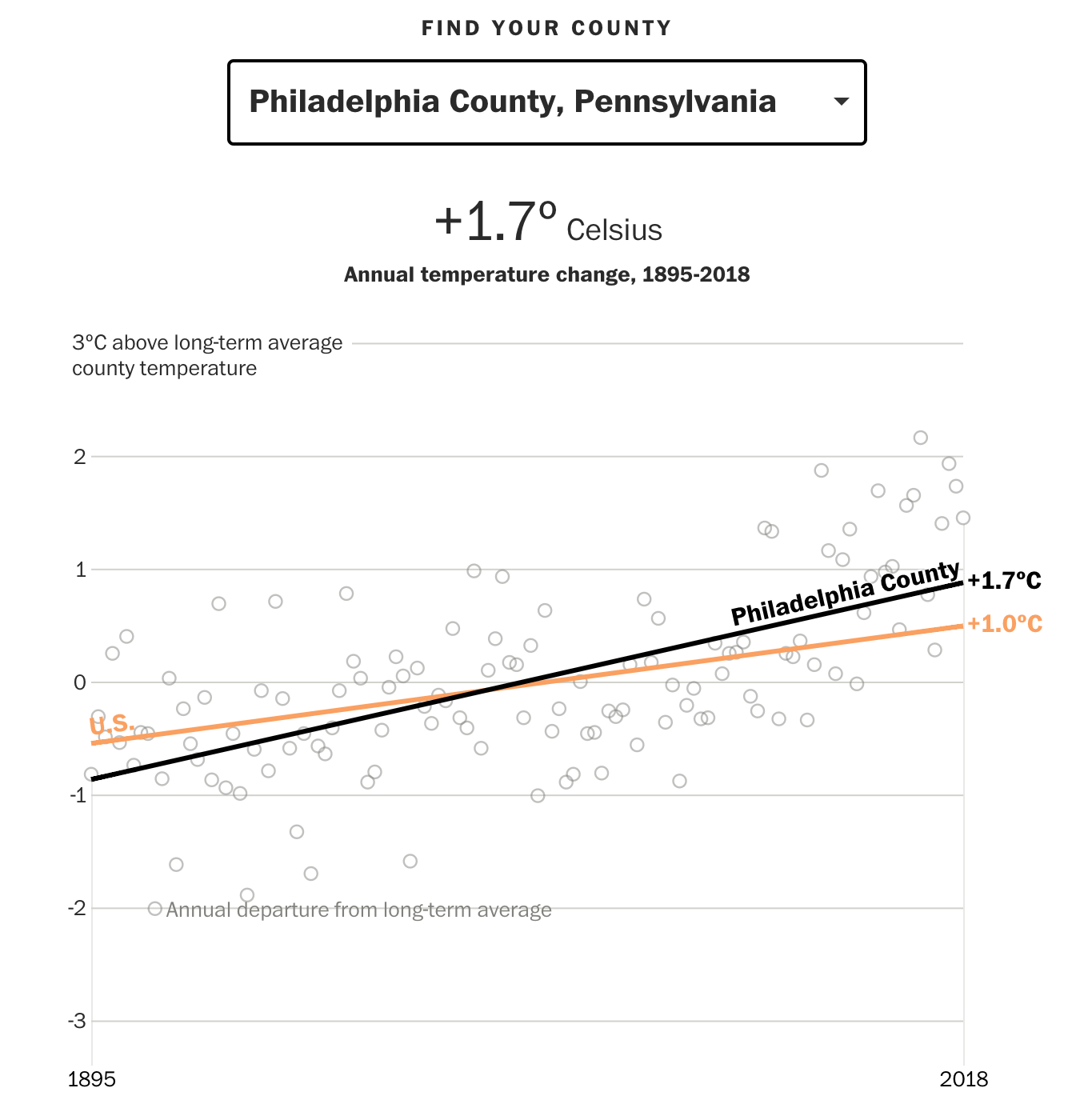
The more interesting part, along with what we looked at last week, is the ability to choose a particular county and see how it has trended since 1895 and compare that to the baseline, US-level average. Naturally, some counties have been warming faster, others slower. Philadelphia County, the entirety of the city, has warmed more than the US average, but thankfully less than the Northeast average as the article points out.

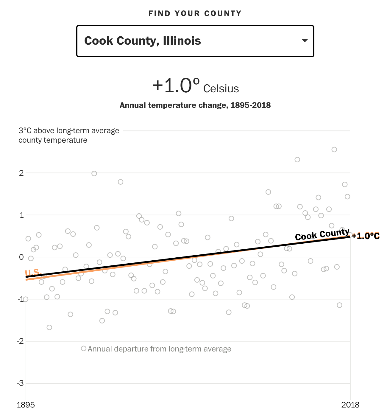
But, not to leave out Chicago as I did last week, Cook County, Illinois is right on line with the US average.

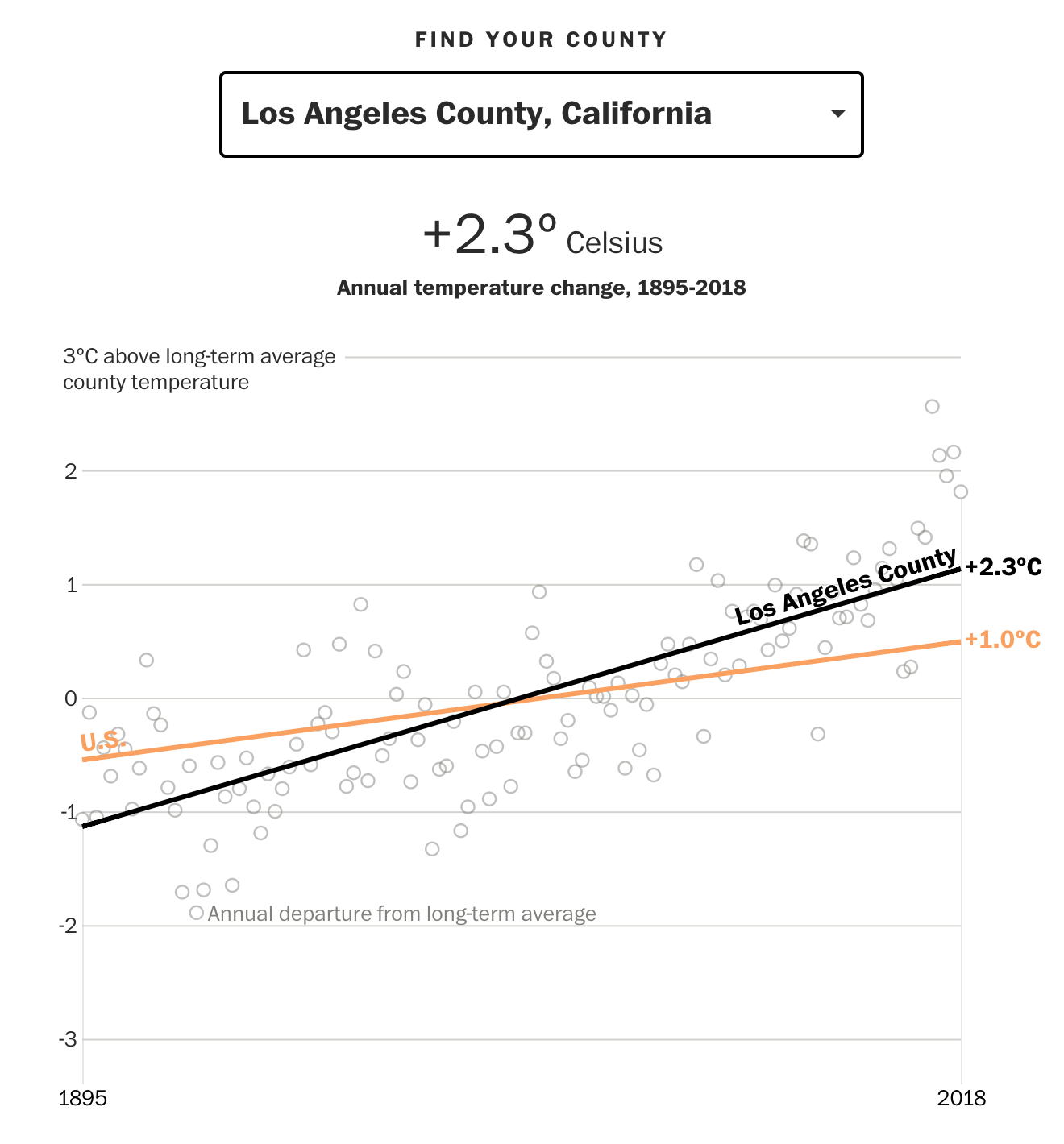
But the big cities on the West Coast look very unattractive.

The interactive piece does a nice job clearly focusing the user’s attention on the long run average through the coloured lines instead of focusing attention on the yearly deviations, which can vary significantly from year to year.
And for those Americans who are not familiar with Celsius, one degree Celsius equals approximately 1.8º Fahrenheit.
Overall this is a solid piece that continues to show just what future generations are going to have to fix.
Credit for the piece goes to Steven Mufson, Chris Mooney, Juliet Eilperin, John Muyskens, and Salwan Georges.
Leave a Reply
You must be logged in to post a comment.