I’ve largely been busy creating and posting content on the Covid pandemic and its impact on the Pennsylvania, New Jersey, and Delaware tristate area along with, by request, both Virginia, and Illinois, my former home. It leaves me very little time for blogging, and I really do not want this site to become a blog of my personal work. That’s why I have a portfolio or my data project sites, after all.
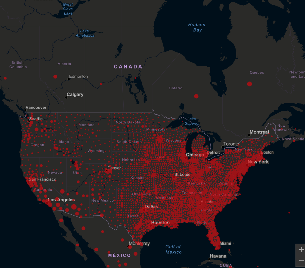
But in posting my Covid datagraphics, I’ve come across variations of this map with all sorts of meme-y, witty captions saying why Canada is doing so much better than the US, why Americans shouldn’t be allowed to travel to Canada, and now why the Blue Jays shouldn’t be allowed to host Major League Baseball games.

Well, that map isn’t necessarily wrong, but it’s incredibly misleading.
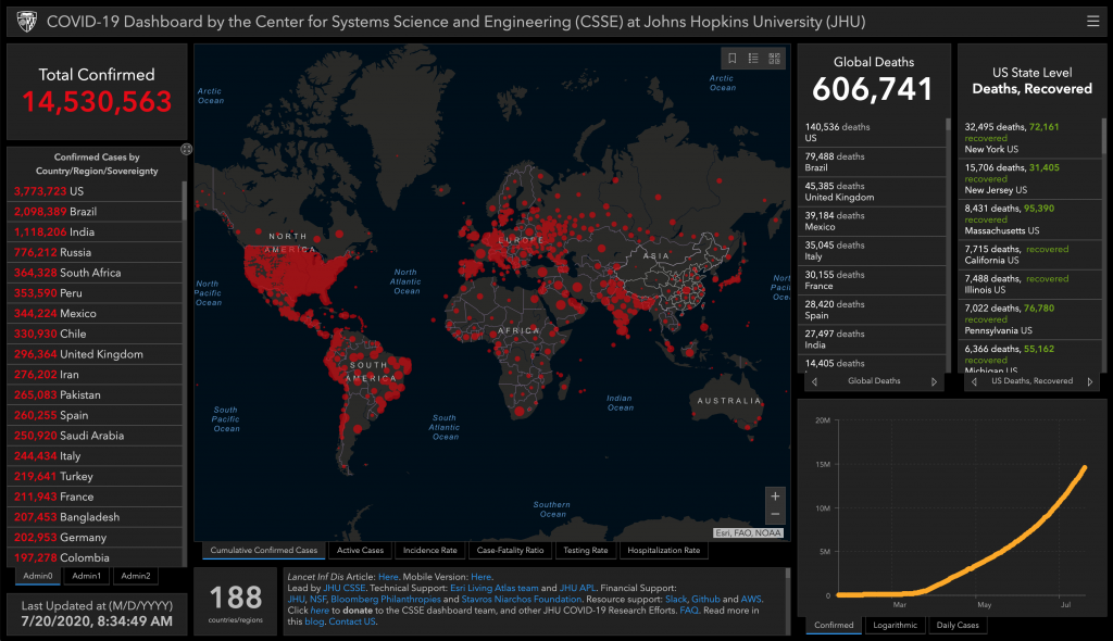
First, the map comes from the fantastic Johns Hopkins work on Covid-19. (Full disclosure, that’s the data source I use at work to create my work work datagraphics: https://philadelphiafed.org/covid-19/covid-19-research/covid-19-cases-and-deaths#.) And their site has a larger and more comprehensive dashboard (still hate that term but it does have sticking power) of which the map is the focal point.

You can see the map there in the centre and some tables to the left, some tables to the right, and even a micro table beneath thundering away at the map’s position. I could get into the overall design—maybe I will one of these days—but again, let’s look at that map.
The crux of the argument is that there are a lot of red dots in the United States and very few in Canada. But look at the table in the dashboard on the left. At the very bottom you see three small tabs, Admin 0, Admin 1, and Admin 2. Admin 0 contains all entities at the sovereign state level, e.g. US, Canada, Sweden, Brazil, &c. Admin 1 is the provincial/state level, e.g. Pennsylvania, Illinois, Ontario, Quebec, &c. Admin 2 is the sub-provincial/sub-state level, e.g. Philadelphia County, Cook County, Chester County, Lake County, &c.
Notice anything about my examples? Not all countries have provinces/states, but Canada certainly does. And then at Admin 2, the examples and indeed the data only have US counties and US data. Everything in Canada has been aggregated up to Admin 1. And that is the problem.
The second part to point out is the dot-ness of the map. And to be fair, this is part of a broader problem I have been seeing in data visualisation the last few months. Dots, circles, or markers imply specificity in location. The centre of that object, after all, has to fall on a specific geographic place, a latitude and longitude coordinate. It utterly fails to capture the dimensions and physical size of the geographic unit, which can be critical.
Because not all geographic units are of the same size. We all know Rhode Island as one of the smallest US states. Let’s compare that to Nunavut or Yukon in Canada, massive provinces that spread across the Canadian Arctic. Rhode Island, according to Google, 1212 square kilometres. Nunavut? 808,200.
So now show both states/provinces on a map with one dot and Rhode Island’s will practically cover the state. And it will also be surrounded by and in close proximity to the states or Massachusetts and Connecticut. Nunavut, on the other hand will be a small dot in a massive empty space on a map. But those dots are equal.
Now, combine that with the fact that the Hopkins map is showing data on the US county level. Every single county in the United States gets a red dot. By default, that means the US is covered with red dots. But there is no county-level equivalent data for Canada. Or for Mexico (also seen in the above graphic). And so given we’re only using dots to relate the data, we see wide swaths of empty space, untouched by red dots. And that’s just not true.
Yes, large parts of the Canadian Arctic are devoid of people, but not southern Ontario and Quebec, not the southwestern coast of British Columbia, not the Maritimes.
The Hopkins map should be showing geographic units at the same admin level. By that I mean that when on Admin 0, the map should reflect geographic units of sovereign state level, allowing us to compare the US to Canada directly. But, and for this argument I’m assuming we’re keeping the dots despite their flaws, we only see Admin 0 level data.
Admin 1 shows only provincial level data. Some countries will begin to disappear, because Hopkins does not have the data at that level. But in North America, we still can compare Pennsylvania and Illinois to Ontario and Quebec.
But then at Admin 2, we only see the numerous dots of the United States counties. It’s neither an accurate nor a helpful comparison to contrast Chester County or Will County to the entire province of Ontario and so the map should not allow it. Instead, as the above graphic shows, it creates misconceptions of the true state of the pandemic in the US and Canada.
Credit for the Hopkins dashboard goes to, well, Hopkins.
Leave a Reply
You must be logged in to post a comment.