Today’s piece comes from a BBC piece that visualises the most popular baby names in the UK along with the largest winners and losers in name popularity. The article leads with the doubling of babies with the name Dua, from a singer named Dua Lipa, and more than doubling those with the name Kylo, from a character in Star Wars. Of course, those are not the most popular names in the United Kingdom. For boys it’s presently Oliver and for girls, Olivia.
Naturally the piece has a bar chart for each sex and their ten most popular names. But later on in the piece we see two set of graphics that look at those names with the fastest rises or declines in popularity. I chose to screenshot the winners.
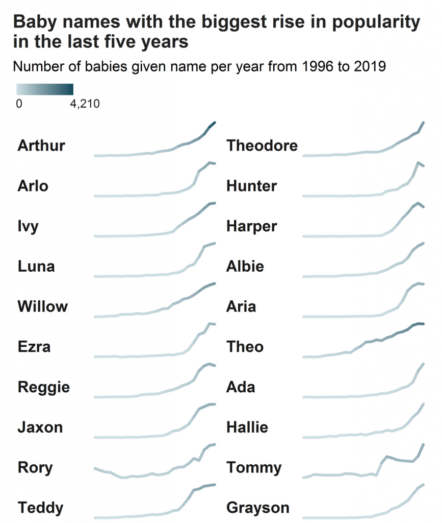
It makes use of essentially sparklines, a concept that features small line charts that really focus on direction instead of levels. Note the lack of axis labelling to inform the reader the line’s minimum and maximum. Instead the minimum and maximum are the absolute vertical range of the line.
What this chart attempts to do, however, is hint at those ranges through colour. By using a thicker weight, the line encodes the number of names in the colour. Compare Arthur, whose line ends in a dark bluish colour, to that of Arlo or Grayson, whose names also end in their peak, but in a light bluish colour. All three names have risen, but in terms of absolute levels, we see far more Arthurs than Graysons. Holy popularity, Batman.
When it comes to communicating the size of the names’ popularity, I am not entirely convinced about the idea’s efficacy. But, it lands more often than not. Can I compare Ada to Hallie? No, not really. But Ada vs. Theo is fairly clear.
Could the same effect be accomplished by a sorting order? Say the names were grouped by those who have numbers in 2019 that fall between 3,000 and 4,000, then another range of 1,000–2,000, and so on.
I also wonder if the colours in the bar charts could have been linked to those of the rising and falling names? Keep dark green for the boys’ names and purple for the girls’. It could have made a more solid thematic link between the graphics. As it is now, there seems no rhyme nor reason for the colour choices.
Finally the article has two tables that list the most popular names for each sex for each region. There’s nothing really to improve in the table’s design. The rules dividing rows and columns are fairly light so we don’t have to highlight that usual fault.
Overall, it’s a strong article with some nice visualisations.
Credit for the piece goes to the BBC graphics department.
Leave a Reply
You must be logged in to post a comment.