No two rivers are the same, though they certainly can be similar. Rivers have their own ecosystems and when I was at school, I learned of the different classifications of rivers by the colour of their water: black, white, and clear. Broadly speaking, that just means the amount of sediment dissolved in the river’s water. Black colours appear when slow moving water has absorbed lots from its environment, think swamps. White waters resemble tea or coffee with added milk or cream. This happens when sediments enter and dissolved into the water. Clear water is that, relatively clear and free of sediment.
But a team of scientists at University of North Carolina at Chapel Hill (UNC Chapel Hill) recently released some work where they used shifts in blue to yellow and green to help classify rivers. Their classification differs, but broadly can point to a change from healthy (blue) to unhealthy (yellow and green). The novelty in their work, however, focuses on using satellite imagery to capture the colour of rivers and their evolution since the mid 1980s.

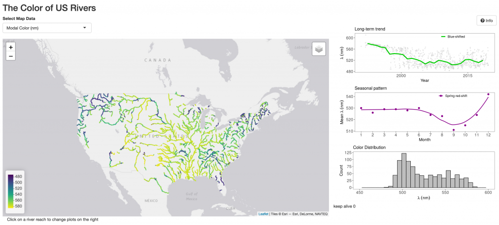
They published their findings as an interactive application driven primarily by a clickable map. Clearly not all rivers are available, but a large number are, and you can see some obvious patterns at a national scale—their work excludes Alaska and Hawaii. If blue represents healthy rivers, we see healthy rivers in New England and the Pacific Northwest with a host of green rivers in the Mid-Atlantic and Upper Midwest with yellow in the Mississippi basin and southeast.
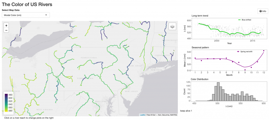
I wanted to look at Pennsylvania a bit more specifically given my familiarity with the Commonwealth and zoomed in a bit on the map.

You can see that using that above scale, Pennsylvania’s rivers are in okay, not great state. Some of the upper stretches of the Delaware and Susquehanna Rivers are coloured blue, but we mostly see a lot of green.
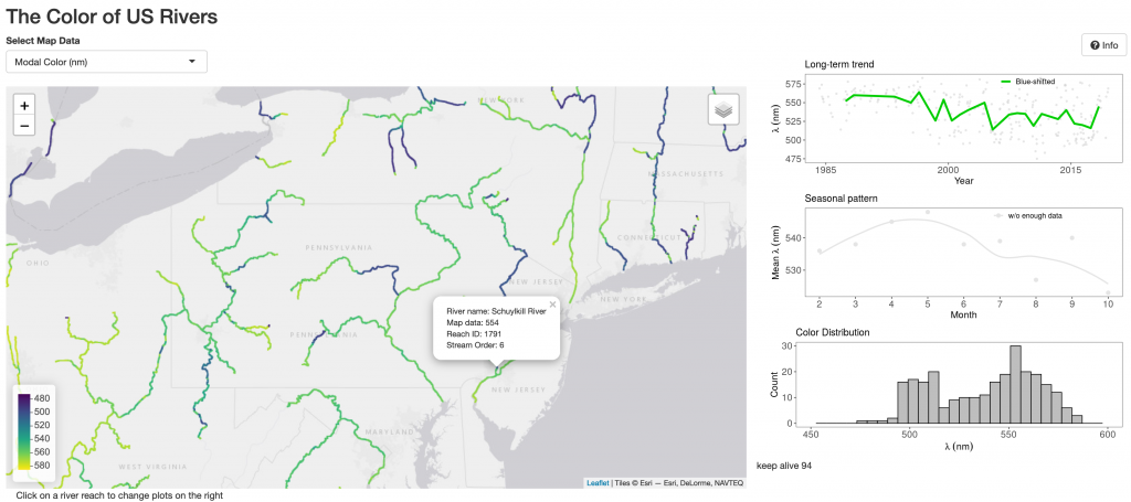
To the right of the map, the designers placed three smaller charts driven by the user’s selection of river. Let’s take a look at the Juniata River as an example—my grandfather grew up living alongside a tributary that emptied into the Frankstown Branch just a short walk from his house.

We can see that the chart on the upper right shows the colour shift over the decades for that observed section of the river. The legend provides the information that the section of the river has shifting blue—gotten healthier—and then below it looks for any seasonal changes. Here the chart is grey, indicating the system lacks enough data for a clear trend. This examines the short changes we might see in a river based on seasonal effects like rainy season, dry season, and human-driven effects—perhaps we pollute more in the spring and then use rivers recreationally in the summer.
Finally a distribution of the river section’s colour, all in wavelengths of light.
My biggest critique here would be the wavelengths. Users likely will not the colour spectrum by wavelength, and adding some labels like blue, yellow, and green could go a long ways to help users understand at what they are looking.
Overall, though, this is a really fascinating project.
Credit for the piece goes to John Gardner et al.
Leave a Reply
You must be logged in to post a comment.