Yesterday I wrote about Covid-19 here in five states of the US. I mentioned how I am concerned about the levelling out of new cases in certain states, notably Pennsylvania and New Jersey. In Italy, the government issued a new round of lockdowns in an attempt to contain a new wave before it swamps their healthcare system.
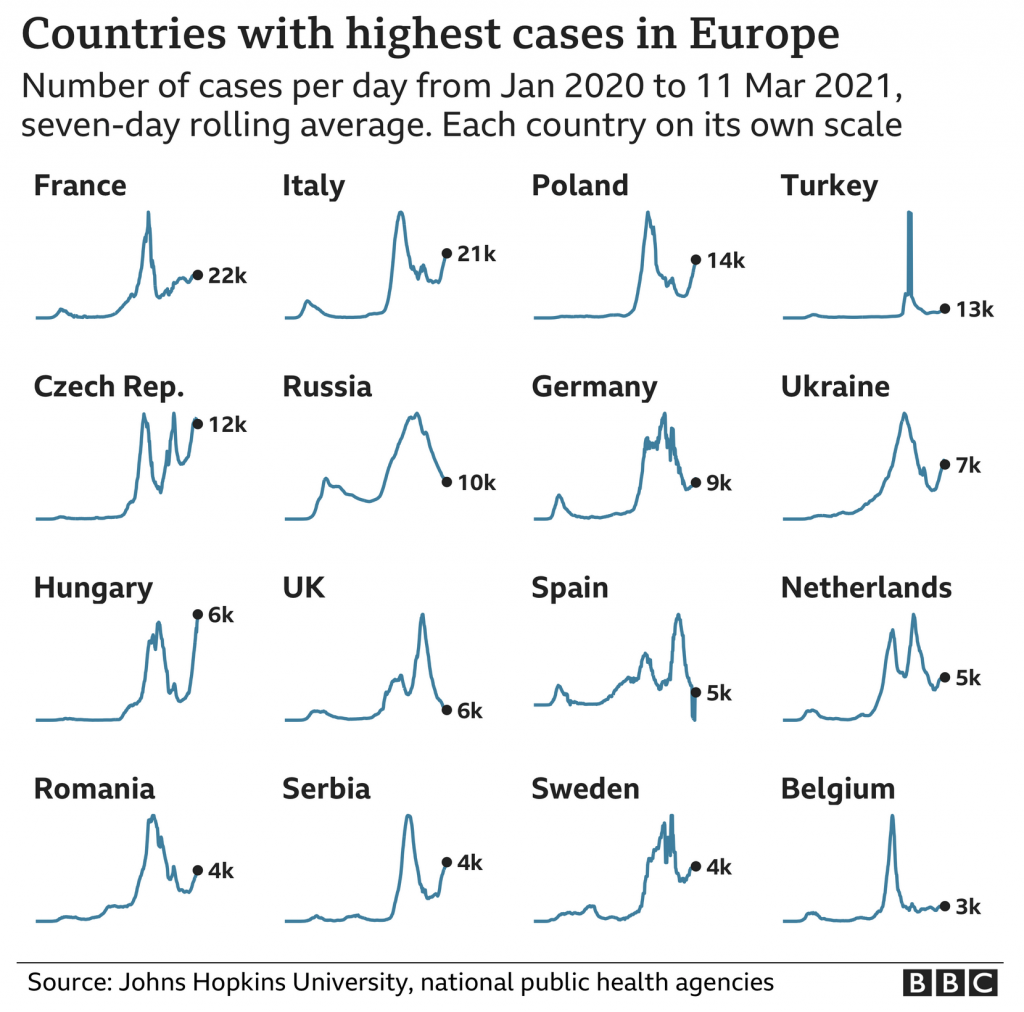
At the end of that BBC article, they used a small multiples graphic showing the seven-day average in several European countries. Today is the 16th, and so the data is now a few days old, but the concept remains important.

From a design standpoint, we are seeing a few things here. First, each country’s line chart exists with its own scale. Unfortunately this makes comparing country-to-country nigh impossible. We know from the title that in the present these are the countries with the highest new case rates in Europe. But, how do these rates today compare to earlier peaks? Without axis lines or a baseline, it’s difficult to say.
Of course, the point could well be just to show how in places like Italy, France, Poland, &c. we are seeing an emergent surge of new cases since the holiday peak.
If that is the goal, I think this chart works well. However, if the goal is to provide more context of the state of the pandemic in these select countries, we need some additional context and information.
Credit for the piece goes to the BBC graphics department.
Leave a Reply
You must be logged in to post a comment.