Last month Vox published an article about the trend in America wherein people are drinking less alcohol. They cited a Gallup poll conducted since 1939 and which reported only 54% of Americans reported partaking in America’s national tipple—except for that brief dalliance with Prohibition—making this the least-drinking society since, well, at least 1939.
Vox charted the data in the following graphic.
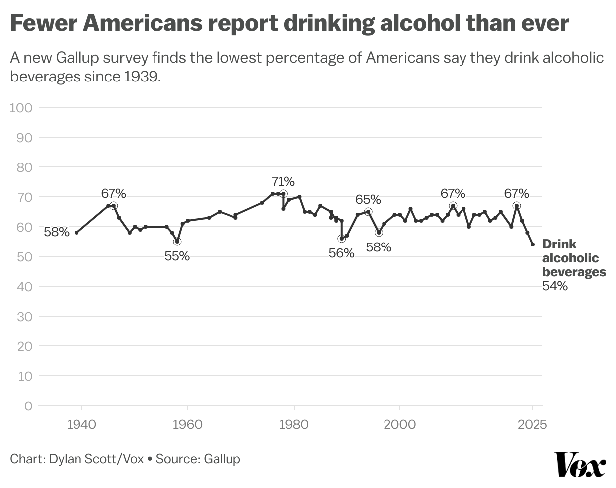
Overall, the graphic is good. Here the use of individual dots makes clear the years wherein Gallup conducted the survey. In some of the earlier periods it was not an annual question. The line weight is just thick enough to be distinct and the axis lines are lighter and in a light grey to create contrast.
The line uses the colour black. You really do not need colour in a line chart—or a bar chart or anything really charting only a single variable—unless it stems from your branding. Admittedly, Vox is now membership-supported and I am not a member so I only can read a few articles and am unsure if their chart brand standards now use black as their primary colour.
I can quibble with the axis label, “Drink alcoholic beverages”, because that should or could be included in the graphic header or sub-header. But putting in the graphic space is fine. And I like it next to the line instead of in a legend above the chart.
But the thing that irks me is the use of data labels at specific years. You could argue for the inclusion of the label at the current year, the 54%. You could argue for the maximum value, the 71%, but I would not.
Labels distract the reader’s eyes from the line itself and the line is the story. Calling out the 54% and maybe the 71%, fine, but the random 67%? A second random 67%? Those are unnecessary distractions that take away from the chart’s communicative value.
I have mentioned it before and I will mention it again, the use of excessive data labels plagues data visualisation these days. I need to write it up in a longer piece and someday I will. Here is a crude mockup of the graphic without the data labels.
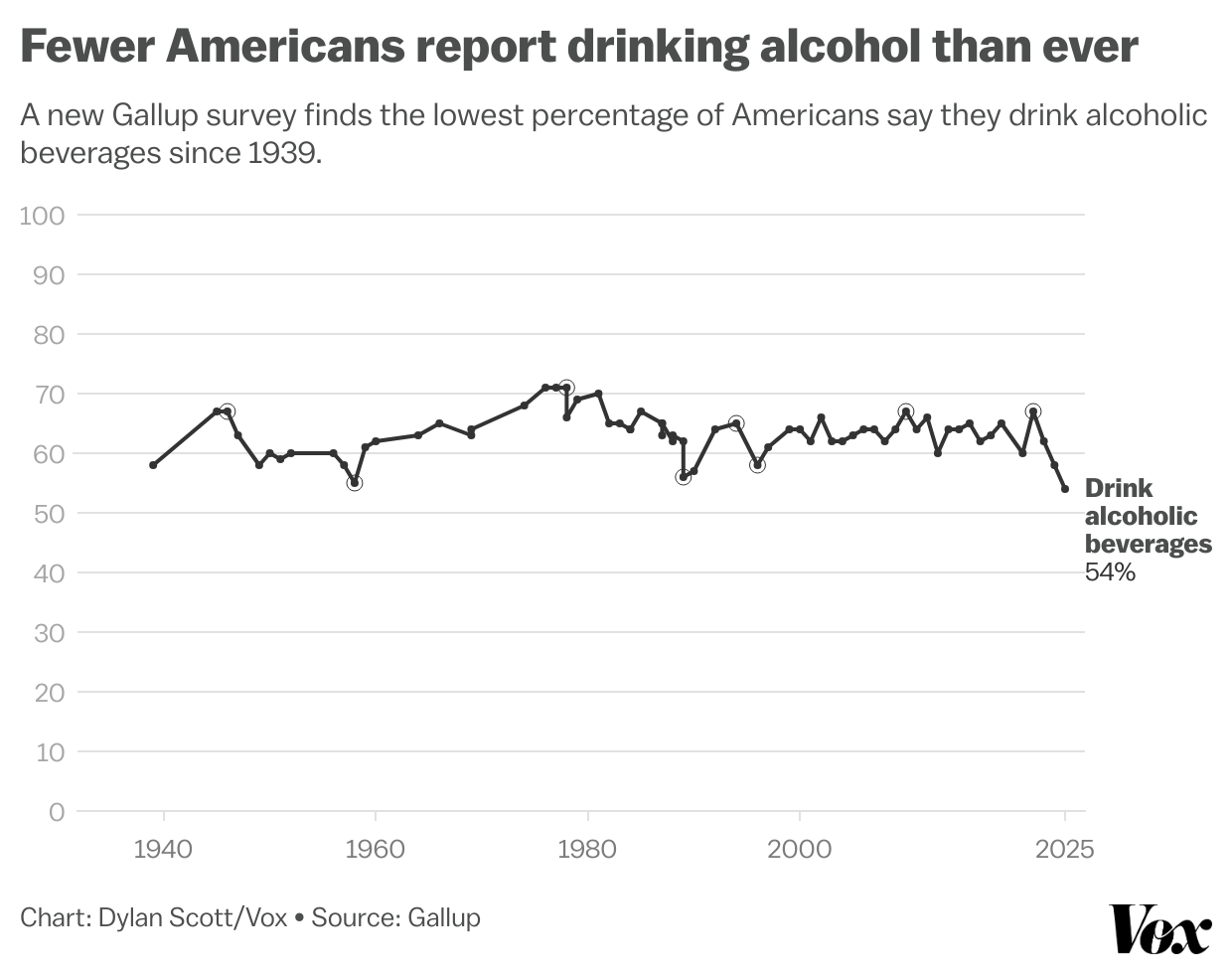
The line’s pattern is easier to spot—fewer distractions for the eyes. The pattern is clear that since the late 1970s roughly 65% of Americans drank alcohol, with the occasional dip, including one in the late 1980s and early 1990s and a briefer one in the mid-90s. I wonder if the 1989–90 dip relates to the recession. The sudden dip in the mid-90s confounds me. But the point is these things are easier to spot without labels the sparkling distraction of the labelling.
Again, overall, the graphic is good. And these days the state of information design and data visualisation is…not great, Bob. So I do not want to critique this graphic too heavily. But a tweak or two would make it even better.
Credit for the piece goes to Dylan Scott.