Spoiler, we don’t look so great.
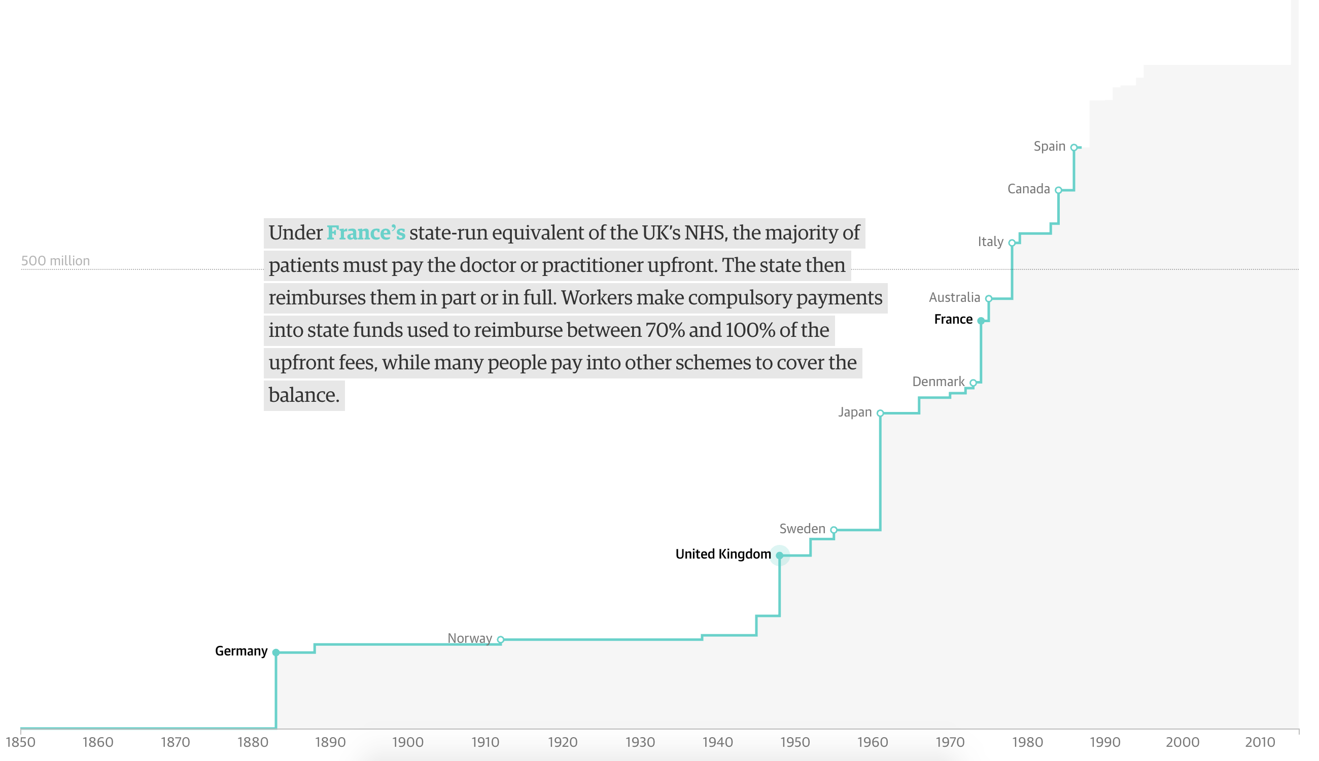
In this piece from the Guardian, we have one of my favourite types of charts. But, the piece begins with a chart I wonder about. We have a timeline of countries creating universal healthcare coverage, according to the WHO definition—of which there are only 32 countries. But we then plot their 2016 population regardless of when the country established the system. It honestly took me a few minutes to figure out what the chart was trying to communicate.
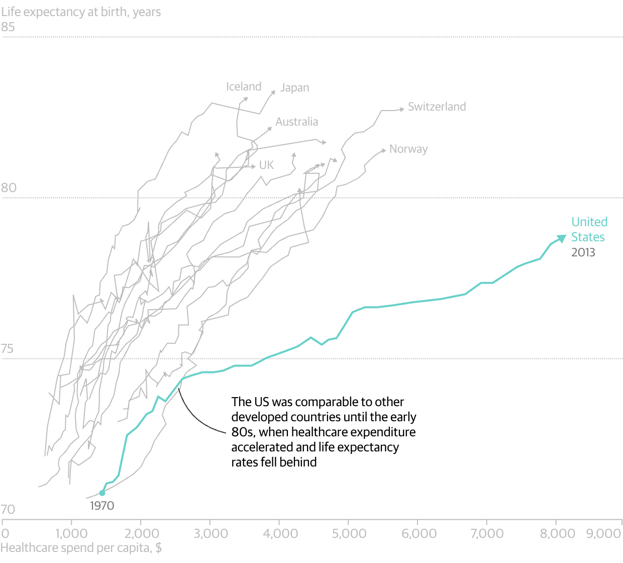
However, we do get one of my favourite charts: the scatter plot over time. And in it we look at the correlation between spending on healthcare compared to life expectancy. And, as I revealed in the spoiler, for all the money we spend on healthcare—it is not leading to longer lives as it broadly does throughout the world. And care as you might want to blame Obamacare, the data makes clear this problem began in the 1980s.
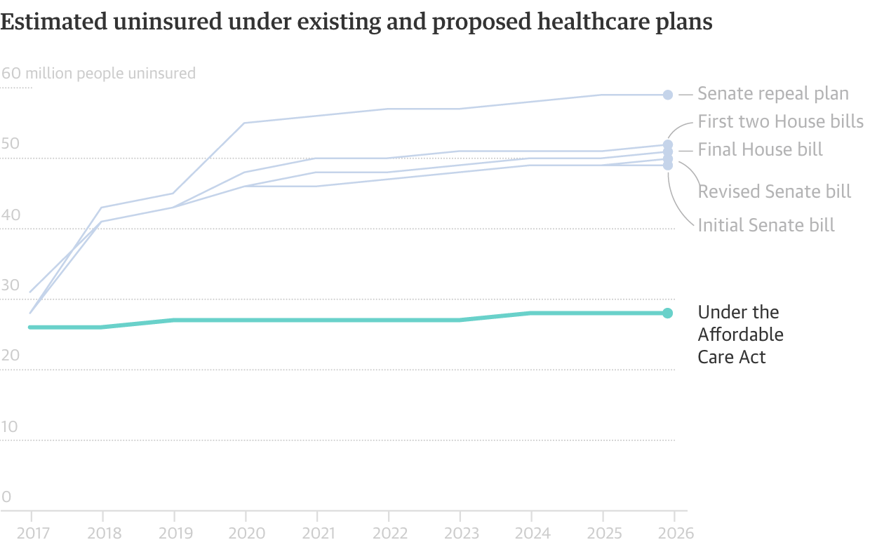
And of course Obamacare is why the Guardian published this piece since this is the week of the Vote-a-rama that we expect to see Thursday night. The Republicans will basically be holding an open floor to vote on anything and everything that can get some measure of repeal and/or replace 50 votes. And to wrap the piece, the Guardian concludes with a simple line chart showing the number of uninsured out to 2026. To nobody’s surprise, all the plans put forward leave tens of millions uncovered.
It is a fantastic piece that is well worth the read, especially because it compares the systems used by a number of countries. (That is largely the text bit that we do not cover here at Coffeespoons.) I found the piece very informative.
Credit for the piece goes to the Guardian graphics department.
Leave a Reply
You must be logged in to post a comment.