Yesterday I mentioned that there was some data to suggest that at least in New Jersey the curve was flattening. Monday we received additional data and so I wanted to share what that data showed.
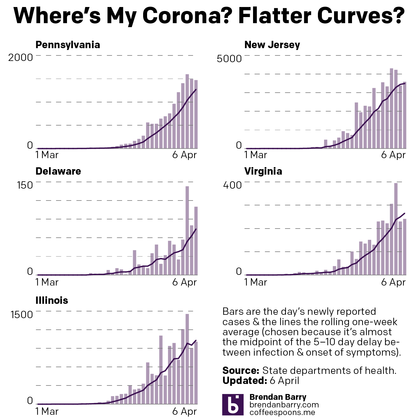
I used a set of bar charts to show the new daily cases yesterday for Pennsylvania, New Jersey, Delaware, Virginia, and Illinois. But as I mentioned, a single day can be a blip. Noise. We want to find the pattern or the signal within that data set. Consequently I applied a simple 7-day rolling average to the new daily cases data set.
I chose seven days for two reasons. The first was that the onset of the symptoms is 5–10 days after infection. Picking a mid-point in that range assures us that people who are infected are beginning to appear in the data. Secondly, a cursory check of the data suggests that reported numbers dip lower on weekends. And so making a week-long average covers any possibility of lower values at week’s end.
That preface out of the way, what do we see? Well, there is some evidence that the curve is flattening in New Jersey. The lines below represent that rolling average. And if you look at the very top of the New Jersey curve, you can see it beginning to flatten.
Unfortunately that does not mean New Jersey is out of the woods. Not by a long shot. Instead, that means tens of thousands of people will still be infected. And hundreds more will die. But, the rate at which those two things happen will be lower. Hopefully hospitals will not be as overwhelmed as they presently are. And that might make for a lower total death count.
The data does not support, however, the notion that the curve is flattening in the other states. Consider that the United States spans a continent and contains over 330 million people. The outbreak will look different in different states. Compare Pennsylvania and Illinois, which have similar case numbers. But in Pennsylvania we have more cases in smaller cities and rural areas and fewer in the largest cities. Plus, of course, we have the different measures taken by different states to contain and mitigate the pandemic within their borders.
But, we do have some data to suggest that at least in New Jersey the curve is flattening. I’ll take good news where I can find it. (Even if it comes from Jersey.)
Credit for the piece is mine.
Leave a Reply
You must be logged in to post a comment.