I didn’t have the internet yesterday morning, so apologies for no posting. But at least it was back by the afternoon. Unlike utilities in La Palma, where a volcano has been erupting and lava flowing, covering parts of the island.
The BBC had a brief article last week detailing the spread of the lava, which has been devastating the town. And it was a neat little graphic that I really liked.
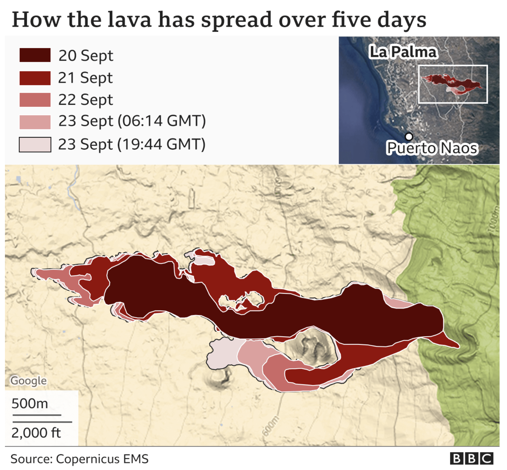
This graphic does a couple of things that I really like. First, context. Yes, the main graphic is the actual spread over four days (the fifth layer is almost half-a-day later). But in the upper-right corner, we have the same graphic layered over a satellite image of the region. I’m not sure how I feel about the satellite image, but overall it does provide a sense of scale.
Because the second thing I like is how the larger map shows not a satellite view, but rather a topographic or terrain view. The lines represent points of continuous height and help explain why the lava flow looks the way it does. The drawback here is that you don’t get any sense of urban development, like streets or neighbourhoods impacted. For that you could often use a satellite image, but then the colours and their saturation could detract from the importance of the graphical element, the lava flow layers.
Finally for the layers, I like the stepped gradients of the dark reds. This makes the sequential flow very clear. My only quibble might be the stroke or border on the shape. You can see that for all but the final shape, the stroke is a thin white line. But because those layers are stacked in reverse order—or else you would only be able to see the last layer, the most distant spread—the white stroke often overlaps and hides the black stroke for the final day.
Here I would recommend taking the five layers, duplicating them then merging them into a single sixth shape that sits atop the original five layers. I would eliminate the fill colour from the shape and then put the outline to black, that way the final borders of the lava flow in the graphic could be seen for the entirety of the flow.
But overall, this was a really nice piece that provides a lot of context to the lava flow.
Credit for the piece goes to the BBC graphics department.
Leave a Reply
You must be logged in to post a comment.