
Well, we have arrived at 2017. We all know the big political story in the executive branch. But we also saw elections in the legislative branch. But how different will the 115th Congress look from the 114th? The Wall Street Journal took a look at that in an article.
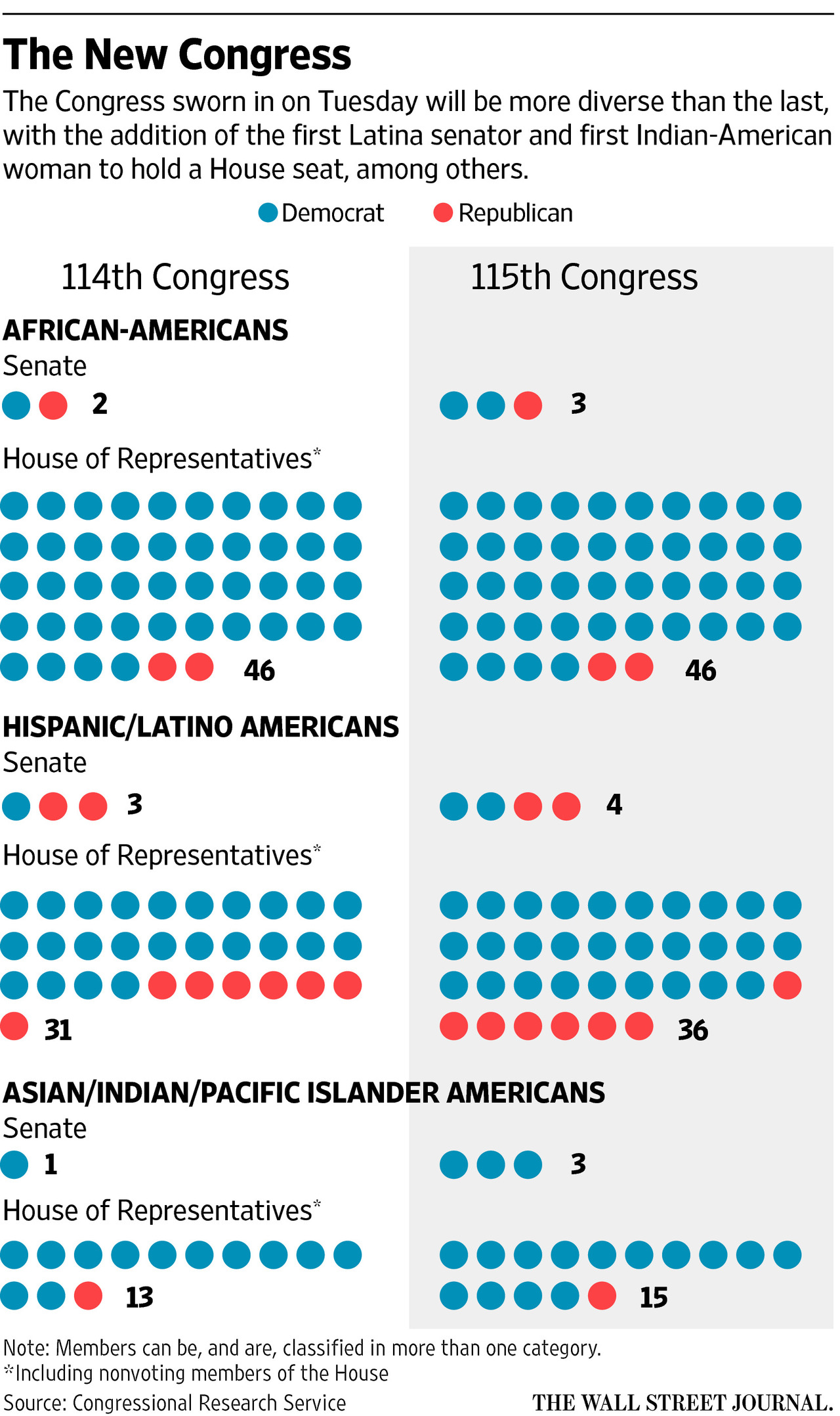
The article’s graphic does a nice job showing the two different compositions. But if we are truly interested in the growth, we could use a line chart to better showcase the data. So what did I do last night? I made that chart. But as I was playing with the data I saw some numbers that stood out for me. So I compared the proportion of minorities in the original graphic to their proportion of the US national population, per Census Bureau data.
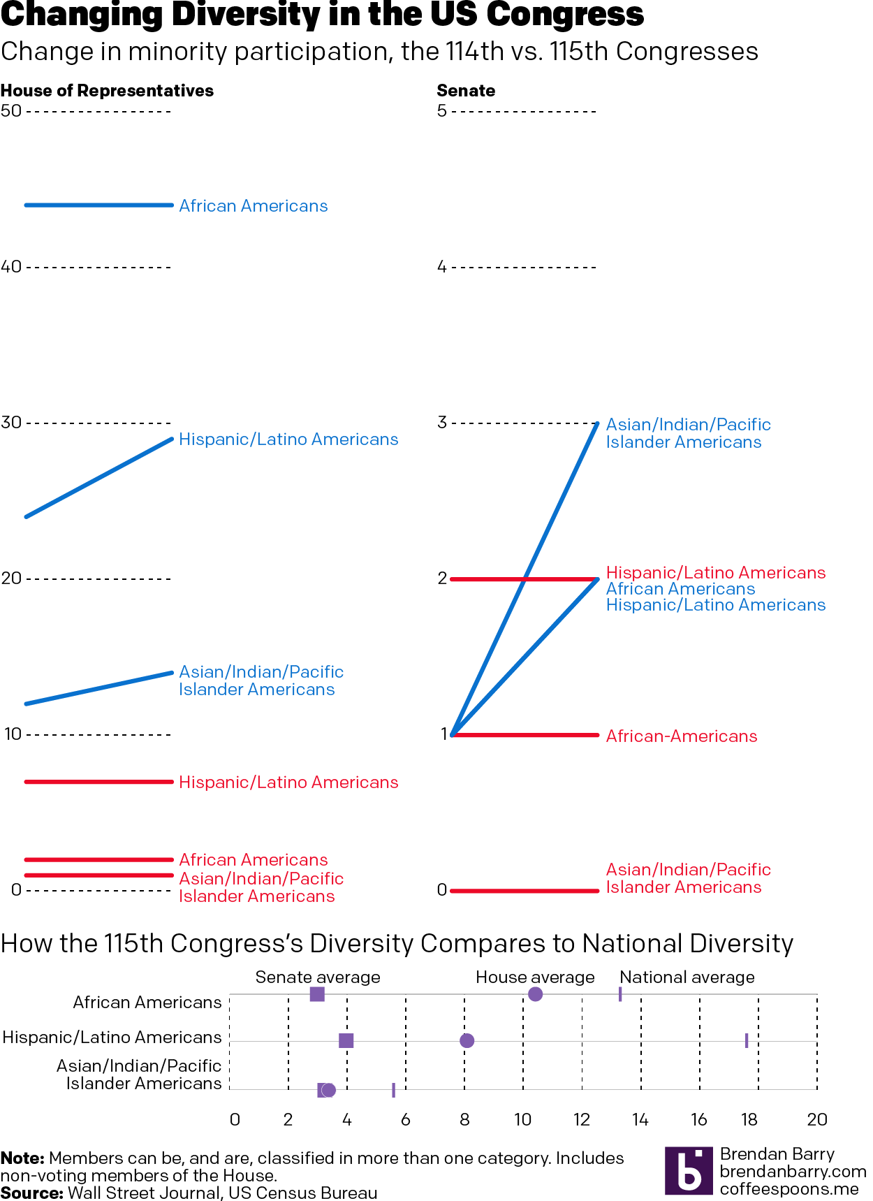
The line charts, broken out into the House vs. the Senate and then into the two parties, do a really good job of showing how the growth is not equally distributed between the two parties. And the reverse of that is that it shows how one party has failed to diversify between the two congresses.
The 115th Congress might be more diverse than ever. But it has a long way to go.
Credit for the original piece goes to the Wall Street Journal graphics department.