As I said yesterday, since people are finding these updates helpful on the social media, I am going to repost the previous evening’s graphics I make on the Coronavirus Covid-19 outbreak here on Coffeespoons as well. So while today is Thursday, these are the numbers states provided yesterday, so it’s more of a Wednesday update.
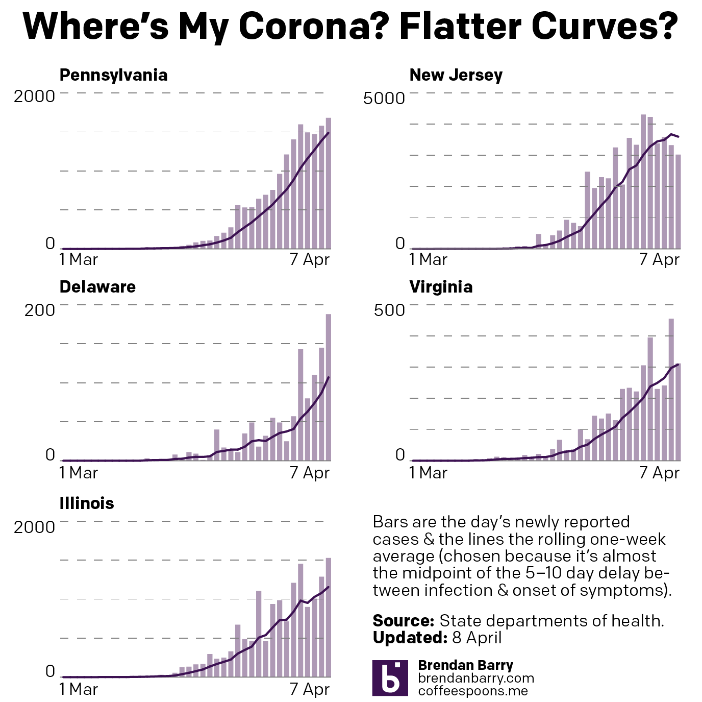
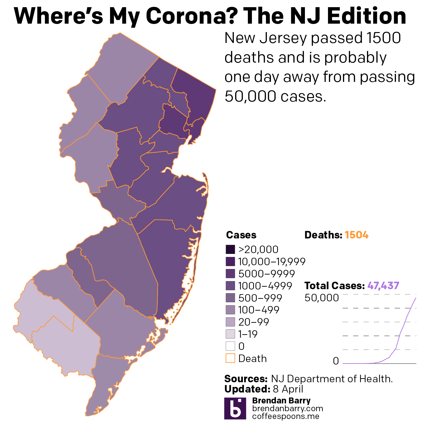
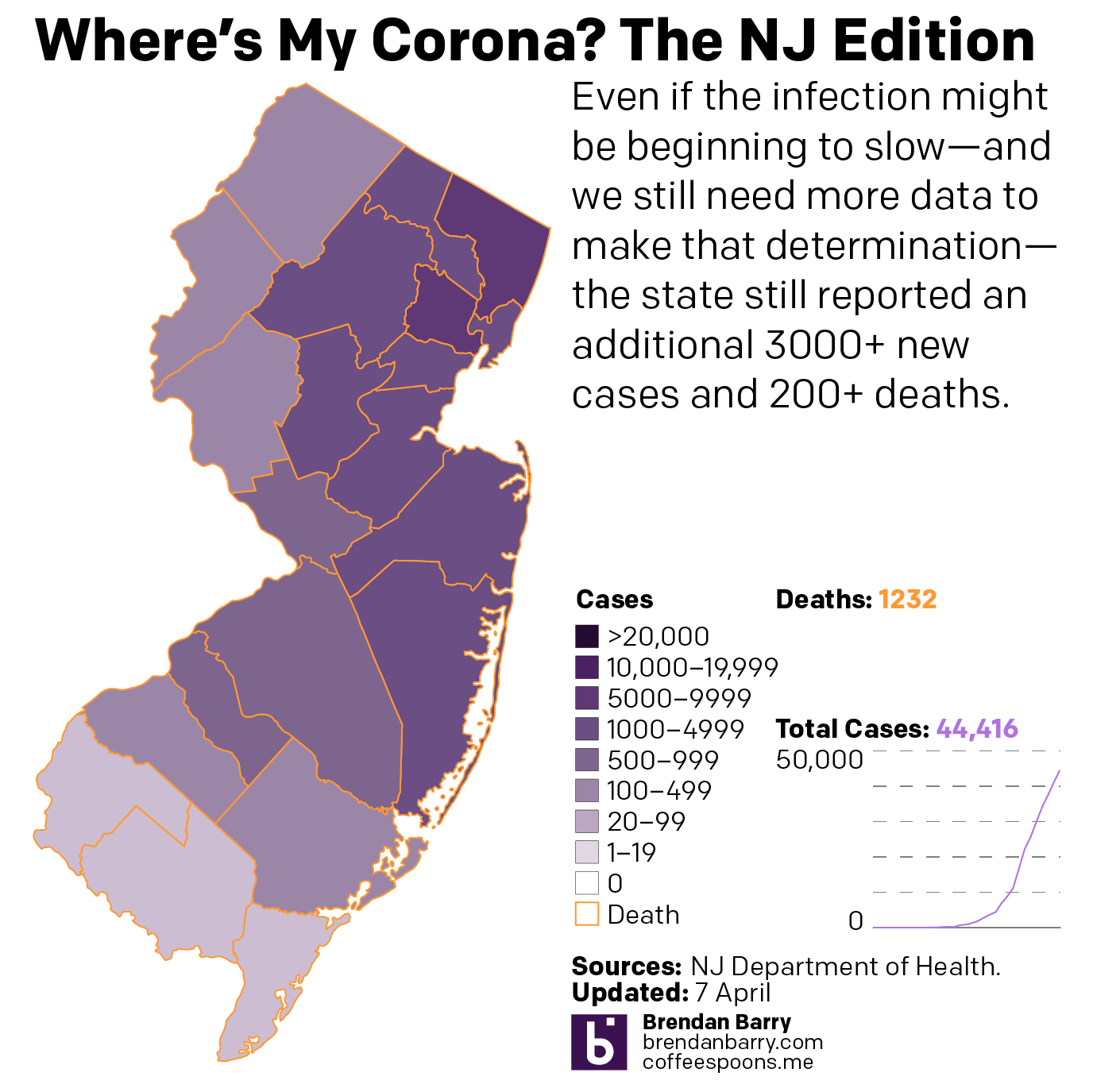
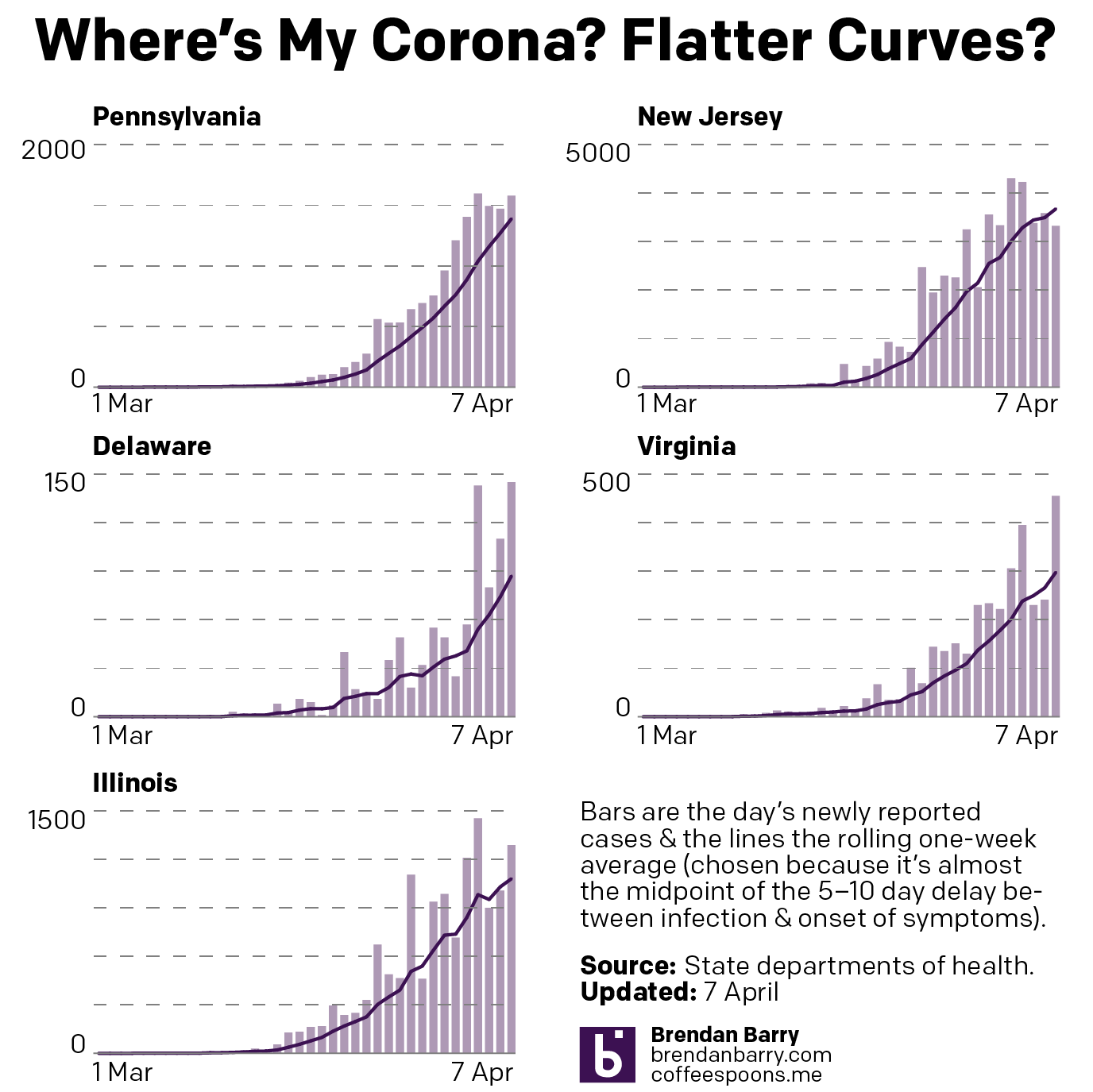
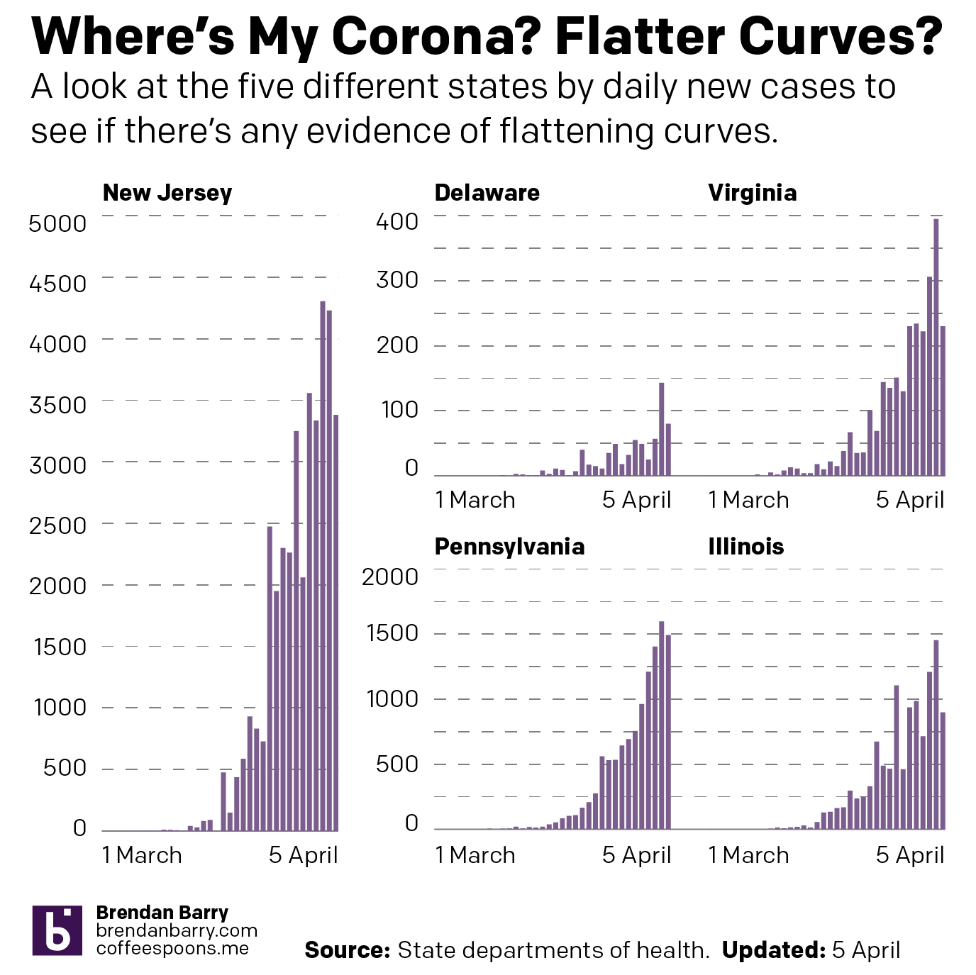
But here I can start with the flatter curves graphic. The New Jersey numbers in particular look good—I mean they’re still bad. Of course we are just a few big breaches of quarantine and lapses in social distancing from reversing that progress.
Maybe some curve flattening?
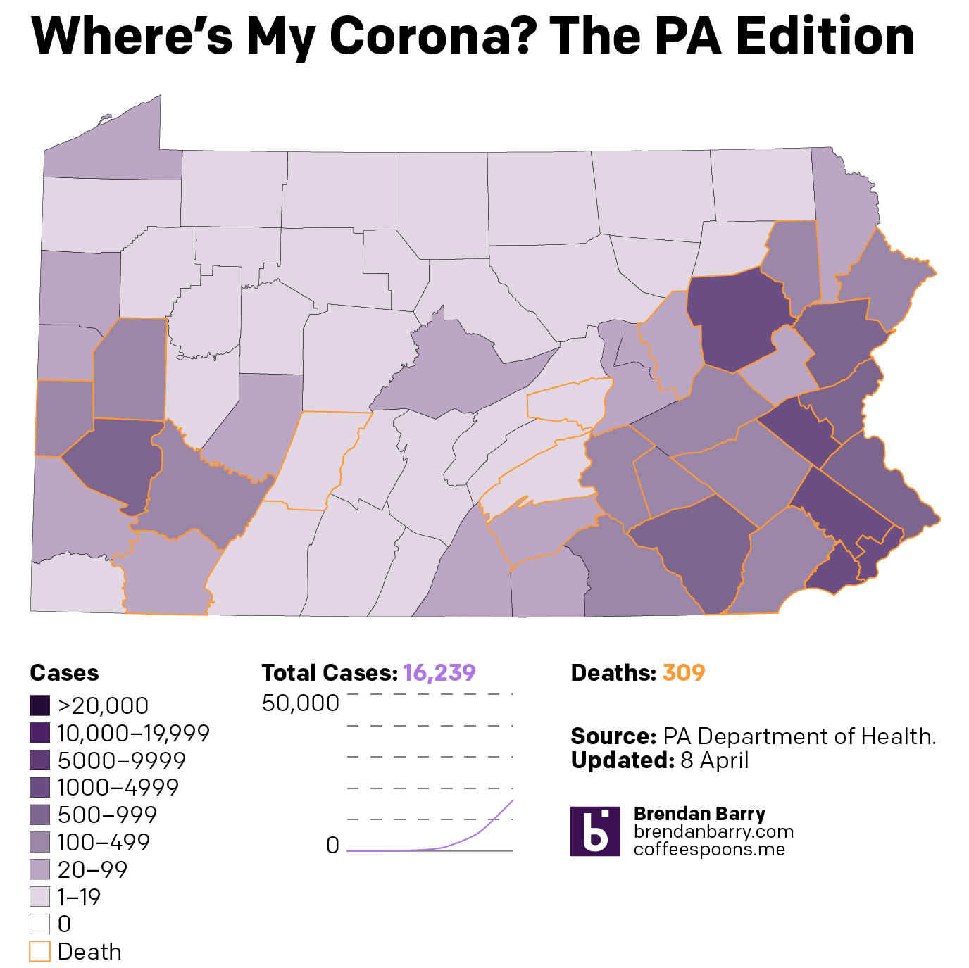
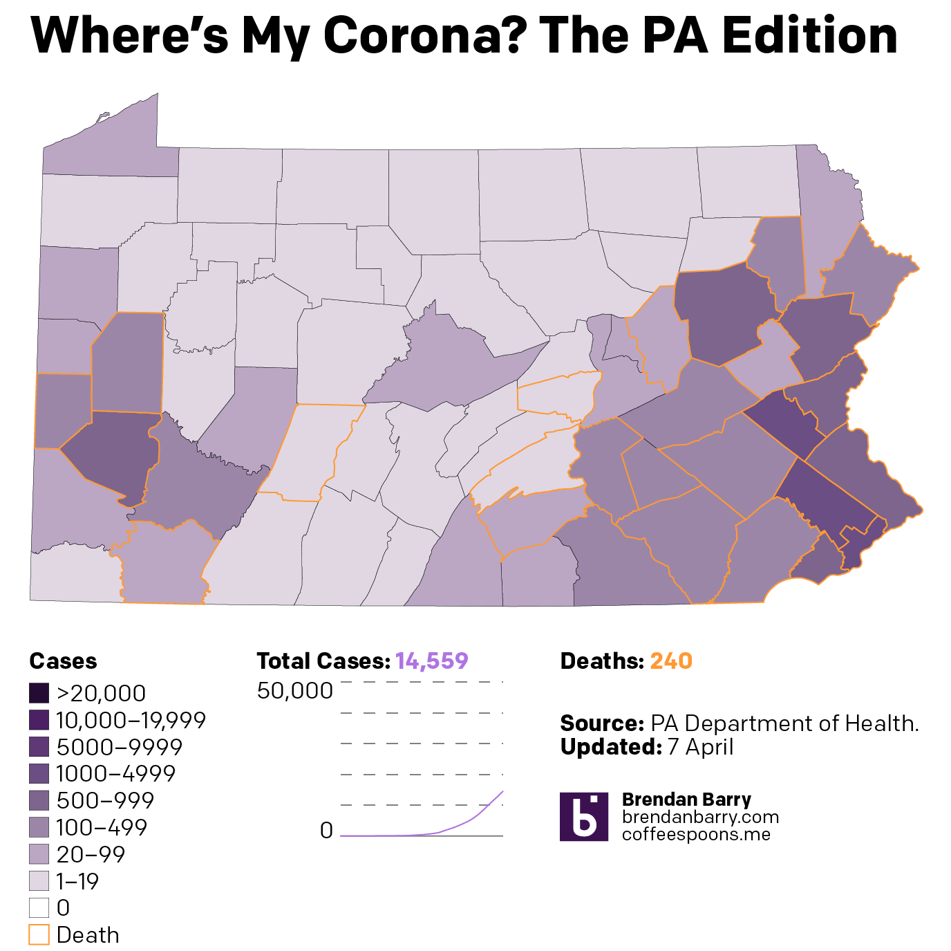
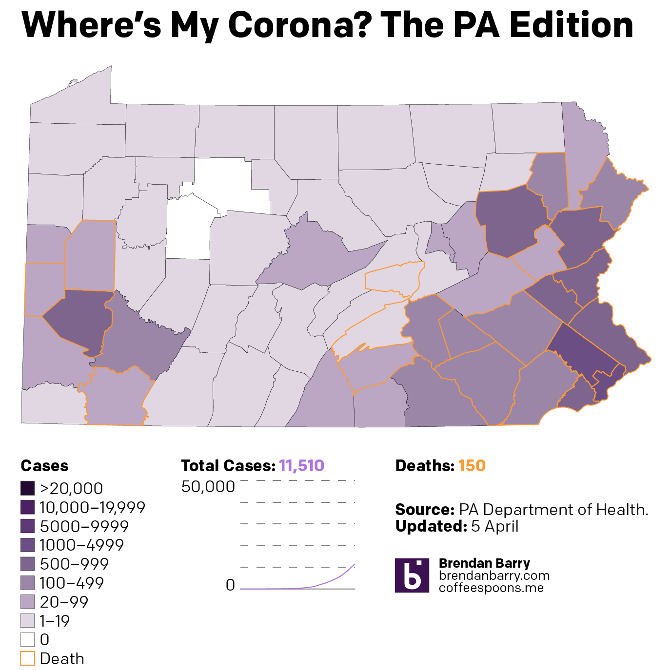
State-wise, Pennsylvania continues to worsen. However, a close look at the slope of the line in the previous chart indicates that the steepness of the growth may be lessening. Deaths passed 300 and cases are now firmly entrenched on both sides of the state with the rural, less densely populated areas in the Ridge and Valley portion of the state seemingly hit not as hard.
The situation in Pennsylvania
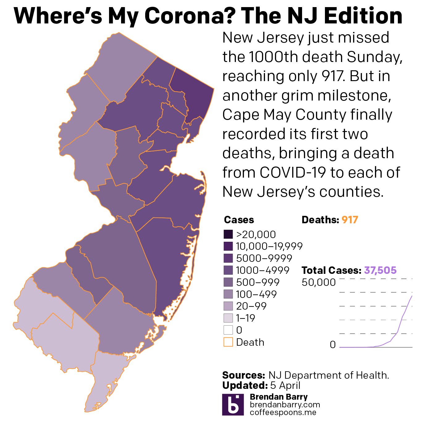
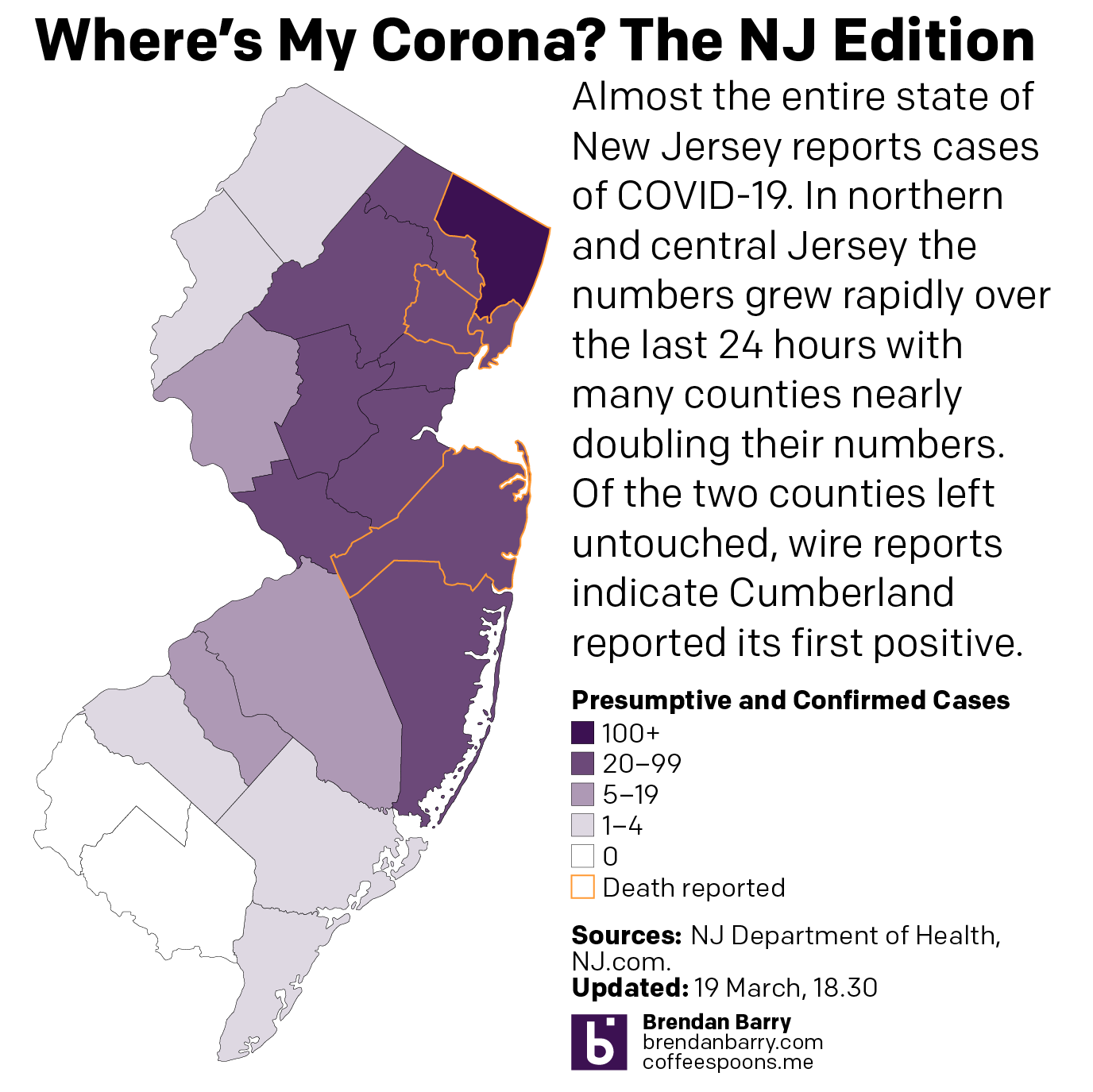
Despite the potential flattening, New Jersey is just in a rough spot. The final bastions of low case numbers in South Jersey are slowly filling up as Cape May County passed the 100-case threshold.
The situation in New Jersey
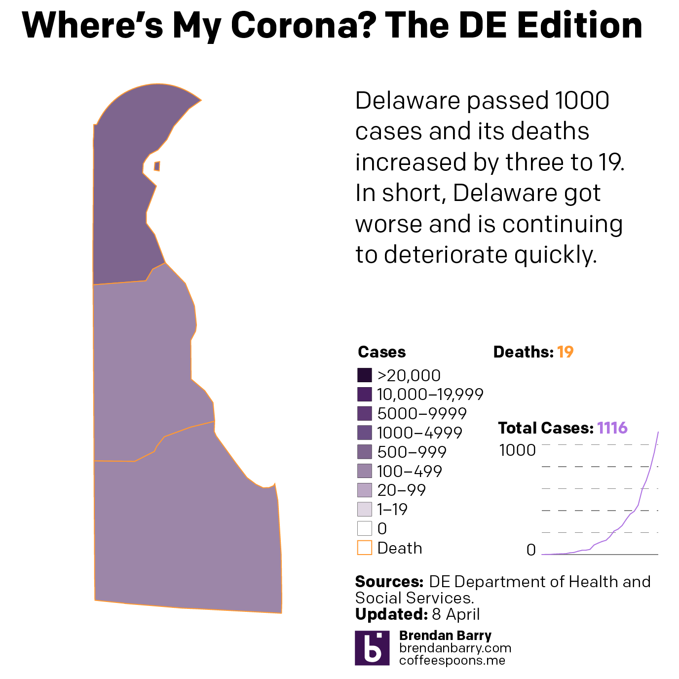
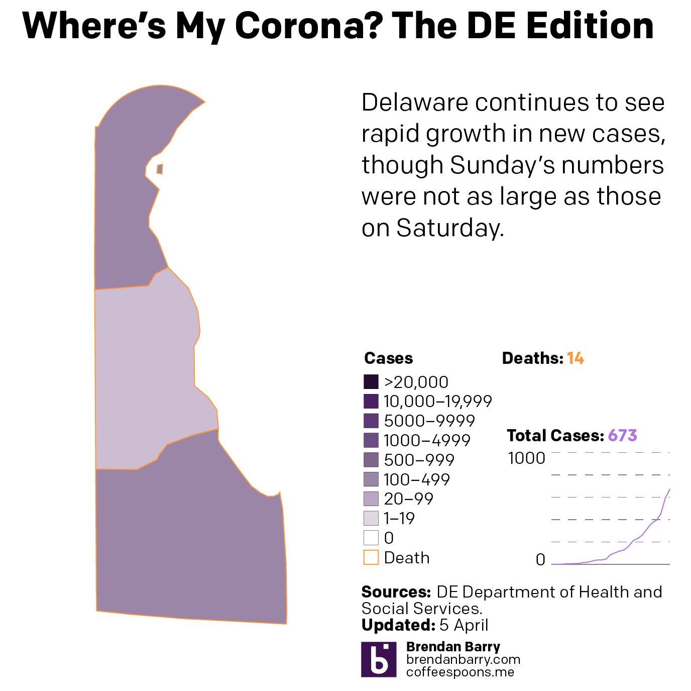
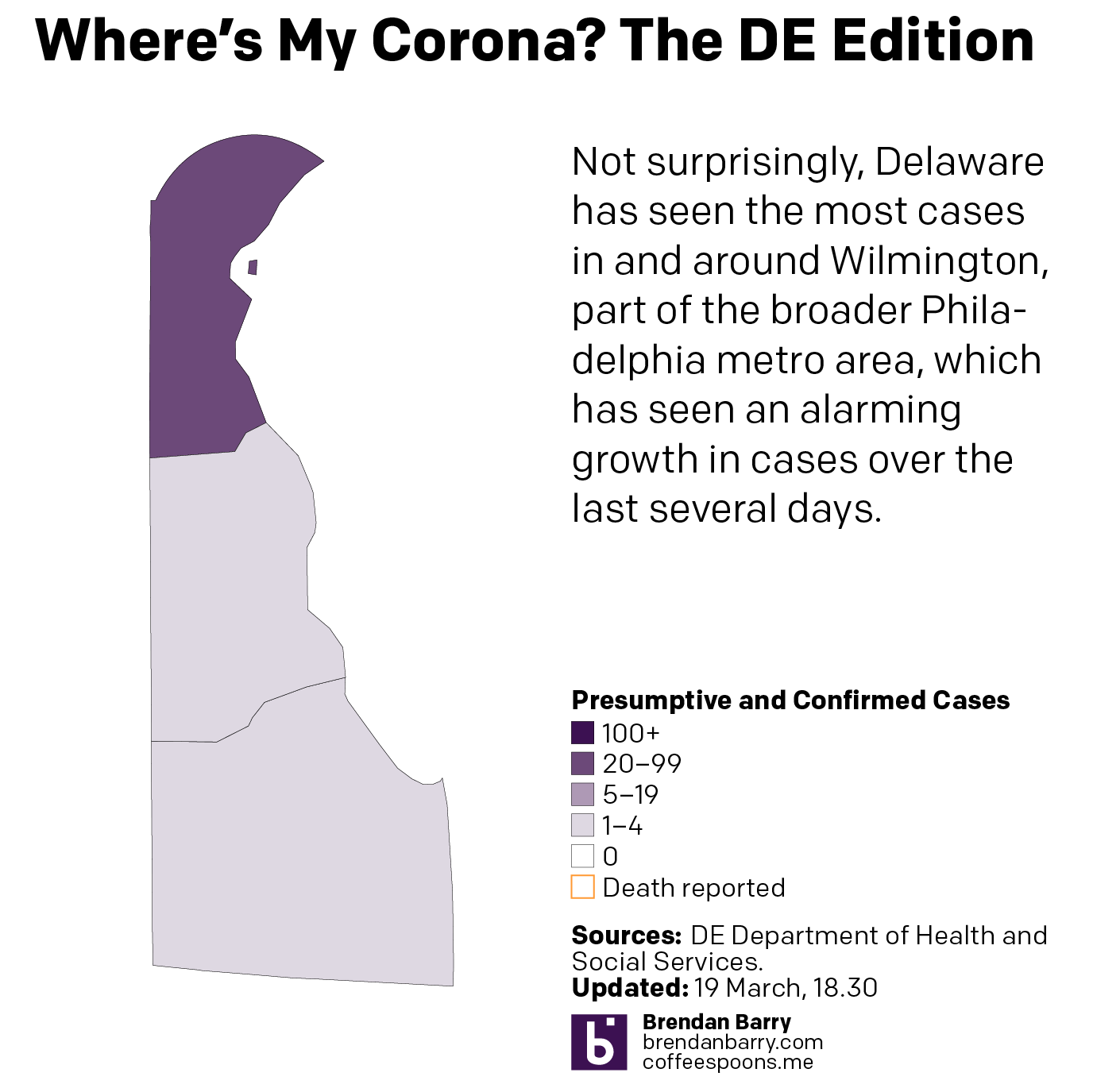
Delaware continues to accelerate and is now past 1000 cases.
The situation in Delaware
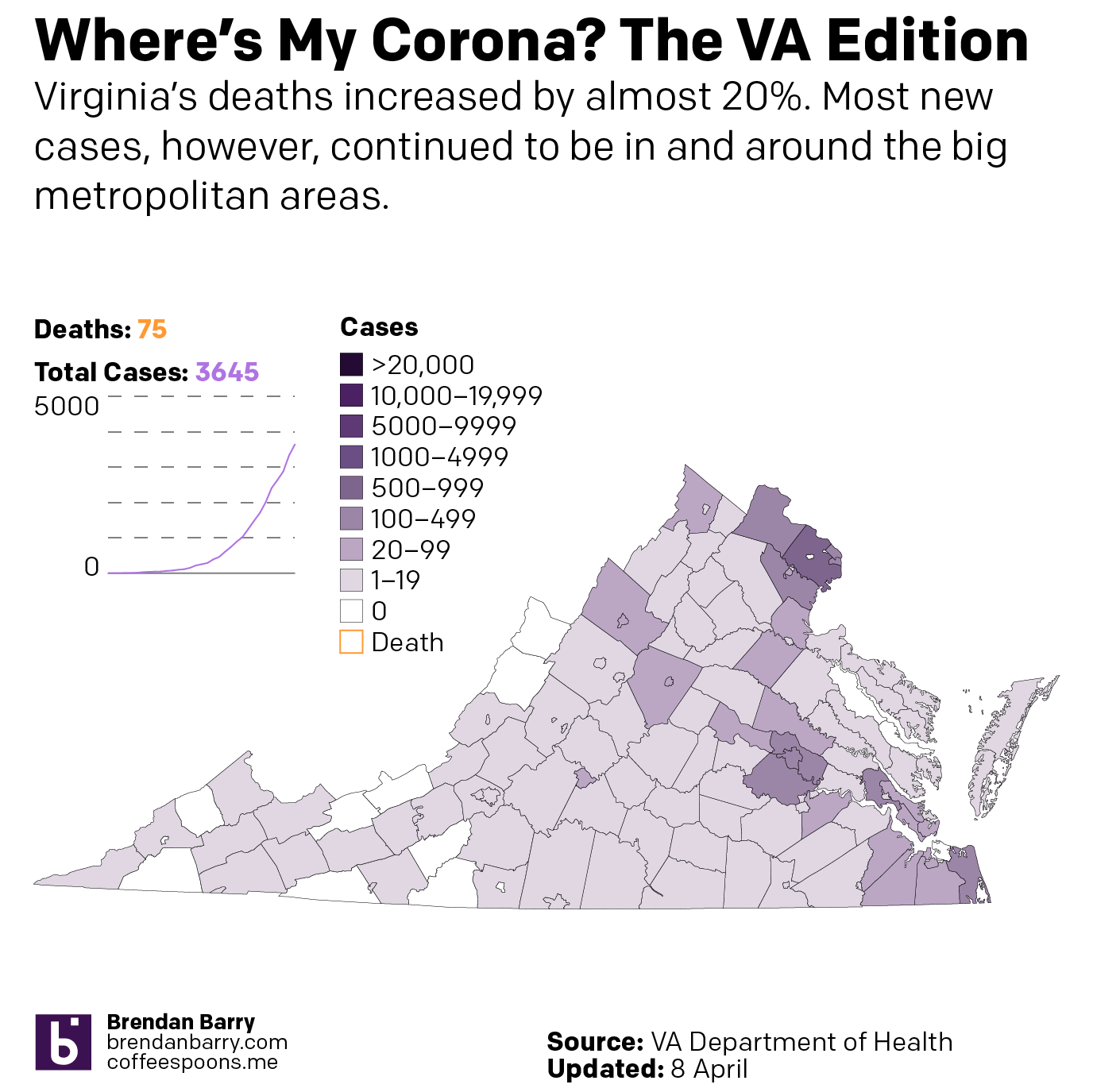
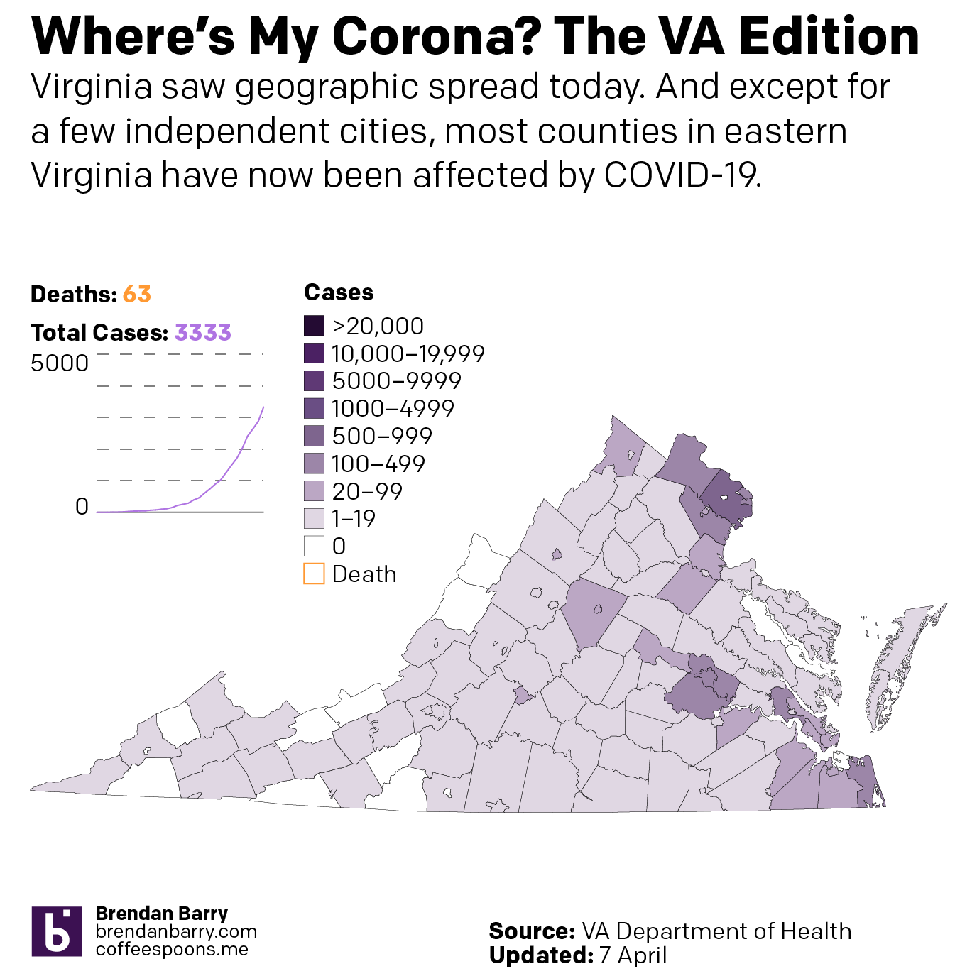
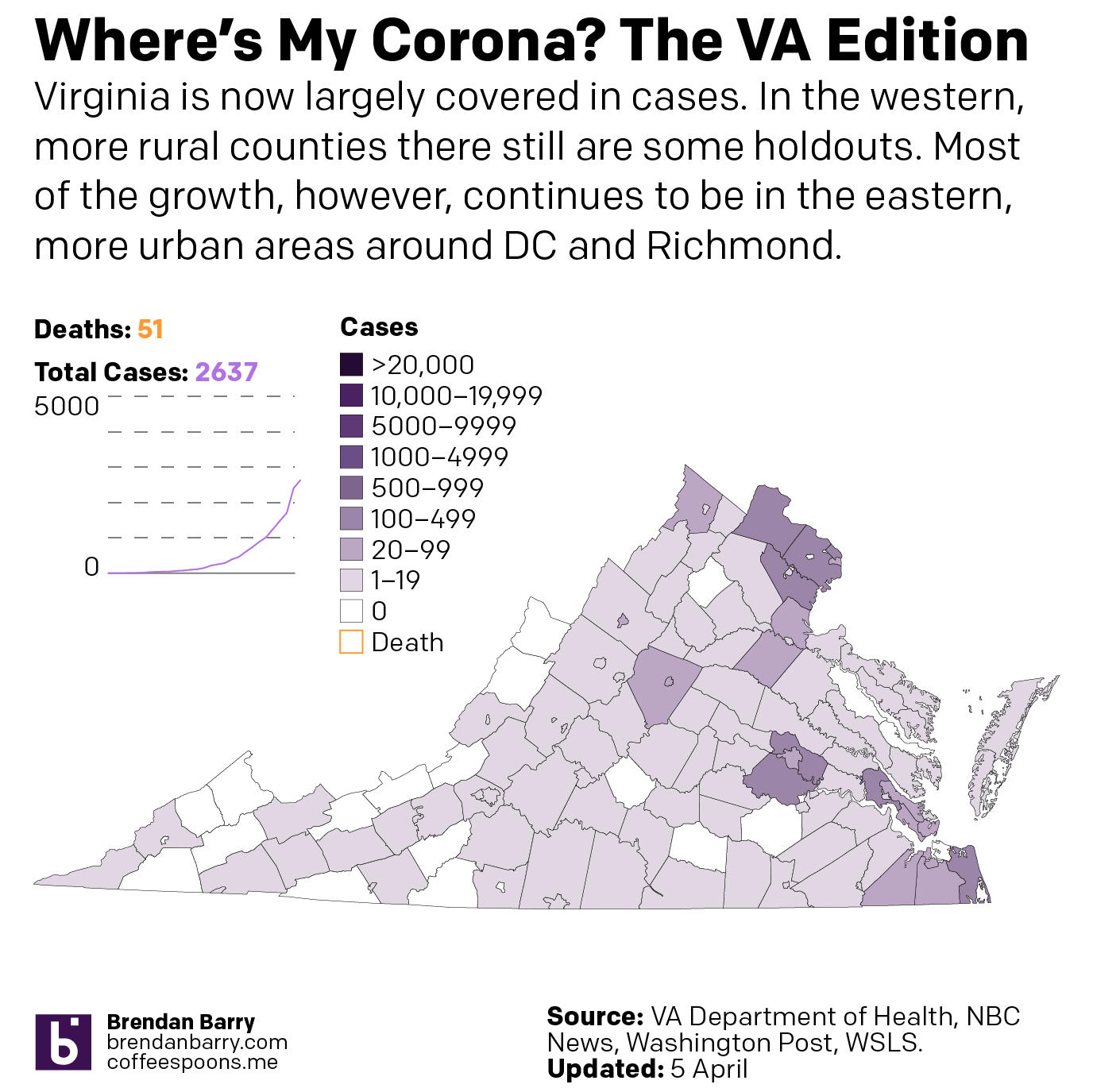
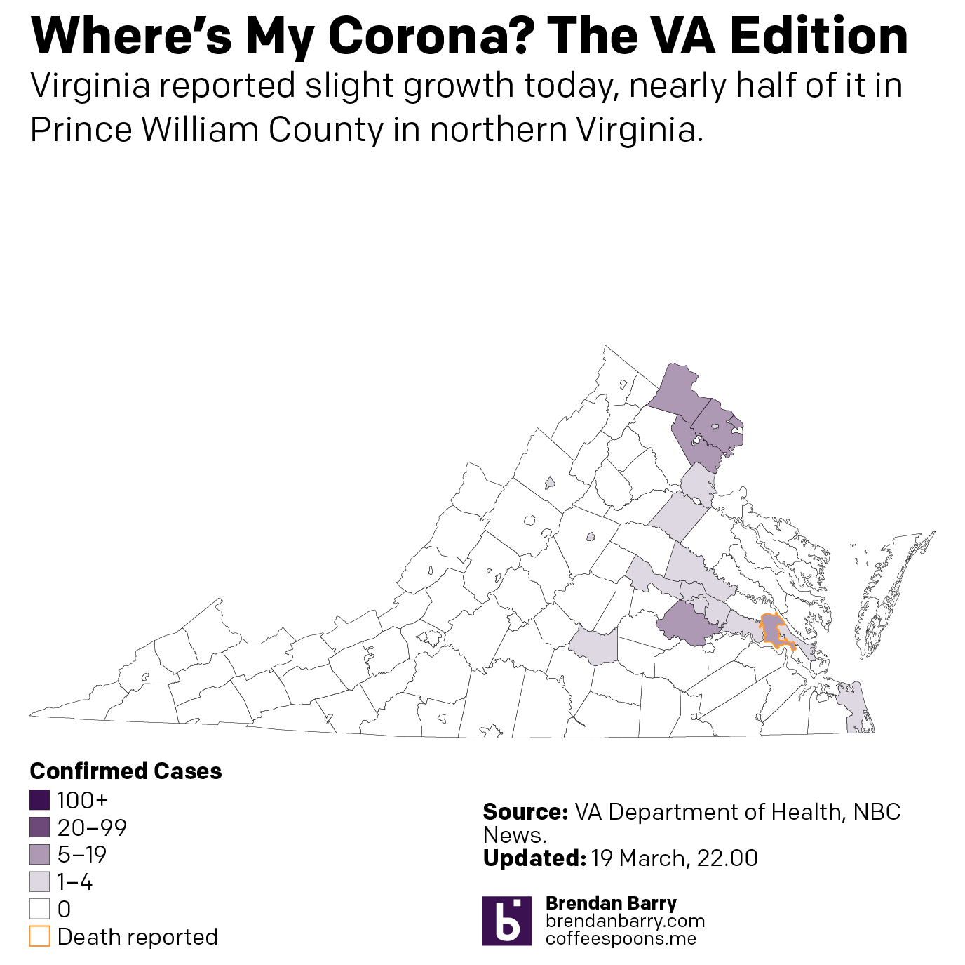
Virginia continues to see cases spreading in the eastern, more populous portions of the state. And at 75 deaths, it’s nearing the 100-death threshold.
The situation in Virginia
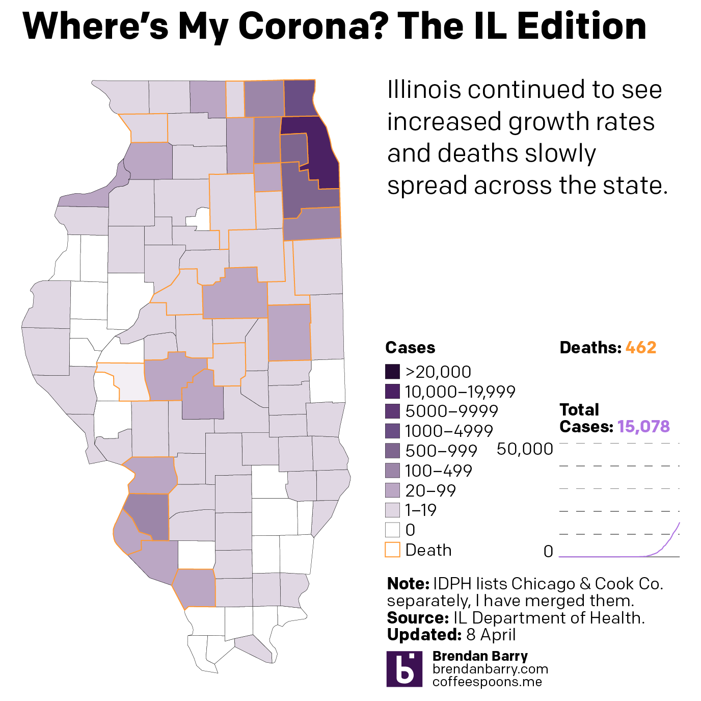
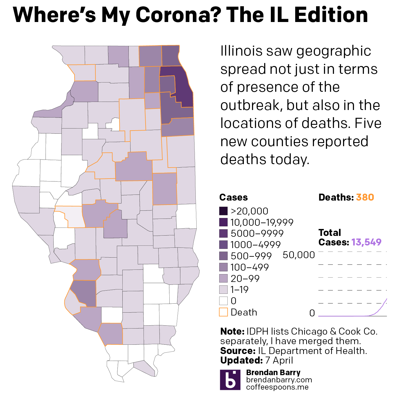
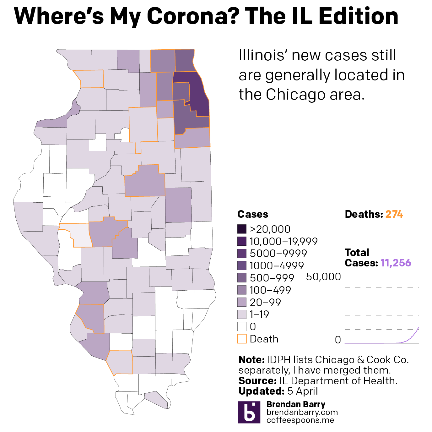
Illinois is seeing deaths occur away from Chicago, in the St. Louis suburban counties and in and around Springfield and Champaign and Bloomington areas.
Here are the Tuesday figures for Pennsylvania, New Jersey, Delaware, Virginia, and Illinois. At the end is an updated version of the flattening curves chart as well. Given the value of these graphics that people have been texting, emailing, and DMing me on social media, I might consider making these a regular staple here on my blog as well. I would probably slowly write about other graphics covering the outbreak as well.
Any feedback is welcome on how to make the graphics more useful to you, the public.
Pennsylvania has finally reached the point where the virus has infected at least one person in every county. Now, if we shift our attention a wee bit to the deaths, we can see those are still largely confined to the eastern third of the state.
The condition in Pennsylvania
New Jersey continues to suffer greatly. But a sharp increase in new cases could be a blip, or it could mean the curve isn’t flattening. We need more data to see a longer trend. Regardless, over 3000 more people were reported infected and over 200 more died.
The condition in New Jersey
Delaware worsened significantly. As a small state, it has a lower captive population. But it is rapidly approaching 1000 cases. In fact, I would not be surprised if that is the headline from Wednesday.
The condition in Delaware
Virginia also saw a significant uptick in cases. And most counties and independent cities in eastern Virginia now report cases. But the rural, mountainous counties in the west and southwest are not uniformly infected. At least not yet.
The condition in Virginia
Illinois saw some geographic spread, but again, compared to a state like Pennsylvania, the worst in Illinois is disproportionately concentrated in the Chicago metropolitan area.
The condition in Illinois
Lastly, the curves are not flattening in all the states but maybe New Jersey. But as I noted above, the higher daily cases there might be a blip.
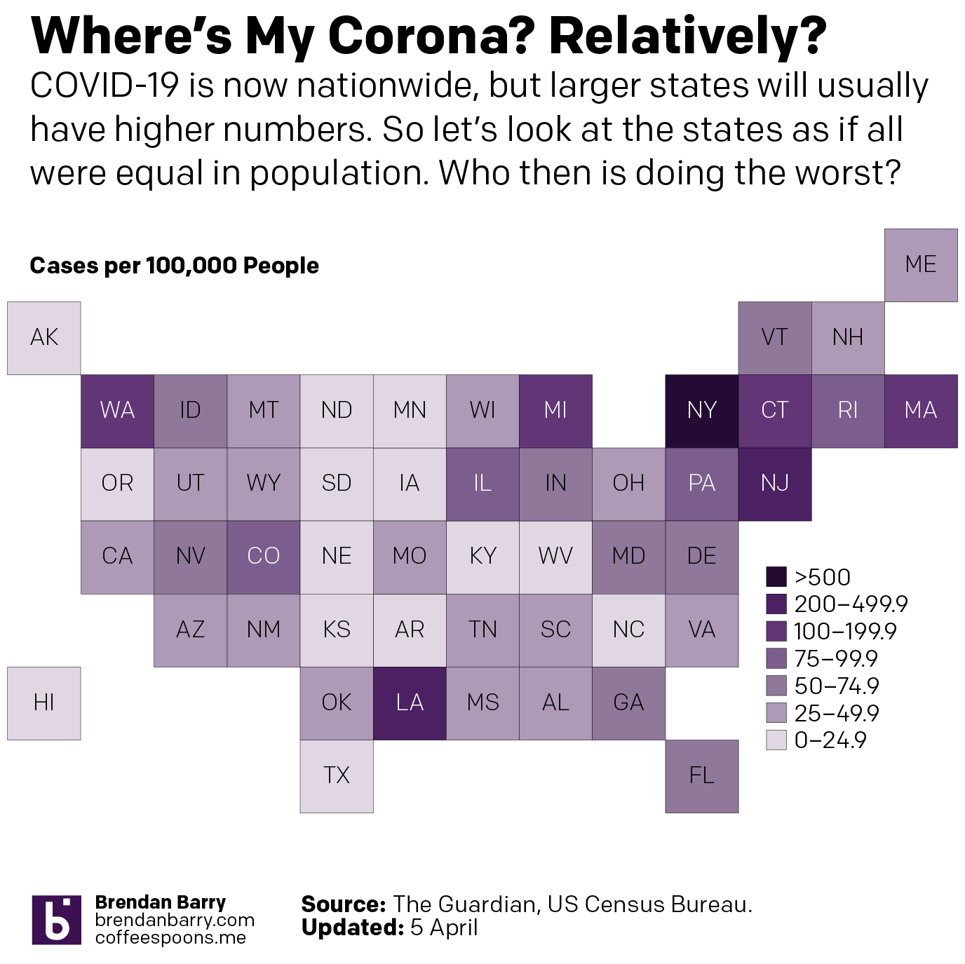
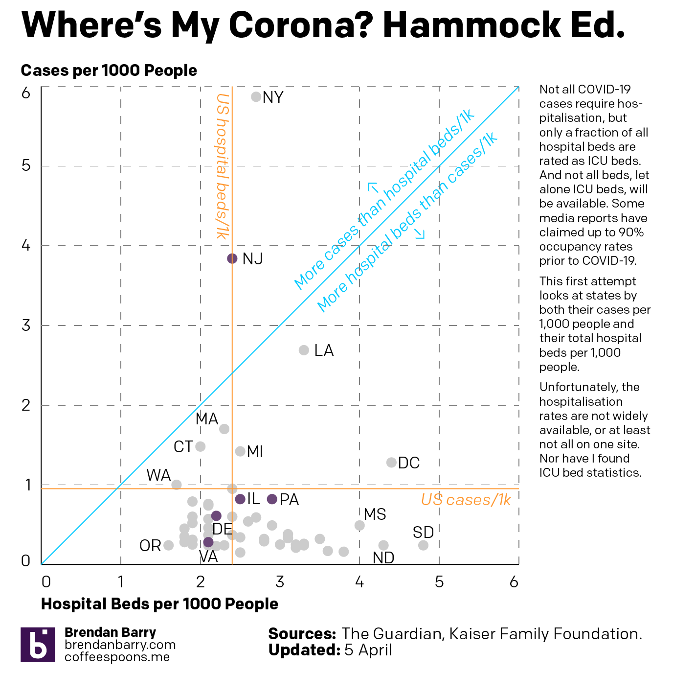
This past weekend I continued looking at the spread of COVID-19 across the United States. But in addition to my usual maps of Pennsylvania, New Jersey, Delaware, Virginia, and Illinois, I also looked at the number of cases across the United States adjusted for population. I then looked at the five aforementioned states in terms of new cases to see if the curve is flattening. Finally, I looked at the number of hospital beds per 1000 people vs the number of cases per 1000 people.
The latter in particular I wanted to be an examination of hospitalisation rates vs ICU beds, which are a small fraction of total hospital beds. But as I could not find that data, I made do with overall cases and overall beds.
So first let’s look at the cases across the U.S. What you can see is that whilst New York and New Jersey do have some of the worst of the impact, Washington is still not great and Louisiana and Michigan are also suffering.
The situation across the United States
And then when we look at the states by their cases per 1000 people and their hospital beds per 1000 people, we see that the states often claimed to be overwhelmed, New York, New Jersey, and Washington are all well over the blue line, which indicates an equal number of beds and cases per 1000 people, or near it. Because it is important to remember that not all beds are the type needed for COVID-19 victims, who often require the more fully kitted out ICU beds. Additionally, not all cases are severe enough to warrant hospitalisation.
Cases per 1k people vs hospital beds per 1k people
Then from the broader national view, we can look at the states of interest. Here, those of you who have been following my social media posts, you can see fewer dark purples in these maps. That’s because I have adopted a new palette that has sacrificed granularity at the lower end of the scale and added it at the top, a particular need in New Jersey and the Philadelphia and Chicago metro areas. And finally we look at the daily new cases to see if that curve is flattening.
Pennsylvania now has almost every county infected. But unlike Illinois, which has a similar infection rate but more unaffected counties, Pennsylvania has fewer cases in its big city, Philadelphia, and has more cases in the smaller cities and towns.
The situation in Pennsylvania
New Jersey is just a disaster. Deaths are now reported in every county—so I can probably remove those orange outlines. The only potential good news is that new cases for the second day in a row were fewer than the day before. It could be a blip. But it could also be a signal that the peak of infection has or is nearing. That said, hospitalisations and deaths are lagging indicators and could take two weeks to follow the positive test results. So in the best case scenario that this is a peak, New Jersey is far from out of the woods.
The situation in New Jersey
Delaware is the smallest state I look at—and one of the smallest in the union overall—but its cases are worryingly increasing rapidly, although like every state I examine in detail it had fewer new cases Sunday than Saturday.
The situation in Delaware
Virginia is in a better spot overall than the other four states. You can see that in the national map above. And most of Virginia’s cases are concentrated in the DC and Richmond areas as well as the cities along the peninsulas jutting into the Chesapeake.
The situation in Virginia
Illinois is, as noted above, similar to Pennsylvania in terms of infections. In terms of deaths, however, it is doubling Pennsylvania’s numbers. And most of its cases are located in and around Chicago. Big chunks of downstate Illinois are unaffected or lightly affected compared to the Commonwealth.
The situation in Illinois
Finally, as I noted in New Jersey, could these lower numbers Sunday than Saturday be meaningful? Possibly. But in all five states? Highly unlikely. Regardless, we can look at the number of daily new cases and see if that curve of infection is flattening. We should wait several days before beginning to make that assessment. But one can hope.
The case for flattening curves
All of this is to say that things are bad and likely will continue to get worse. But I will keep looking at the data daily and presenting it to the public to keep them informed.
By now we have probably all seen the maps of state coverage of the COVID-19 outbreak. But state level maps only tell part of the story. Not all outbreaks are widespread within states. And so after some requests from family, friends, and colleagues, I’ve been attempting to compile county-level data from the state health departments where those family, friends, and colleagues live. Not surprisingly, most of these states are the Philadelphia and Chicago metro areas, but also Virginia.
These are all images I have posted to Instagram. But the content tells a familiar story. The outbreaks in this early stage are all concentrated in and around the larger, interconnected cities. In Pennsylvania, that means clusters around the large cities of Philadelphia, Pittsburgh, and Harrisburg. In New Jersey they stretch along the Northeast Corridor between New York and Trenton (and along into Philadelphia) and then down into Delaware’s New Castle County, home to the city of Wilmington. And then in Virginia, we see small clusters in Northern Virginia in the DC metro area and also around Richmond and the Williamsburg area. Finally in Illinois we have a big cluster in and around Chicago, but also Springfield and the St. Louis area, whose eastern suburbs include Illinois communities like East St. Louis.
19 March county wide spread of COVID-1919 March county wide spread of COVID-1919 March county wide spread of COVID-1919 March county wide spread of COVID-1919 March county wide spread of COVID-19
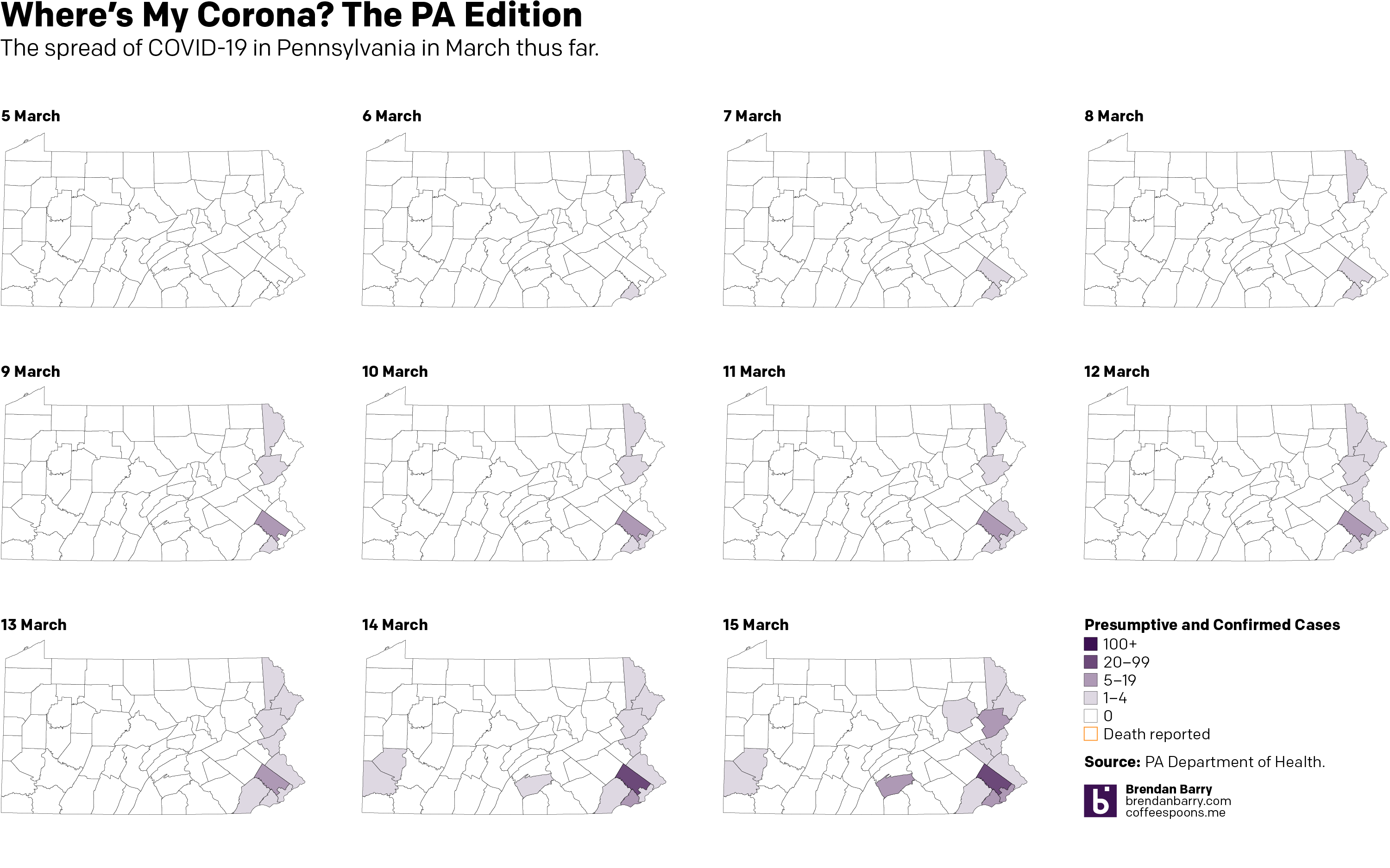
I have also been taking a more detailed look at the spread in Pennsylvania, because I live there. And I want to see the rapidity with which the outbreak is growing in each county. And for that I moved from a choropleth to a small multiple matrix of line charts, all with the same fixed scale. And, well, it doesn’t look good for southeastern Pennsylvania.
County levels compared
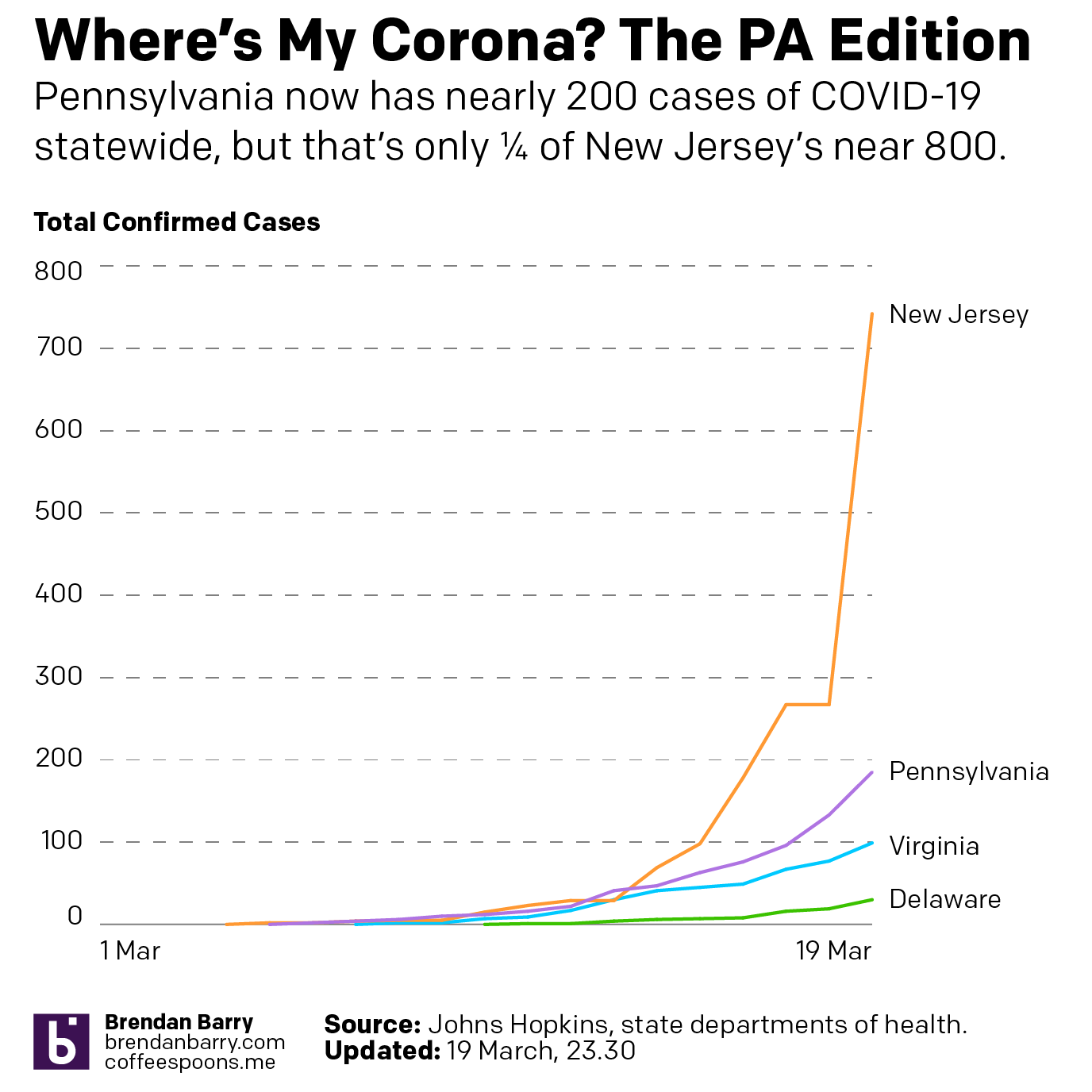
Then last night I also compared the total number of cases in Pennsylvania, New Jersey, Delaware, and Virginia. Most interestingly, Pennsylvania and New Jersey’s outbreaks began just a day apart (at least so far as we know given the limited amount of testing in early March). And those two states have taken dramatically different directions. New Jersey has seen a steep curve doubling less than every two days whereas Pennsylvania has been a bit more gradual, doubling a little less than every three.
State levels since early March
For those of you who want to continue following along, I will be looking at potential options this coming weekend whilst still recording the data for future graphics.
Over the last several days, along with most of the country, I’ve taken an interest in the spread of the novel coronavirus named COVID-19. Though, to be fair, it’s actually been in the news since early January, though early news reports like this from the Times, simply called it a mysterious new virus. At the time I thought little of it, because the news out of China was that it did not appear it could spread amongst humans. How did that idea…wait for it…pan out?
Anyway, over the last couple of days I’ve been making some maps for Instagram because people tend to look at a national map and see every nearly state infected when, in reality, there are pockets and clusters within those states. So I started looking at Pennsylvania. And initially, the cluster was along the Delaware River, namely Pennsylvania as well as its upper reaches near the Lehigh Valley and in the far northeast of the state.
But the spread has grown, and fairly quickly, with Montgomery County, a Philadelphia suburb, a hotspot. Consequently, the Pennsylvania governor has shut down all schools across the state and ordered non-essential shops, restaurants, and bars in the counties surrounding Philadelphia—as well as the county containing Pittsburgh—closed.
So 11 days in, here’s where we stand. (To be fair, I looked at including the early numbers out of today, but nothing has really changed, so I’ll wait until the evening figures are released before I update this again.)
Credit is mine. Data is the Pennsylvania Department of Health.
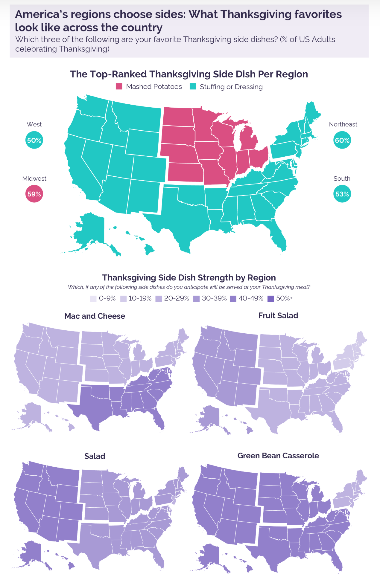
American Thanksgiving meals often feature elaborate spreads of side dishes. And everyone has a favourite. A common theme around the holiday is for media outlets to conduct surveys to see which ones are most popular where. In today’s piece we have one such survey from pollster YouGov. In particular, I wanted to focus on a series of small multiples maps they used to illustrate the preferences.
Big splashes of colour do not necessarily make for a great map
I used to see this approach taken more often and by this I hope I do not see a foreshadow of its comeback. Here we have US states aggregated into distinct regions, e.g. the Northeast. One could get into an argument about how one defines what region. The Midwest is one often contested such region—I have one post on it dating back to at least 2014.
Instead, however, I want to focus on the distinction between states and regions. This small multiples graphic is a set of choropleth maps that use side dish preferences to colour the map. Simple enough. However, the white lines delineating states imply different fields to be coloured within the graphic. Consequently, it appears that each state within the region has the same preference at the same percentage.
The underlying data behind the maps, at least that which was released, indicates the data is not at the state level but instead at the regional level. In other words, there are no differences to be seen between, say, Pennsylvania and New Jersey. Consequently, a more appropriate map choice would have been one that omitted the state boundaries in favour of the larger outlines of the regions.
More radically, a set of bar charts would have done a better job. Consider that with the exception of fruit salad, in every map, only one region is different than the others. A bar chart would have shown the nuance separating the three regions that in almost all of these maps is lost when they all appear as one colour.
I appreciate what the designers were attempting to do, but here I would ask for seconds, as in chances.
Credit for the piece goes to the YouGov graphics team.
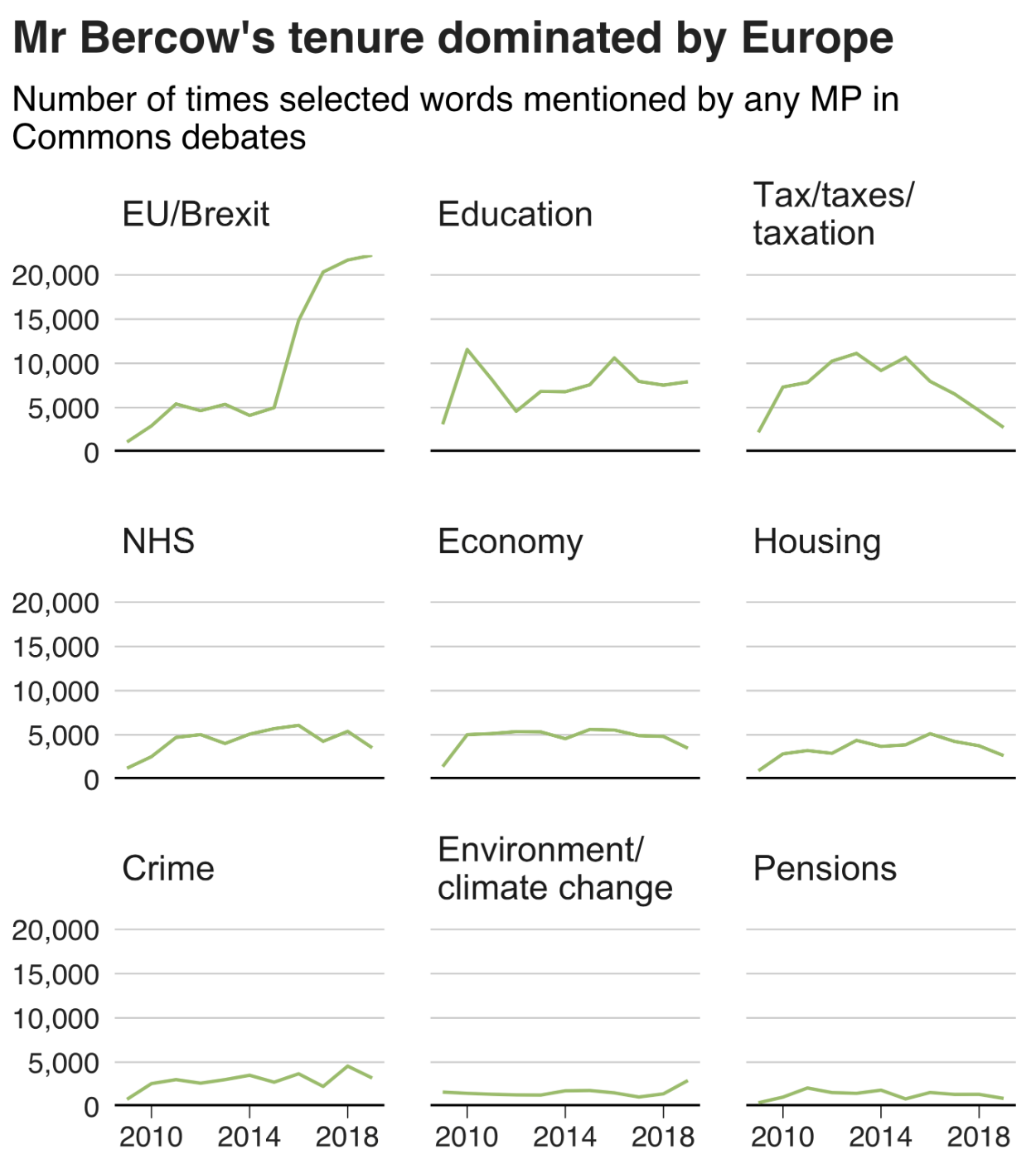
A few weeks ago we said farewell to John Bercow as Speaker of the House (UK). Whilst I covered the election for the new speaker, I missed the opportunity to post this piece from the BBC. It looked at Bercow’s time in office from a data perspective.
The piece did not look at him per se, but that era for the House of Commons. The graphic below was a look at what constituted debates in the chamber using words in speeches as a proxy. Shockingly, Brexit has consumed the House over the last few years.
At least climate change has also ticked upwards?
I love the graphic, as it uses small multiples and fixes the axes for each row and column. It is clean, clear, and concise—just what a graphic should be.
And the rest of the piece makes smart use of graphical forms. Mostly. Smart line charts with background shading, some bar charts, and the only questionable one is where it uses emoji handclaps to represent instances of people clapping the chamber—not traditionally a thing that happens.
Content wise it also nailed a few important things, chiefly Bercow’s penchant for big words. The piece did not, however, cover his amazing sense of sartorial style vis-a-vis neckties.
Overall a solid piece with which to begin the weekend.
Credit for the piece goes to Ed Lowther & Will Dahlgreen.
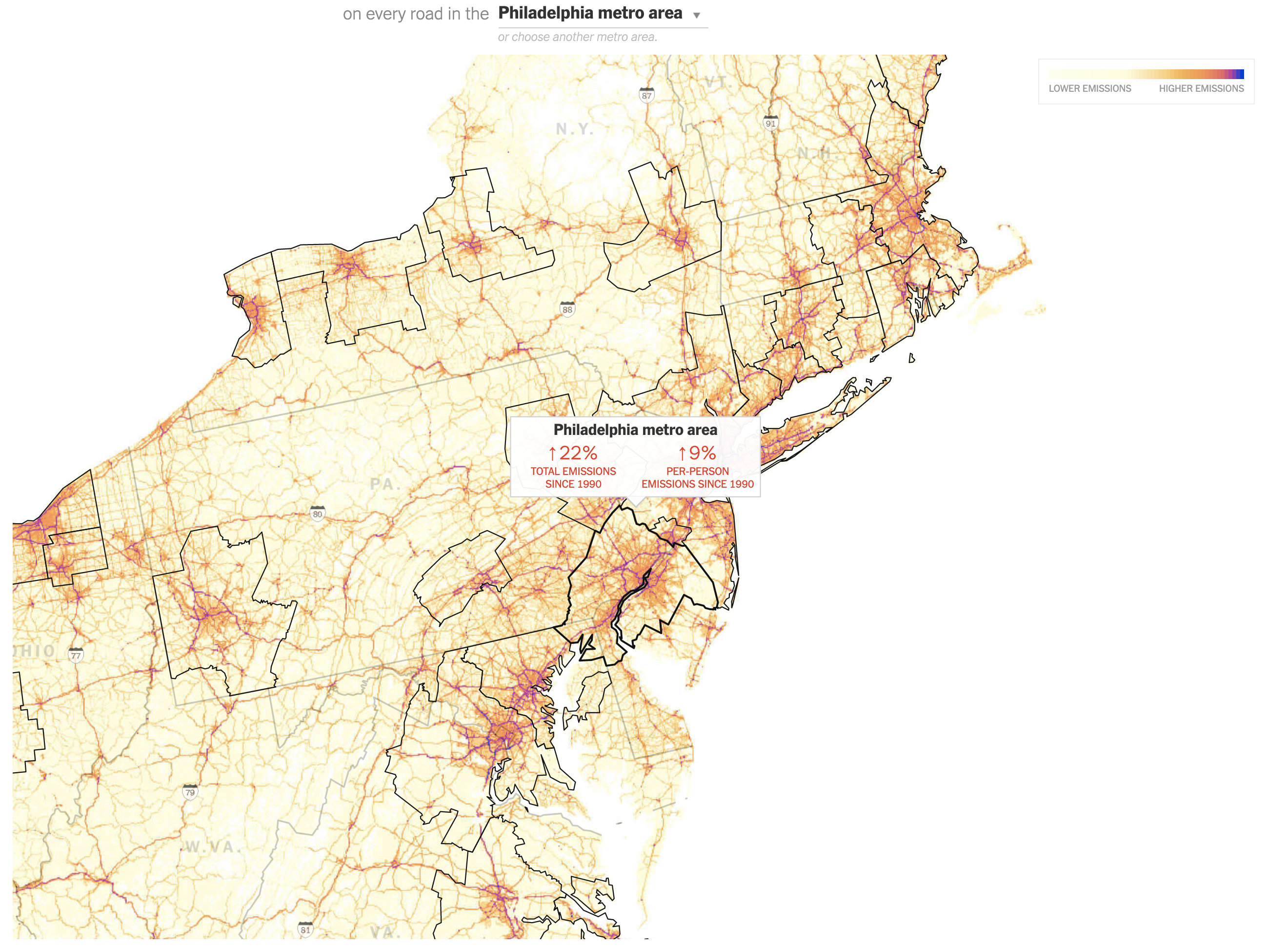
The last two days we looked at densification in cities and how the physical size of cities grew in response to the development of transport technologies, most notably the automobile. Today we look at a New York Times article showing the growth of automobile emissions and the problem they pose for combating the greenhouse gas side of climate change.
The article is well worth a read. It shows just how problematic the auto-centric American culture is to the goal of combating climate change. The key paragraph for me occurs towards the end of the article:
Meaningfully lowering emissions from driving requires both technological and behavioral change, said Deb Niemeier, a professor of civil and environmental engineering at the University of Maryland. Fundamentally, you need to make vehicles pollute less, make people drive less, or both, she said.
Of course the key to that is probably in the range of both.
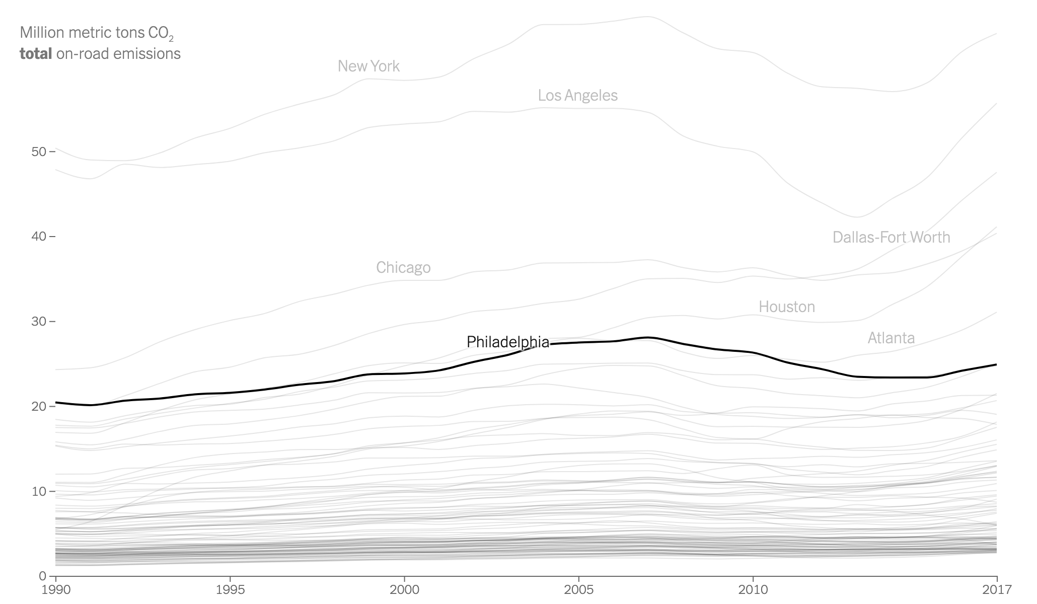
The star of the piece is the map showing the carbon dioxide emissions on the roads from passenger and freight traffic. Spoiler: not good.
From this I blame the Schuylkill, Rte 202, the Blue Route, I-95, and just all the highways
Each MSA is outlined in black and is selectable. The designers chose well by setting the state borders in a light grey to differentiate them from when the MSA crosses state lines, as the Philadelphia one does, encompassing parts of Pennsylvania, New Jersey, Delaware, and Maryland. A slight opacity appears when the user mouses over the MSA. Additionally a little box remains up once the MSA is selected to show the region’s key datapoints: the aggregate increase and the per capita increase. Again, for Philly, not good. But it could be worse. Phoenix, which surpassed Philadelphia proper in population, has seen its total emissions grow 291%, its per capita growth at 86%. My only gripe is that I wish I could see the entire US map in one view.
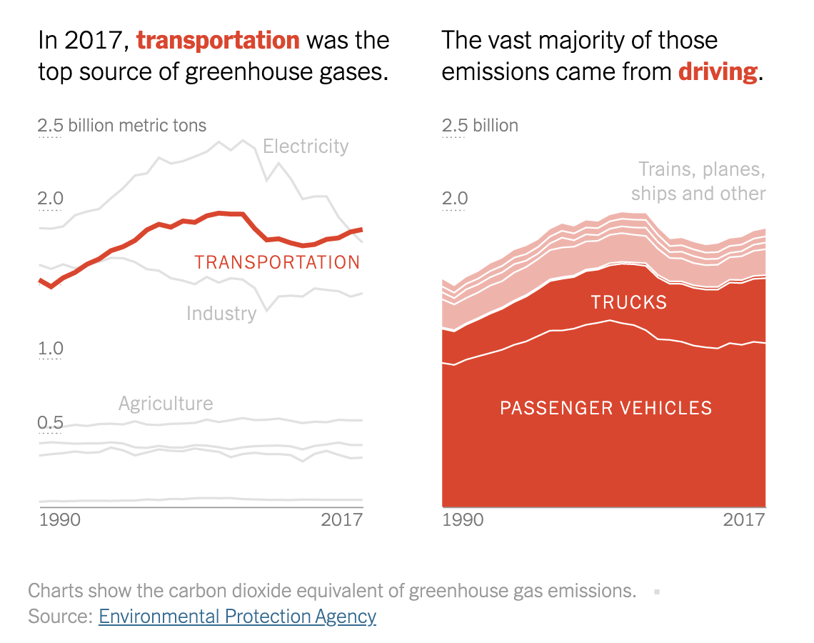
The piece also includes some nice charts showing how automobile emissions compare to other sources. Yet another spoiler: not good.
I’ve got it: wind-powered cars with solar panels on the bonnet.
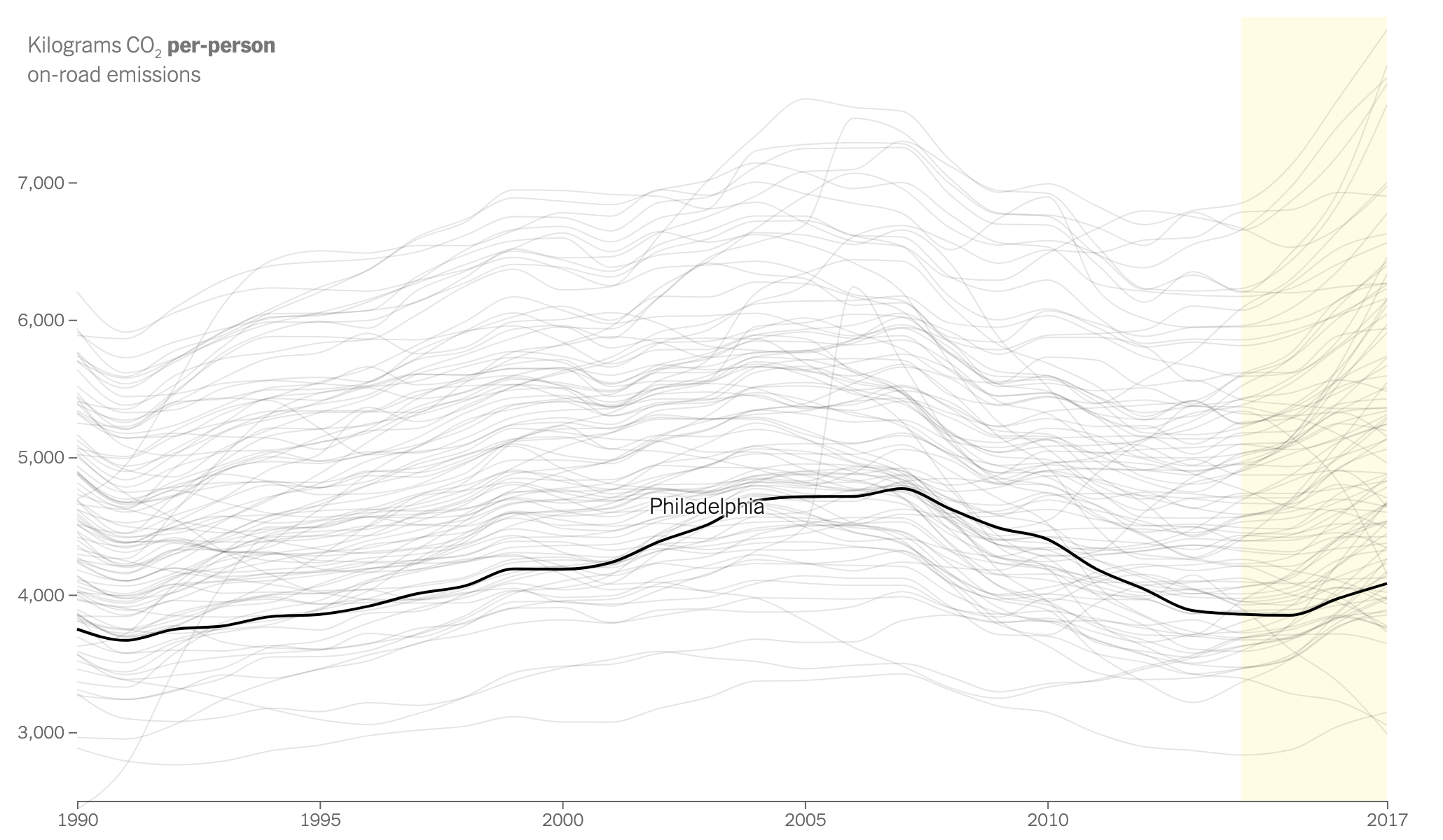
Since 1990, automobile emissions have surpassed both industry emissions and more recently electrical generation emissions (think shuttered coal plants). Here what I would have really enjoyed is for the share of auto emissions to be treated like that share of total emissions. That is, the line chart does a great job showing how auto emissions have surpassed all other sources. But the stacked chart does not do as great a job. The user can sort of see how passenger vehicles have plateaued, but have yet to decline whereas lorries have increased in recent years. (I would suspect due to increased deliveries of online-ordered goods, but that is pure speculation.) But a line chart would show that a little bit more clearly.
Finally, we have a larger line chart that plots each city’s emissions. As with the map, the key thing here is the aggregate vs. per capita numbers. When one continues to scroll through, the lines all change.
Lots of people means lots of emissions.There’s driving in the Philadelphia area, but it’s not as bad as it could be.
Very quickly one can see how large cities like New York have large aggregate emissions because millions of people live there. But then at a per capita level, the less dense, more sprawl-y cities tend to shoot up the list as they are generally more car dependent.
Credit for the piece goes to Nadja Popovich and Denise Lu.
Yesterday we looked at the expansion of city footprints by sprawl, in modern years largely thanks to the automobile. Today, I want to go back to another article I’ve been saving for a wee bit. This one comes from the Economist, though it dates only back to the beginning of October.
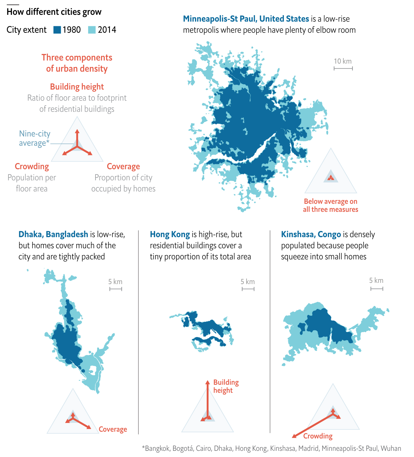
This article looks at the different ways a city can achieve density. Usually one things of soaring skyscrapers, but there are other paths. For those interested, the article is a short read and I won’t cover it here. But for the sake of the graphic below, there are three basic paths: coverage, height, and crowding. Or to put in other terms, how much of the city is covered by homes, how tall those homes go, and how many people fit into each home.
Reticulating splines
I really like this graphic. It does a great job of using small multiples to compare and contrast three cities that exemplify the different paths. Notably, it keeps each city footprint at the same scale, making it easier to see things such as why Hong Kong builds skyward. Because it has little land. (It is, after all, an island and the tip of a peninsula.)
One area where I wish the graphic had kept to the small multiples is its display of Minneapolis. There, the scale shifts (note the lines for 5 km below vs. Minneapolis’ 10 km). I think I understand why, because the sprawling city would not have fit within the confines of the graphic, but that would have also hammered home the point of sprawl.
I should also point out that the article begins with a graphic I chose not to screenshot, but that I also really enjoy. It uses small multiples to compare cities density over time, running population on the x-axis and people per hectare on the y-. It is not a perfect graphic (it uses I think unnecessary arrowheads at the end of the line), but scatter plots over time are, I think, an underused graphic to show how two variables (ideally related) have moved in tandem over time.
Overall, this is a strong piece from the Economist.
Credit for the piece goes to the Economist graphics department.
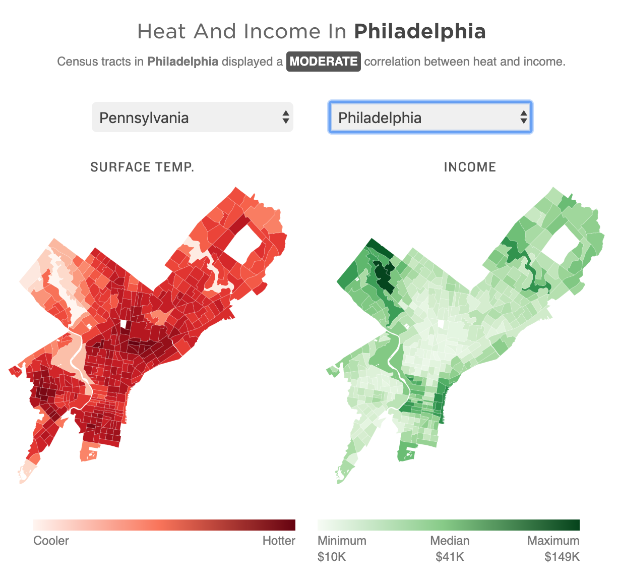
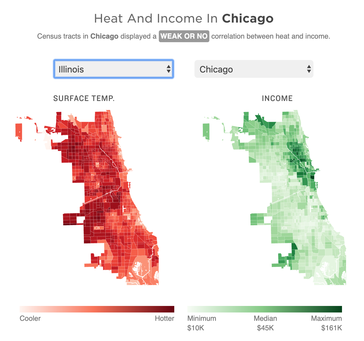
Yesterday was the first day of 32º+C (90º+F) in Philadelphia in October in 78 years. Gross. But it made me remember this piece last month from NPR that looked at the correlation between extreme urban heat islands and areas of urban poverty. In addition to the narrative—well worth the read—the piece makes use of choropleths for various US cities to explore said relationship.
My neighbourhood’s not bad, but thankfully I live next to a park.
As graphics go, these are effective. I don’t love the pure gradient from minimum to maximum, however, my bigger point is about the use of the choropleth compared to perhaps a scatter plot. In these graphics that are trying to show a correlation between impoverished districts and extreme heat, I wonder if a more technical scatterplot showing correlation would be effective.
Another approach could be to map the actual strength of the correlation. What if the designers had created a metric or value to capture the average relationship between income and heat. In that case, each neighbourhood could be mapped as how far above or below that value they are. Because here, the user is forced to mentally transpose the one map atop the other, which is not easy.
For those of you from Chicago, that city is rated as weak or no correlation to the moderately correlated Philadelphia.
I lived near the lake for eight years, and that does a great deal for mitigating temperature extremes.
Granted, that kind of scatterplot probably requires more explanation, and the user cannot quickly find their local neighbourhood, but the graphics could show the correlation more clearly that way.
Finally, it goes almost without saying that I do not love the red/green colour palette. I would have preferred a more colour-blind friendly red/blue or green/purple. Ultimately though, a clearer top label would obviate the need for any colour differentiation at all. The same colour could be used for each metric since they never directly interact.
Overall this is a strong piece and speaks to an important topic. But the graphics could be a wee bit more effective with just a few tweaks.
Credit for the piece goes to Meg Anderson and Sean McMinn.