This is an older piece from back in August, but I was waiting for a time when I would have some related articles to post alongside it. To start off the series of posts, we start with this piece from CityLab. As my titles implies, it looks at the growth of cities, but not in terms of people or technology but in terms of area/land.
The basic premise is that people look for a 30-minute commute and have done so throughout history. To make that point, the authors look at how transport technology evolved to enable people to live and work at further distances from each other, expanding the urban core.
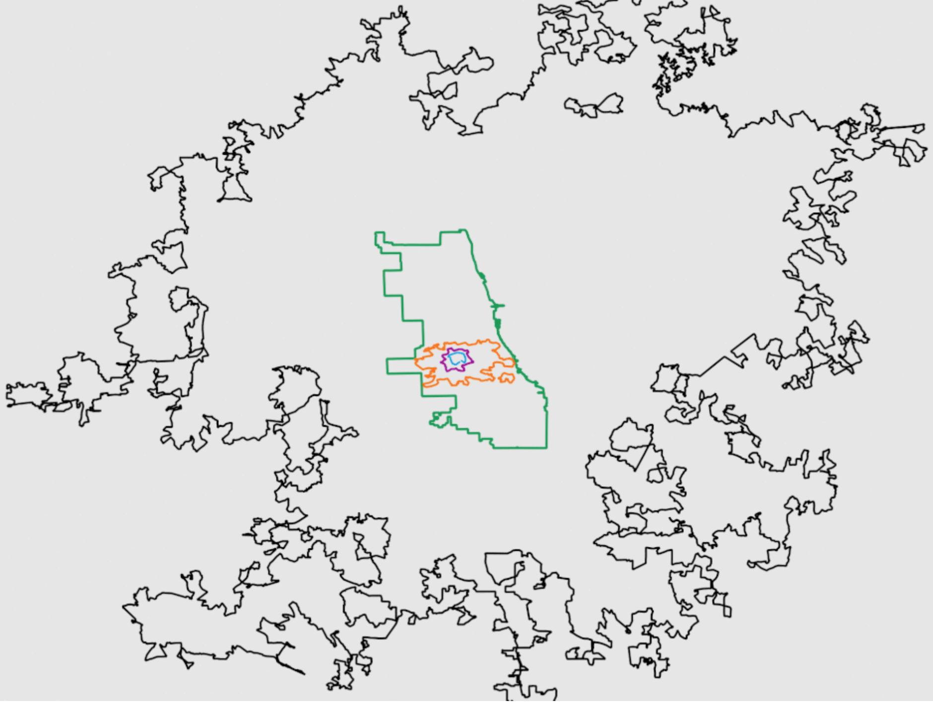
The designer then chose to overlay the city limits of several cities largely defined by these technologies atop each other.

Conceptually the graphic works really well. The screenshot is of an animated. gif leading into the article that step-by-step reveals each city. However, throughout the article, each de facto section is introduced by a city outline graphic.
The graphic does a really nice job of showing how as technology allowed us to move faster, people chose to be further removed from the city core. Of course there are often multiple factors in why people may move out of the core, but transport certainly facilitates it.
Credit for the piece goes to David Montgomery.
Leave a Reply
You must be logged in to post a comment.