Yesterday we looked at the expansion of city footprints by sprawl, in modern years largely thanks to the automobile. Today, I want to go back to another article I’ve been saving for a wee bit. This one comes from the Economist, though it dates only back to the beginning of October.
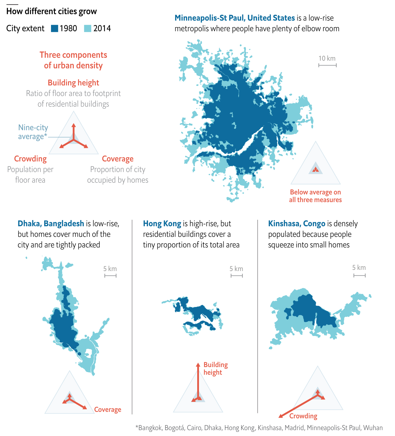
This article looks at the different ways a city can achieve density. Usually one things of soaring skyscrapers, but there are other paths. For those interested, the article is a short read and I won’t cover it here. But for the sake of the graphic below, there are three basic paths: coverage, height, and crowding. Or to put in other terms, how much of the city is covered by homes, how tall those homes go, and how many people fit into each home.

I really like this graphic. It does a great job of using small multiples to compare and contrast three cities that exemplify the different paths. Notably, it keeps each city footprint at the same scale, making it easier to see things such as why Hong Kong builds skyward. Because it has little land. (It is, after all, an island and the tip of a peninsula.)
One area where I wish the graphic had kept to the small multiples is its display of Minneapolis. There, the scale shifts (note the lines for 5 km below vs. Minneapolis’ 10 km). I think I understand why, because the sprawling city would not have fit within the confines of the graphic, but that would have also hammered home the point of sprawl.
I should also point out that the article begins with a graphic I chose not to screenshot, but that I also really enjoy. It uses small multiples to compare cities density over time, running population on the x-axis and people per hectare on the y-. It is not a perfect graphic (it uses I think unnecessary arrowheads at the end of the line), but scatter plots over time are, I think, an underused graphic to show how two variables (ideally related) have moved in tandem over time.
Overall, this is a strong piece from the Economist.
Credit for the piece goes to the Economist graphics department.
Leave a Reply
You must be logged in to post a comment.