As I said yesterday, since people are finding these updates helpful on the social media, I am going to repost the previous evening’s graphics I make on the Coronavirus Covid-19 outbreak here on Coffeespoons as well. So while today is Thursday, these are the numbers states provided yesterday, so it’s more of a Wednesday update.
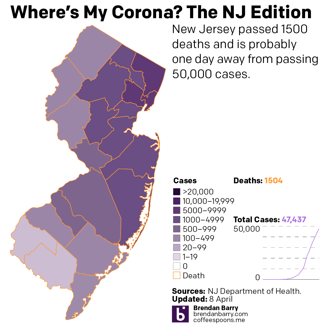
But here I can start with the flatter curves graphic. The New Jersey numbers in particular look good—I mean they’re still bad. Of course we are just a few big breaches of quarantine and lapses in social distancing from reversing that progress.
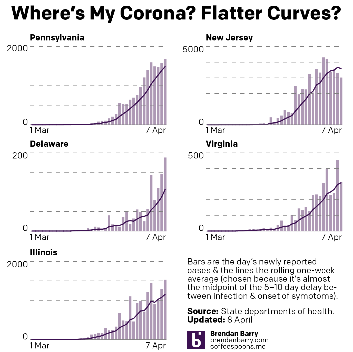
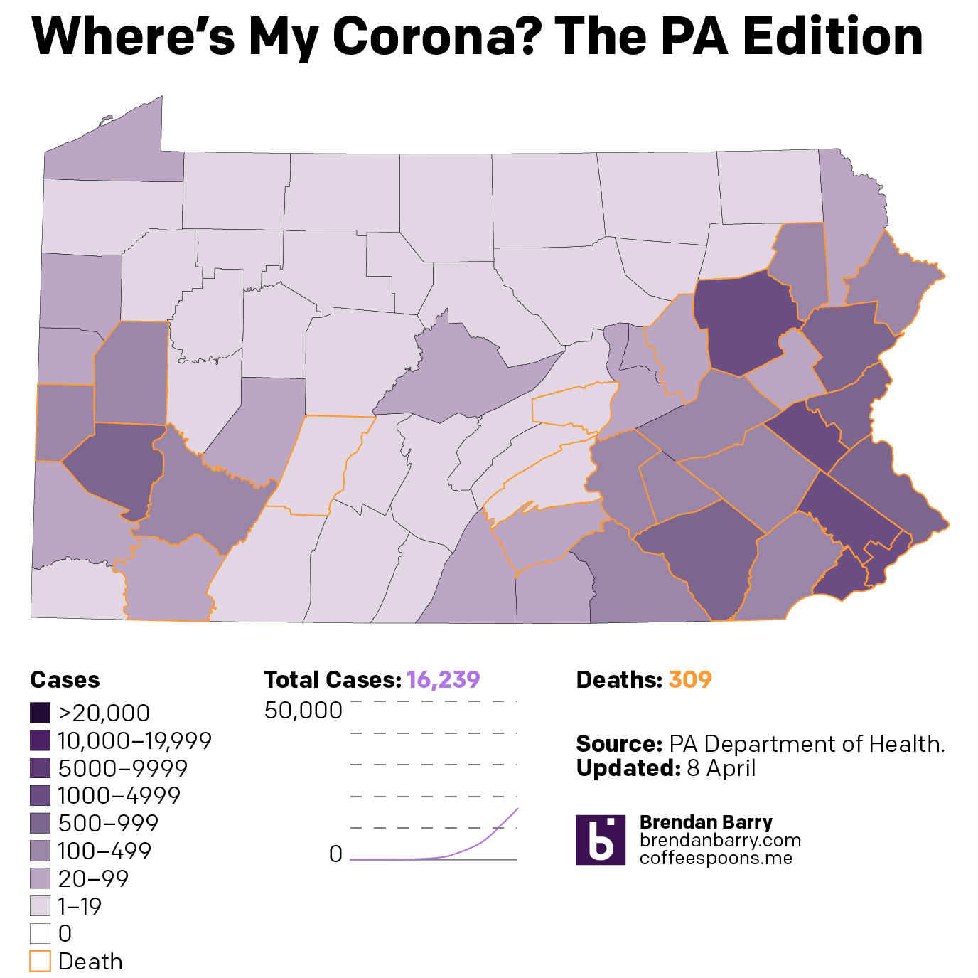
State-wise, Pennsylvania continues to worsen. However, a close look at the slope of the line in the previous chart indicates that the steepness of the growth may be lessening. Deaths passed 300 and cases are now firmly entrenched on both sides of the state with the rural, less densely populated areas in the Ridge and Valley portion of the state seemingly hit not as hard.
Despite the potential flattening, New Jersey is just in a rough spot. The final bastions of low case numbers in South Jersey are slowly filling up as Cape May County passed the 100-case threshold.
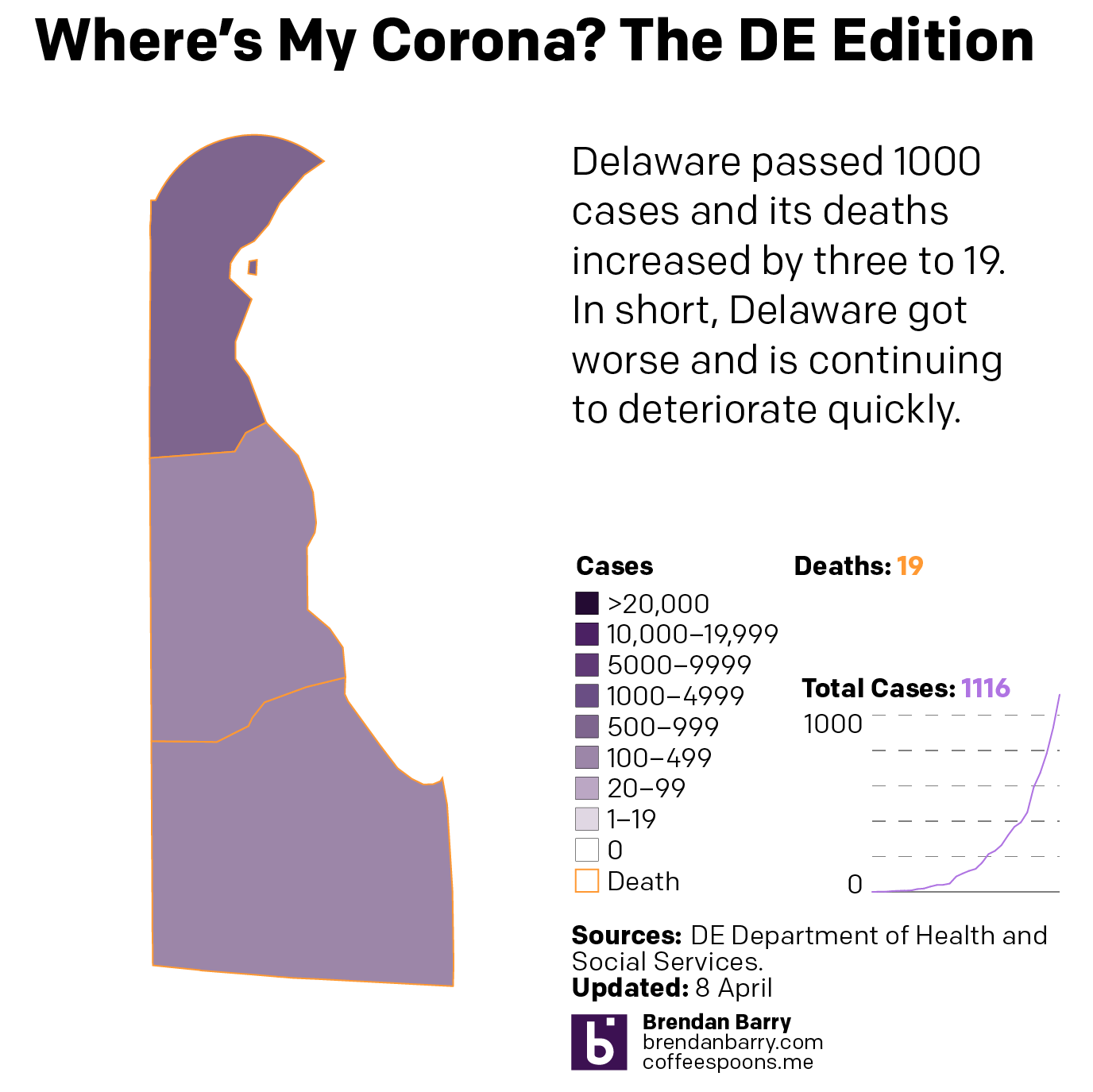
Delaware continues to accelerate and is now past 1000 cases.
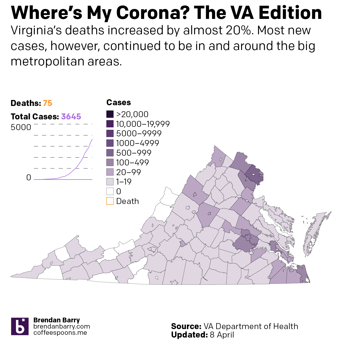
Virginia continues to see cases spreading in the eastern, more populous portions of the state. And at 75 deaths, it’s nearing the 100-death threshold.
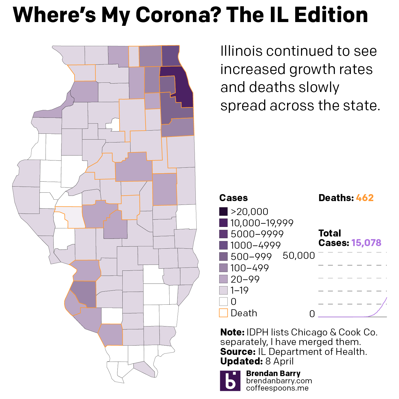
Illinois is seeing deaths occur away from Chicago, in the St. Louis suburban counties and in and around Springfield and Champaign and Bloomington areas.
Credit for the piece goes to me.
Leave a Reply
You must be logged in to post a comment.