Yesterday, Chartporn posted a link to an OkCupid post about sex, specifically charts of sex. And yes, they are quite interesting and worth checking out. But, I enjoyed the humour at the outset, where they noted the brilliance of the pie chart as a modern chart form that can replace the classic Minard chart about Napoleon’s invasion of Russia.
Minard’s original at top, the modern simplification at bottom.
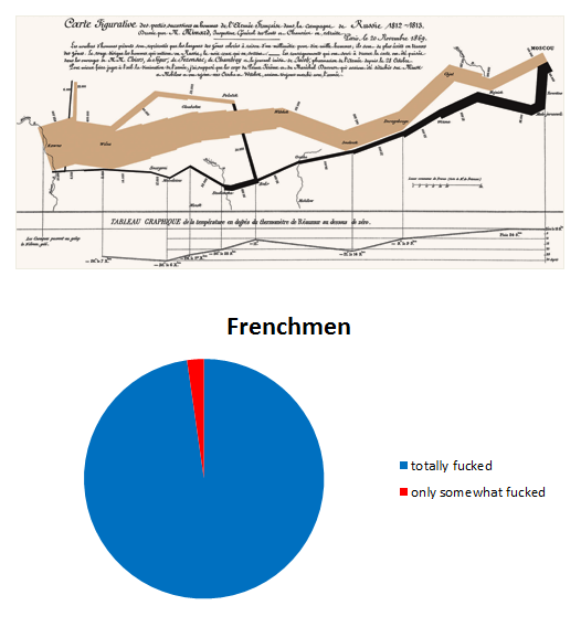
Credit for the work to OkCupid.
Author: Brendan Barry
I am a graphic designer who focuses on information design. My day job? Well, they asked me not to say. But to be clear, this blog is my something I do on my own time and does not represent the views of…my employers. I think what I can say is that given my interest in information design—be it in the shape of clear charts, maps, diagrams, or wayfinding systems—I am fortunate that my day job focuses on data visualisation. Outside of work, I try to stay busy with personal design work. Away from the world of design, I have become an amateur genealogist and family historian. You will sometimes see that area of work bleed into my posts.
View all posts by Brendan Barry