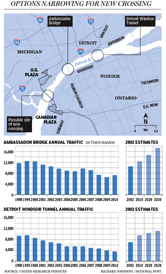
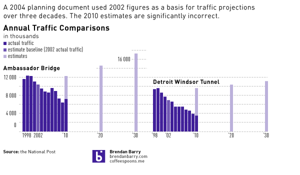
The National Post’s business section, branded separately as the Financial Post, posted a comment about a proposed bridge that would span the Detroit River and add a third major crossing to the Detroit–Windsor area. The comment used a graphic to explain one of the key points of the story, that early 21st century traffic projections haven proven to be very much incorrect. Unfortunately, it took me a little bit of time to realise that in the graphic.

So without access to the raw data provided by United Research Services I have made a quick attempt to improve the graphic within the confines of Coffee Spoons’ main column space, i.e. 600 pixels. The original locator map is quite useful and therefore not included in my effort.

My main issues with the charts are the separation of the estimates from the actuals and the spacing between the estimates. I would have preferred to have seen, as in my example, how the actuals for 2010 fell far short of the 2004 projections. Ideally, I would have liked to have seen the original estimates for the intervening years between 2010, ’20, and ’30, however that data was not provided in the comment if it is even available from the original source. Consequently, unlike the original, I have kept the spacing of the actual data in the estimates with the intervening gaps.
The subtle effect of this increased spacing is to reduce the visual speed, if one will, of the projected growth. Over the original and narrower space the rate of increase appears fairly dramatic. However when given the correct spacing the ‘time’ to reach the projections lengthens and thus the rate ‘slows down’.
Credit for the original piece goes to Richard Johnson. The reinterpretation and any errors therein are entirely my own.
Leave a Reply
You must be logged in to post a comment.