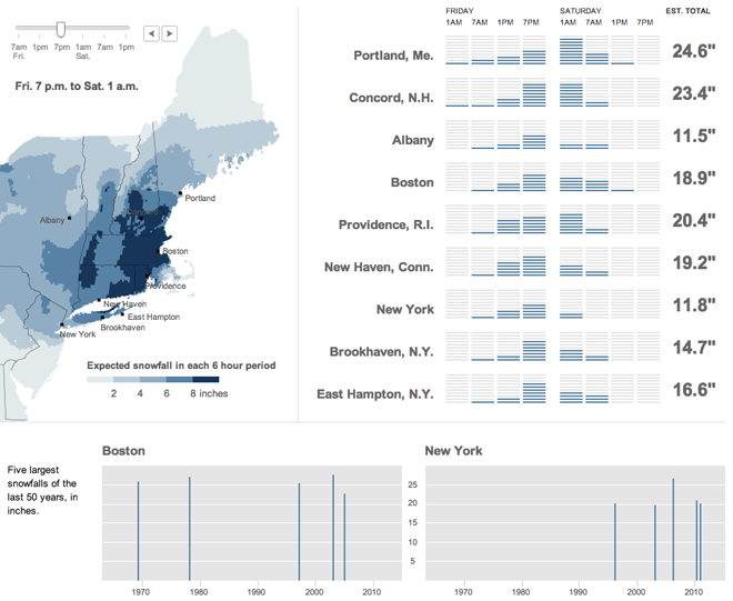
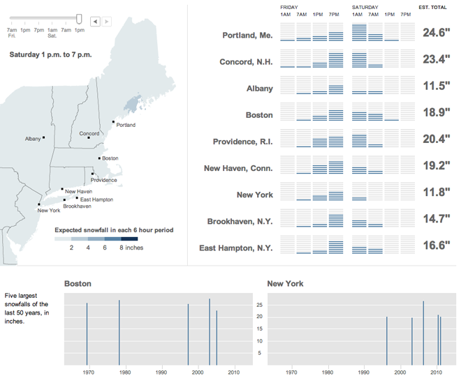
So that fishy little storm the Weather Channel called Nemo—you may have heard of it—put a little snow across New England. Last week the New York Times published an interactive infographic that looked at when and where the snow would be falling, from New Jersey to New York to Maine.

The times are cut into six-hour blocks and show in the upper left where the snow would be falling by rate per six-hours. To the right of the map is a series of bar charts that show the snowfall pattern in more or less of a wave. Beneath all of it are a comparison of when, over the last several decades, the largest snowstorms hit Boston and New York (and how much snow each city received). A comparison of the map before to the end of the storm, except for parts of Maine.

Credit for the piece goes to Tom Giratikanon, Matthew Ericson, Xaquin G.V., Archie Tse, and Jeremy White.
Leave a Reply
You must be logged in to post a comment.