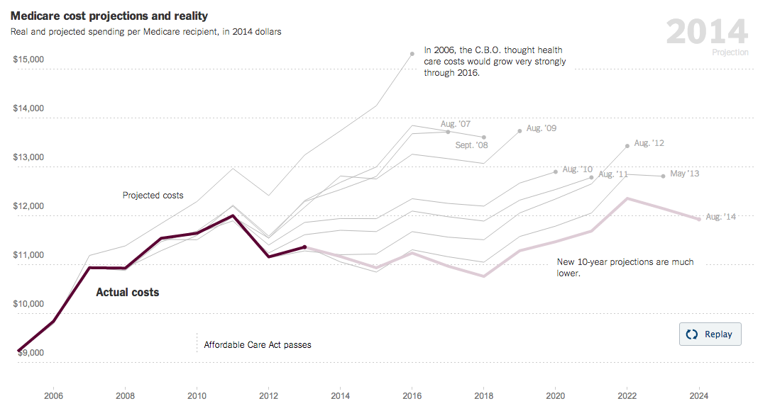
Medicare is one of those things that everybody has feared in terms of its impact on our long-term debt and deficit. The New York Times looks at the falling projections over time through a nice, animated line chart. The accompanying article places the cause for these to two factors. First, technical reductions that mean behaviour changes among medical care professionals and patients. Second, to spending reductions through the Affordable Care Act.
Credit for the piece goes to Margot Sanger-Katz and Kevin Quealy.
Author: Brendan Barry
I am a graphic designer who focuses on information design. My day job? Well, they asked me not to say. But to be clear, this blog is my something I do on my own time and does not represent the views of…my employers. I think what I can say is that given my interest in information design—be it in the shape of clear charts, maps, diagrams, or wayfinding systems—I am fortunate that my day job focuses on data visualisation. Outside of work, I try to stay busy with personal design work. Away from the world of design, I have become an amateur genealogist and family historian. You will sometimes see that area of work bleed into my posts.
View all posts by Brendan Barry