Of all the things I expected to cover this week, this was not one of them.
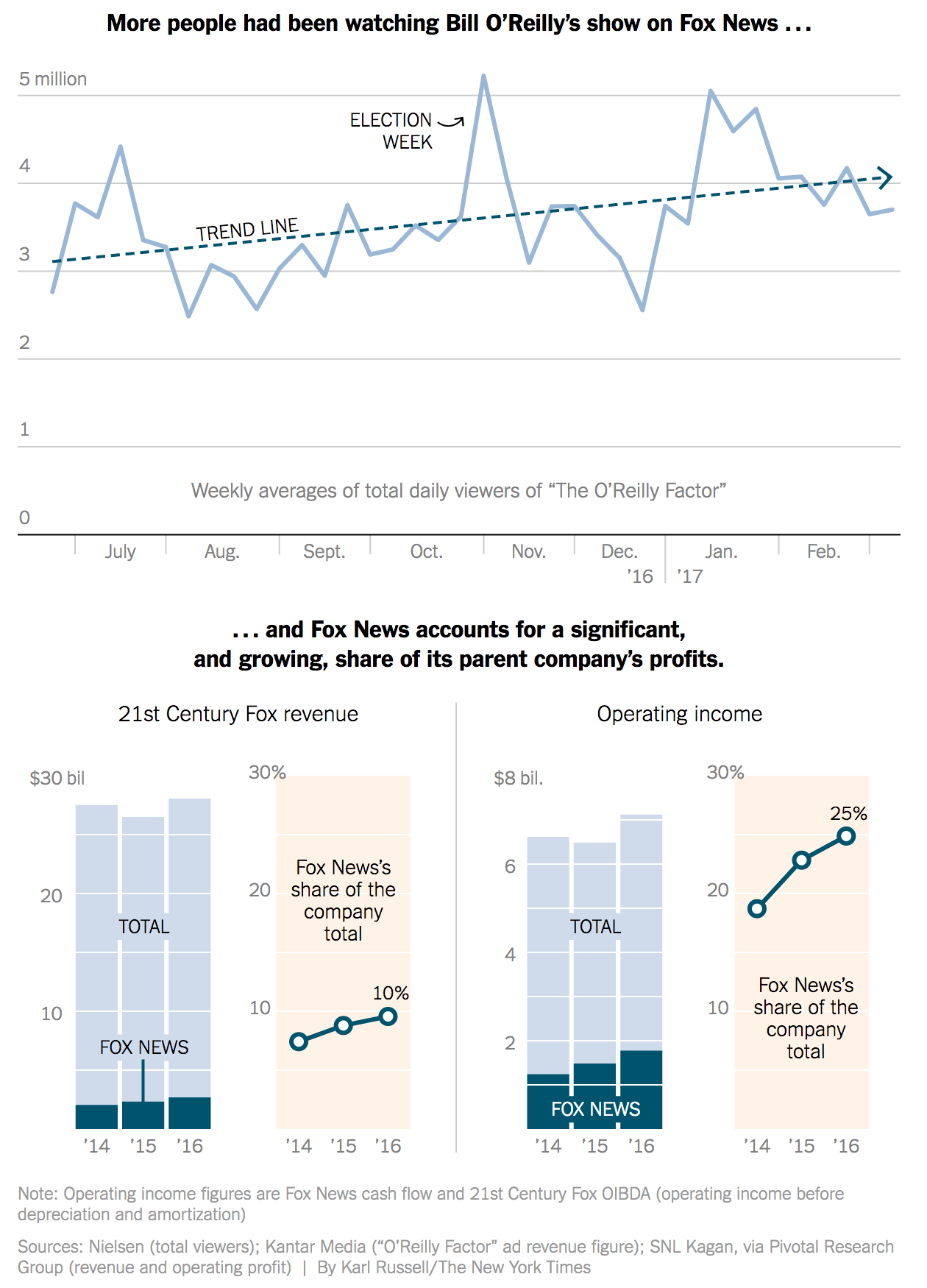
This is Fox New’s firing of Bill O’Reilly, their lead personality and heaviest hitter for the last 21 years, for accusations of sexual harassment both externally and internally. But up until yesterday afternoon, just how important was O’Reilly to Fox News? Well, as you might guess somebody covered just that question. The New York Times addressed the question in this online piece and uses a nice graphic to buttress their argument.

I like the use of the longer time horizon across the top of the graphic. But most important in it is the inclusion of the trend line. It helps the reader find the story amid the noise in the weekly numbers. The big decline towards the end of December looks important until one realises that it probably owes the drop to the Christmas holidays.
Then the bottom piece does something intriguing; it shows both the actuals and percentages side-by-side. Typically people love stacked bar charts—by this point you probably all know my personal reluctance to use them—and that would be that. But here the designer also opts to show the share as a separate data point beside the stacked bar charts.
I think the only thing missing from the piece is a bit more context. Is O’Reilly still the heaviest weight in the lineup? The top chart could have perhaps used some additional context of other shows over the last few months. For example, how does O’Reilly compare to Hannity?
Regardless, this piece does a fantastic job of showing the until-yesterday increasing importance of O’Reilly to Fox News and then Fox News’ importance to 21st Century Fox.
Credit for the piece goes to Karl Russell.
Leave a Reply
You must be logged in to post a comment.