Kenya presently waits for the results of its presidential election, one that pitted incumbent Uhuru Kenyatta against Raila Odinga, a many ran but never won candidate. Now, if you will indulge me, the Kenyan elections have interested me since December 2007, which if you recall provoked sectarian violence to break out across the country.
At the time I had just started working at my undergraduate thesis, a book using Fareed Zakaria’s Future of Freedom as the text (with a parallel narrative from Chinua Achebe’s Things Fall Apart) and I wanted to use specific case studies and data to add to the point of the book. Kenya with its election result data and horrific outcome allowed me to do just that. I juxtaposed awful images of that violence with quiet text and a full-page graphic of the results. I still find it one of the stronger spreads in the book, but as we await the results in Kenya, I am hoping that a ten-year anniversary piece will not be required.
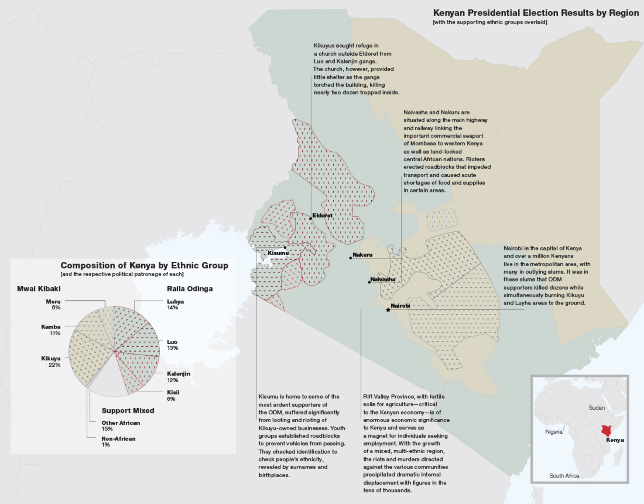
And yes, I have learned a lot since 2007. Including my deep-seated antipathy for pie charts.
Credit for the piece goes to a much less knowledgable me.
Leave a Reply
You must be logged in to post a comment.