I meant to post this yesterday, but accidentally saved it as a draft. So let’s try this again.
Yesterday the New York Times published a print piece that explored how the Cassidy-Graham bill would change the healthcare system. This would, of course, be another attempt to repeal and replace Obamacare. And like previous efforts, this bill would do real damage to the aim of covering individuals. We know the dollar amounts in terms of changes to aid given to states, but in terms of the numbers of people likely to lose their coverage, that would have to wait for a CBO score.
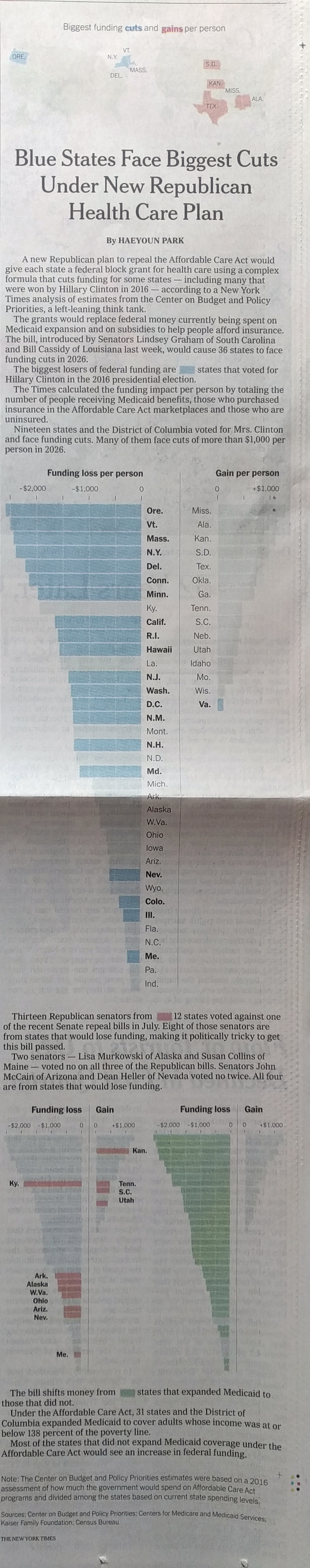
The graphic makes really nice use of the tall vertical space afforded by two columns. (You can kind of see this too in the online version of the article.) At the beginning of the article, above the title even, are two maps that locate the states with the biggest funding gains and cuts. I wonder if the two maps could have been combined into one or if a small table, like in the online version, would have worked better. The map does not read well in the print version as the non-highlighted states are very faint.
The designer chose to repeatedly use the same chart, but highlight different states based on different conditions. This makes the small multiples that appear below the big version useful despite their small size. Any question about the particular length can be referenced in the big chart at the top.
With the exception of the maps at the top of the piece, this was a great piece that used its space on the page very well.
Credit for the piece goes to Haeyoun Park.
Leave a Reply
You must be logged in to post a comment.