Baseball is finally back as Spring Training continues to push through March, getting us closer to Opening Day. But one lingering question from last year remains: why the increase in power and home runs? While Major League Baseball (MLB) says there has been no change to the baseball, many think otherwise.
FiveThirtyEight published a piece looking at the insides of eight baseballs, four predating the power surge, which began after the 2015 All Star Game, and three balls since in addition to a newly manufactured and unused ball.
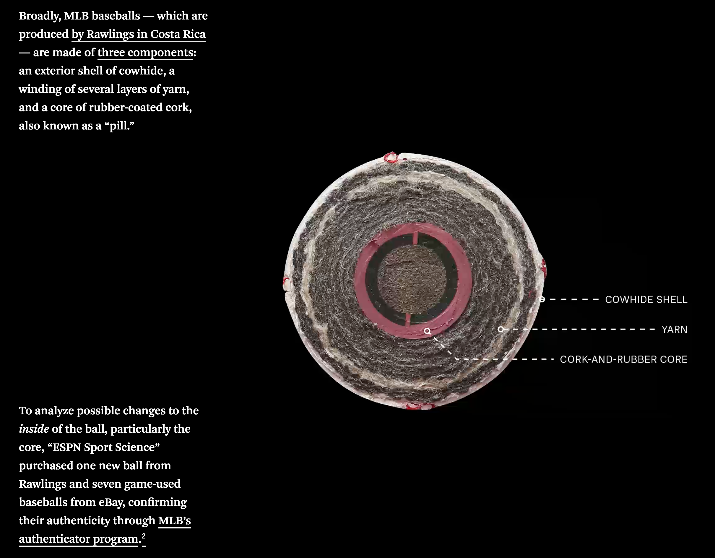
The piece uses a few graphics to showcase the differences, including this cutaway diagram highlighting the different layers of a baseball.
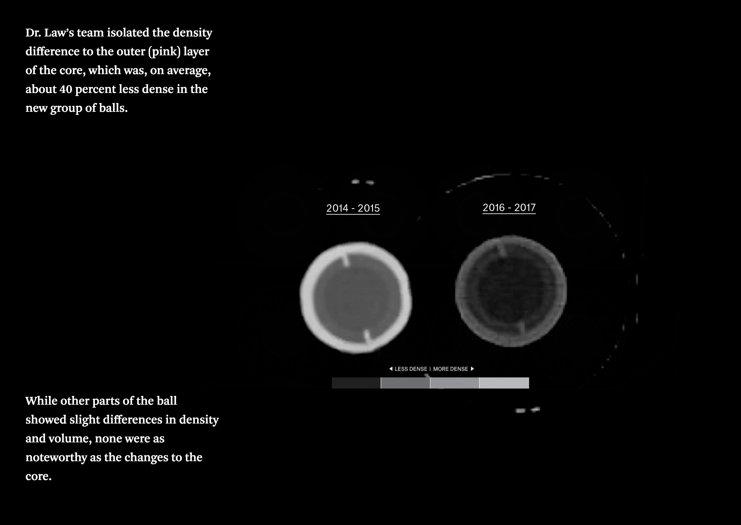
But the real gem is the X-ray photography done to examine the balls without cutting into them. Thankfully for those of us unfamiliar with x-rays, the designers provided a legend showing the clearly different core densities in the balls.
If you are interested in baseball, and in particular the increase in home runs, the whole article is worth the short read. And if you’re not, well, the x-ray views of baseballs are still pretty neat.
Credit for the piece goes to Rob Arthur and Tim Dix.
Leave a Reply
You must be logged in to post a comment.