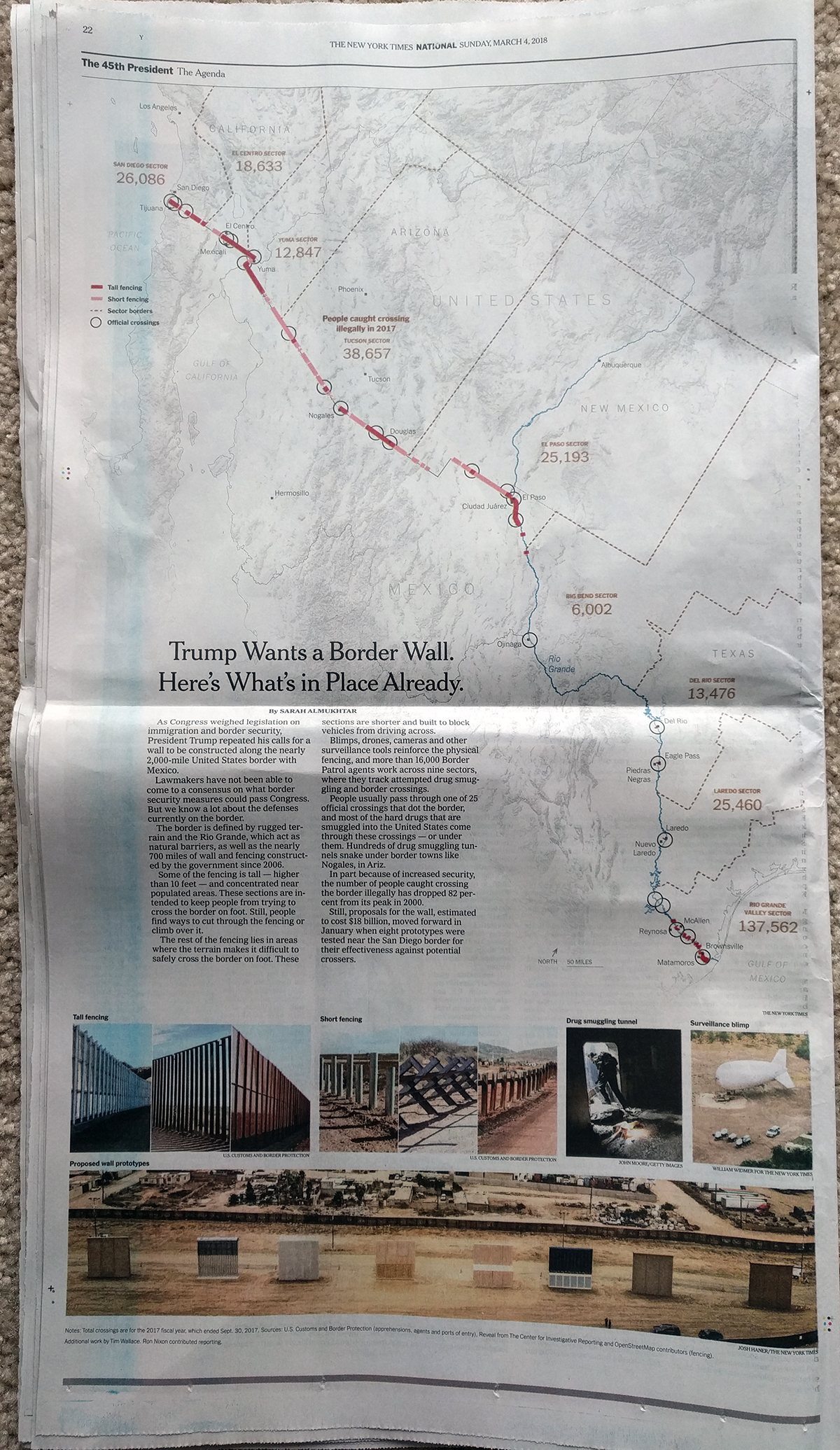
This past Sunday I had a nice treat in the New York Times. They printed a piece looking at the state of the US-Mexican border wall as it is today. And not only was it an article, but it was a full-page article.

There isn’t a lot to say about it in particular. But what I really did like was the decision by the designer to tilt the map at an angle. Normally we would see a straight east-to-west, right-to-left map, but here the axis is more southeast-to-northwest, right-to-left map. And that creates a nice space for text in the lower left area, which the designer here did in fact use for the main block of text.
Credit for the piece goes to Sarah Almukhtar.
Leave a Reply
You must be logged in to post a comment.